
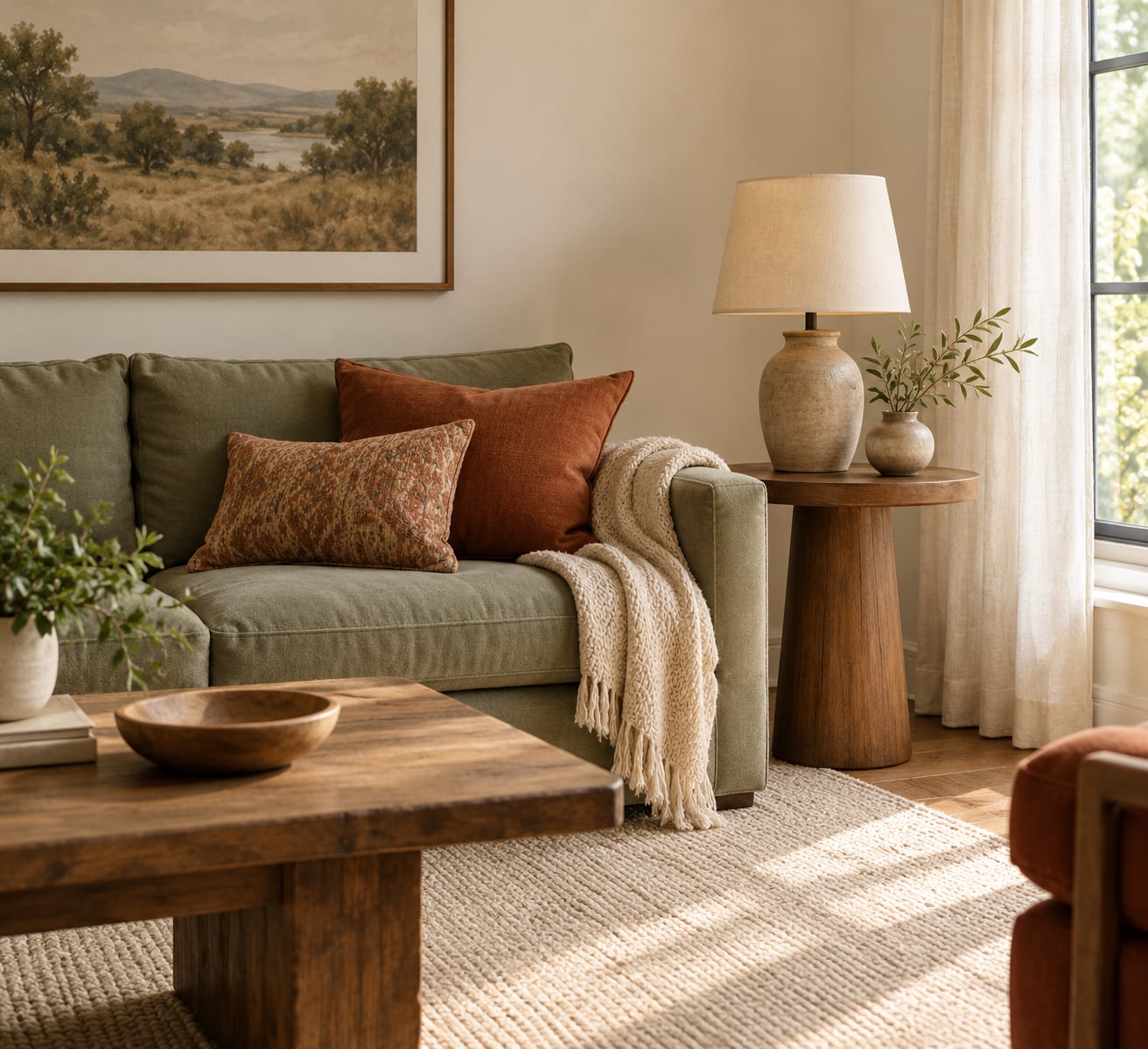
The 60 30 10 color rule splits a room into three visual layers: one dominant color takes roughly 60 percent of what you see, a supporting color takes 30 percent, and an accent color takes the last 10 percent. You do not measure anything, you decide which surface wins, which supports it, and where the accent repeats. Most rooms come together in an afternoon once that decision is made.
It works on paint, furniture, rugs, curtains and thrifted finds, which is why it is useful on a rental budget or in a room with one sofa you plan to keep forever. The percentages are a guideline for visual weight, not a construction spec.
Table of Contents
- What You Need
- Step-by-Step: How to Use the 60 30 10 Color Rule
- 1. Identify the Dominant 60 Percent Color
- 2. Choose a Supporting 30 Percent Color
- 3. Add a Distinct 10 Percent Accent
- 4. Account for the Room’s Fixed Features
- 5. Check the 60 30 10 Balance from Across the Room
- 6. Adjust the Ratio for Lighting and Size
- 7. Make Thrifty and Budget-Friendly Substitutions
- Common Mistakes
- Frequently Asked Questions
- Do the 60 30 10 color rule percentages have to be exact?
- How do I use the 60 30 10 color rule with existing furniture?
- What colors work best for a small room?
- Should walls be the dominant 60 percent color?
- Can I use the 60 30 10 color rule in a rental or an apartment?
What You Need
The 60 30 10 color rule works by giving each color a job. Your dominant color is the background and it should be quiet enough to live with every day. Your secondary color gives the room structure, usually through one large piece such as a sofa or a rug. Your accent color is the one people notice first, and it stays small on purpose.
- 60 percent, dominant color: walls, ceiling, flooring, the largest sofa, or cabinetry. This is the color the room returns to.
- 30 percent, supporting color: a mid-weight upholstery, area rug, drapery panels, or a painted cabinet run.
- 10 percent, accent color: throw pillows, artwork, a lamp, ceramics, books, a door color, or greenery.
A tape measure helps if you want a rough square-footage check, but it is optional. Paint swatches from the same brand matter more, because pigments shift between brands and a warm gray from one line can read green next to another line’s gray.
Also worth grabbing: a few printed color cards, your phone for the squint test, and a list of every surface you cannot change. That last list decides more than any tool. You do not need to buy anything to use this rule, and a second color plus a white counts as a working palette if that is all you have.
Step-by-Step: How to Use the 60 30 10 Color Rule
1. Identify the Dominant 60 Percent Color

Start with the biggest surface you are not repainting, then look at the largest surface you are. In a typical living room the walls plus ceiling plus floor together out-weigh any single furniture piece, even a big sectional, because you see them at once and the furniture sits in front of them.
Counting objects is the mistake people make most often. A sofa may be physically the biggest object in the room and still not be your 60 percent, because it occupies one direction of view while the walls wrap around you on four. Where the two are close, pick the one with the calmer color and treat the other as supporting.
Aim for a neutral, low-saturation base: warm white, soft greige, oatmeal, pale clay. You know it worked when you can walk through the room and your eye does not snag on anything. Most mismatched rooms fail here, because the dominant color is too busy to hold the rest.
2. Choose a Supporting 30 Percent Color

Your 30 percent color should relate to the dominant one without disappearing into it. Shift the hue, hold the value similar, or shift both a little. Warm white walls with a muted blue sofa is the classic pairing, as are cream walls with sage upholstery and oatmeal walls with terracotta drapery.
Two ways to build this layer work better than mixing several small items. Take one large piece, a sofa, an area rug, or full drapery panels, and let it carry the 30 percent on its own. Or take two or three medium pieces in the same color family, such as a rug, a loveseat and a set of curtains.
Watch the undertone. Every paint has a warm, cool or neutral lean underneath its name, and undertones are where rooms argue with themselves. Commenters on decorating forums describe rooms done entirely in greiges that fight each other, and that is nearly always an undertone problem rather than a proportion problem.
You will know the 30 percent works when the room has a center of gravity that is not the walls but is still calmer than the accents. If the supporting color starts competing with the dominant one, drop its saturation a step rather than removing the piece.
3. Add a Distinct 10 Percent Accent
The accent color is where personality lives, and it is the layer most rooms skip. A white, black and gray scheme with no third color often reads unfinished, which is why people say they are missing their 10 percent.
Pick the accent as the opposite side of the color wheel from your dominant color, then pull it toward your secondary color until it feels connected. Deep navy with warm white and sage, burnt orange with cream and warm brown, plum with soft gray and brass, all of these work for the same reason.
Then repeat it in three places. A throw pillow, a piece of artwork and a lamp base will read as a decision. The same pillow in one spot reads as an accident. You need less than you think: a 10 percent layer in a 200 square foot room is roughly 20 square feet of color, which is about three or four small objects.
Because the accent layer is small, it is the cheapest part of the scheme to change. Swap terracotta for deep olive in autumn and for a clear yellow in spring, and the room updates without touching the base.
4. Account for the Room’s Fixed Features
Some surfaces are not up for negotiation: hardwood floors, brick, the tile in a kitchen, a colored wall you inherited with the lease, a landlord’s cabinets. Treat each one as part of your 60 percent if it is large and quiet, or as the 30 percent if it carries a real hue.
Forced neutrals like warm oak and white tile have undertones you must live with, so sample your paint swatches next to them, not in a bright aisle at the store. Hold the swatch against the floor, then against the wall, and look at both under your actual lighting.
A rental works best when the fixed surfaces take the 60 percent and everything you can move takes the other two layers. Curtains, a rug, bedding, a shower curtain and a few cushions are enough to re-balance a room with no painting and no new furniture.
If you own the space and something fixed is fighting the plan, decide whether repainting it is worth the disruption. Cabinets are the usual candidate, and painting them is often the fastest way to hand a dated kitchen a new dominant color.
5. Check the 60 30 10 Balance from Across the Room
Stand at the doorway, squint until you lose detail, and see whether one color still owns the room. Then try it again from the opposite corner, because a room can read differently from each direction.
Your phone is faster and more honest. Take one photo from the doorway at eye level, then step back and look at the thumbnail. If the accent color vanishes, it is too small or too close in value to its neighbors. If it dominates, it is doing the 60 percent’s job.
A large mirror gives you the reverse view for free, which is handy in rooms with one open side. Look at the reflection and count colors rather than objects.
Expect to adjust twice. Most rooms are roughly right on the first pass and land on the second, and the change is usually one swap rather than a repaint.
6. Adjust the Ratio for Lighting and Size
Light changes the math. A north-facing room reads cooler and can make a warm palette look muddy, while strong afternoon sun through south windows washes out light and mid-tone colors and makes dark accents look black. Paint a sample board, hang it in the room, and look at it morning, midday and evening before committing.
Small rooms usually want the 60 percent even flatter than usual, because a busy dominant color closes them in from all sides. A light, low-contrast base plus one clear 30 percent piece is calmer than three mid-tone colors fighting for attention.
Large rooms and high ceilings go the other way. They can carry more contrast, so pull the dominant color darker or the accent brighter without losing the split. Open-plan spaces need the same palette repeating across zones, with the accent color as the thread that ties them together.
If you love maximalism, keep the ratio but widen the gap between the layers. More objects is fine as long as they are all speaking in one of your three colors.
7. Make Thrifty and Budget-Friendly Substitutions
The rule is really a coordination tool, so inherited pieces can carry a layer. A sofa you already own can be your 30 percent if the color is right, and if it is not, slipcover it or throw a large throw over the arm.
Paint is often the highest-return change in a thrifty room because it moves the dominant layer without replacing furniture. Half a gallon of the 60 percent color on a tired wall, or a painted cabinet door, changes the balance more than a new accessory ever will.
For mismatched secondhand pieces, pick the two or three colors they already have in common and make those your palette. Repeat one of those colors in something you buy new so the room reads as chosen rather than accumulated.
DIY wall art in your accent color counts fully toward the 10 percent. So does a thrifted lamp you reupholster, a framed fabric scrap, or a set of painted picture frames.
A tight budget does not change the proportions, it changes where the color comes from. The rule only cares about how much of the room each color occupies.
Common Mistakes
Treating the percentages as measurements. The rule describes visual weight, not square footage. Close enough is close enough, and chasing an exact 30 percent on a rug you already own wastes an afternoon.
Counting objects instead of surfaces. The most repeated mistake on decorating forums is assuming the sofa is the 60 percent when the walls actually dominate what you see. Count what your eye sees first from the doorway.
Choosing three colors that all shout. If the dominant, supporting and accent colors are equally saturated, nothing leads. Pull one of them down a step in saturation or value and the hierarchy returns.
Skipping the accent layer. White, gray and black with nothing bold in the mix is the most common reason a room feels unfinished. Add three small objects in one strong color and it comes alive.
Adding too many accent objects in too many colors. Ten percent is ten percent. Three rust cushions and four navy mugs give you two accents fighting for one slot, and the room ends up noisier than a room with no accent at all.
Never repeating a color. One statement piece in a color that appears nowhere else looks like it was left over from a different room. Repeat each color at least three times.
Ignoring undertones. A room can follow the ratio perfectly and still feel wrong, because the greens are warm and the greige is cool. Compare every swatch side by side in daylight before you commit.
One last tip: if something in the room does not fit any of your three colors, hide it first and live with the room for a week. Half the time you will miss it, and half the time you will find the piece that needs to move.
Frequently Asked Questions
Do the 60 30 10 color rule percentages have to be exact?
No. The numbers describe visual weight, not measured square footage. If your walls read as about 60 percent of what you see, the rule is working. Most people land within 10 percent on the first pass and never measure. Judge it from the doorway with a squint or a phone photo, and only adjust if a color is visibly winning or disappearing.
How do I use the 60 30 10 color rule with existing furniture?
Work from what you already own. Let the largest fixed surface be your 60 percent, then decide whether your biggest sofa or rug is the 30 percent or joins the dominant layer. If a piece sits outside your palette, slipcover it, paint it, or throw a large cover over it. Add the accent color in small items rather than replacing furniture.
What colors work best for a small room?
Light, low-contrast colors for the dominant layer, since a busy base makes a small room feel tighter from every side. Warm white, soft greige and pale clay work well. Keep the 30 percent as one large piece rather than several small ones, and use a single clear accent color in three spots. High contrast is what makes small rooms feel larger.
Should walls be the dominant 60 percent color?
Usually, because walls plus ceiling and floor are what you see at once, and they wrap around you from every direction. A large sofa is physically bigger but occupies one view, so it often works better as the 30 percent. When walls and furniture are close in area, give the 60 percent to whichever color is calmer.
Can I use the 60 30 10 color rule in a rental or an apartment?
Yes, and rentals are where it is most useful. Let the fixed surfaces you cannot change, floors, kitchen cabinets, a painted wall, become the 60 percent, then build the 30 and 10 layers from things you can move. Curtains, a rug, bedding, a shower curtain and a few cushions are enough to rebalance a room with no painting and no new furniture.
Start with the surface you are not changing, and decide which of your three colors is winning right now. That single choice is where every room goes right or wrong.
Then add three small objects in one strong color, and set them where you already sit. That is the whole rule, and it works in a rental just as well as it does in a house you own.


