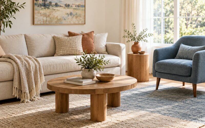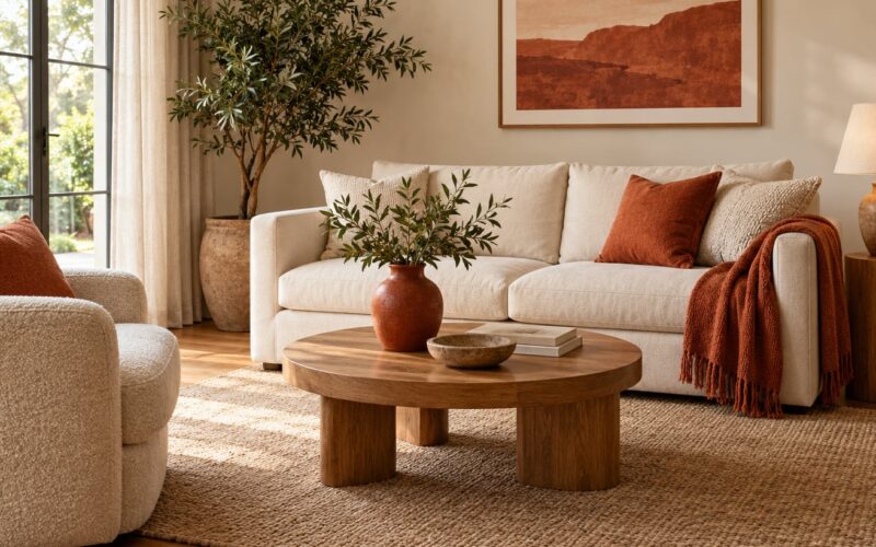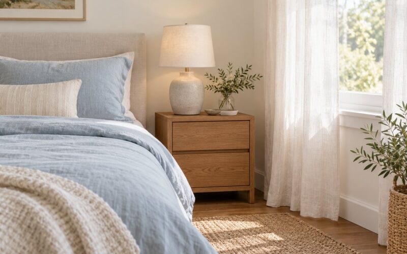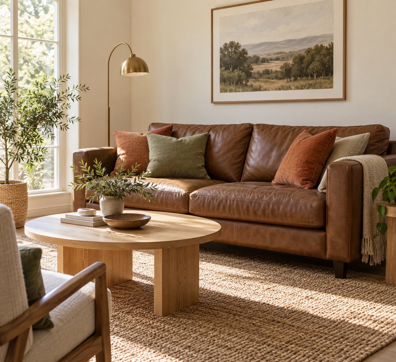
The short answer to what colors go with brown furniture: cream and warm white, soft gray and taupe, black, sage and olive green, navy, terracotta, rust, mustard, dusty blue, and blush pink all sit comfortably next to brown, as long as you match the shade to your furniture’s undertone and the light in the room.
Brown is a warm, medium-to-dark neutral, so it behaves in a predictable way. Colors that lighten it, colors that cool it off, and colors that deepen it all work. What fails is brown next to more of the same warm mid-tone, which is why so many 1990s rooms feel heavy and undefined.
On this site we go back to brown sofas, walnut tables, and chocolate leather sectionals again and again, and the same three questions decide whether a room comes together: what undertone is the brown, how much light does the room get, and how much surface area is already brown. Get those right and the palette writes itself.
Table of Contents
- What Colors Go With Brown Furniture?
- How Do You Know If Your Brown Furniture Is Warm or Cool?
- The Best Neutral Colors for Brown Furniture
- Warm Colors That Pair Well With Brown
- Cool Colors That Pair Well With Brown
- How to Choose a Wall Color for a Room With Brown Furniture
- How to Mix Brown Furniture With Multiple Accent Colors
- Common Color Mistakes to Avoid With Brown Furniture
- Frequently Asked Questions
- What wall color goes with brown furniture?
- Does white go with brown furniture?
- What colors go with a dark brown sofa?
- What colors work with medium-brown wood furniture?
- Is gray or beige better with brown furniture?
- How do I test colors before painting a room with brown furniture?
- Conclusion
What Colors Go With Brown Furniture?
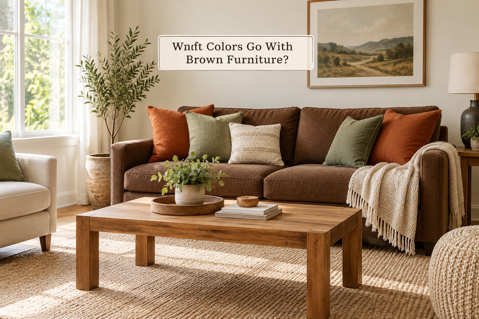
Short version: cream, warm white, beige, taupe, soft gray, black, sage, olive, forest green, navy, dusty blue, terracotta, rust, mustard, and burgundy. The best single choice for most people is a light warm neutral on the walls with one saturated accent repeated in textiles.
- Cream and warm white brightens the room and cuts the visual weight of dark brown wood or leather.
- Beige and taupe stay soft and warm, though they need something darker to anchor them.
- Soft gray and greige cool a red-undertone brown and stop the room reading as one brown mass.
- Black grounds the room and sharpens the edges of a tan or caramel sofa.
- Sage and olive green are nature-inspired counterweights that never fight the wood.
- Navy and denim blue give strong contrast, and navy works with warm or cool brown alike.
- Terracotta and rust echo brown’s red undertone while adding a much brighter note.
- Mustard and ochre read as golden daylight next to honey-toned wood.
- Dusty blue softens chocolate leather without the formality of navy.
- Blush pink and burgundy bring a warm counterpoint most people do not expect.
Here is the same information in a scannable form, with paint names you can actually take to the store. Shade names shift between brands and years, so treat these as starting points to sample rather than exact matches.
| Color | Paint name to sample | The effect it creates | Best for |
|---|---|---|---|
| Cream | Sherwin-Williams Alabaster, Benjamin Moore White Dove | Brightens and enlarges the room | Small or low-light rooms |
| Warm white | Benjamin Moore White Dove, Behr Swiss Coffee | Soft contrast without a hard edge | Bedrooms and calm living rooms |
| Beige | Sherwin-Williams Malted Milk, Benjamin Moore Pale Oak | Warm and layered | Homes with warm brown wood |
| Greige | Sherwin-Williams Accessible Beige, Benjamin Moore Chelsea Gray | Neutral middle ground | Renters and open plans |
| Soft gray | Sherwin-Williams Repose Gray, Benjamin Moore Graystone | Cools a red or orange undertone | Cold rooms and dark leather |
| Black | Sherwin-Williams Iron Ore, Behr Wrought Iron | Grounds and sharpens | Tan and caramel leather |
| Sage green | Benjamin Moore Saybrook Sage, Behr Sage | Calms a warm brown | Living rooms and bedrooms |
| Olive | Sherwin-Williams Pickled Oak Green, Behr Sage | Earthy and muted | Rustic and boho schemes |
| Navy | Sherwin-Williams Naval, Benjamin Moore Stonington Blue | Strongest contrast available | Formal rooms and studies |
| Dusty blue | Benjamin Moore Oxford Blue, Behr Dusty Blue | Softens dark leather | Dark chocolate and espresso tones |
| Terracotta | Benjamin Moore Terracotta Tile, Behr Calico | Echoes red undertones | Mediterranean and warm rooms |
| Rust | Sherwin-Williams Autumn Gold, Behr Rust | Adds warmth and depth | Fall palettes and wood-heavy rooms |
| Mustard | Benjamin Moore Golden Oak, Behr Mustard Field | Brightens golden wood | Accent chairs and pillows |
| Burgundy | Benjamin Moore Red Earth, Behr Wine | Deep, jewel-toned warmth | Dining rooms and darker walls |
| Blush pink | Benjamin Moore Pink Beauty, Behr Rose Quartz | Unexpected and light | Bedrooms and coastal rooms |
How Do You Know If Your Brown Furniture Is Warm or Cool?
Undertone is the hidden color underneath a brown, and it decides which wall color will look crisp and which will look muddy. Find yours before you pick a single swatch, because it takes five minutes and saves a repaint.
Look at the brown in daylight, not under a lamp. A yellow undertone shows up as golden, honey, or oat, and turns slightly greenish in shade. A red undertone reads as mahogany, cherry, or russet, and turns slightly purple in shade. A neutral or cool brown looks like walnut, espresso, or greige-brown, with gray or even a faint green cast.
Use three checks. Stand next to the piece and look at the natural wood grain, since grain tells you more than the stain. Compare it with textiles you already own, since a throw pillow is a free undertone sample. And check the flooring, because a rug and floor that fight the sofa is the single most common reason a brown room looks off no matter what the walls are.
Once you know the undertone, the choice narrows fast. Yellow and red undertones take cream, beige, terracotta, mustard, olive, and rust beautifully. Cool and neutral browns take soft gray, dusty blue, sage, and navy especially well.
The Best Neutral Colors for Brown Furniture
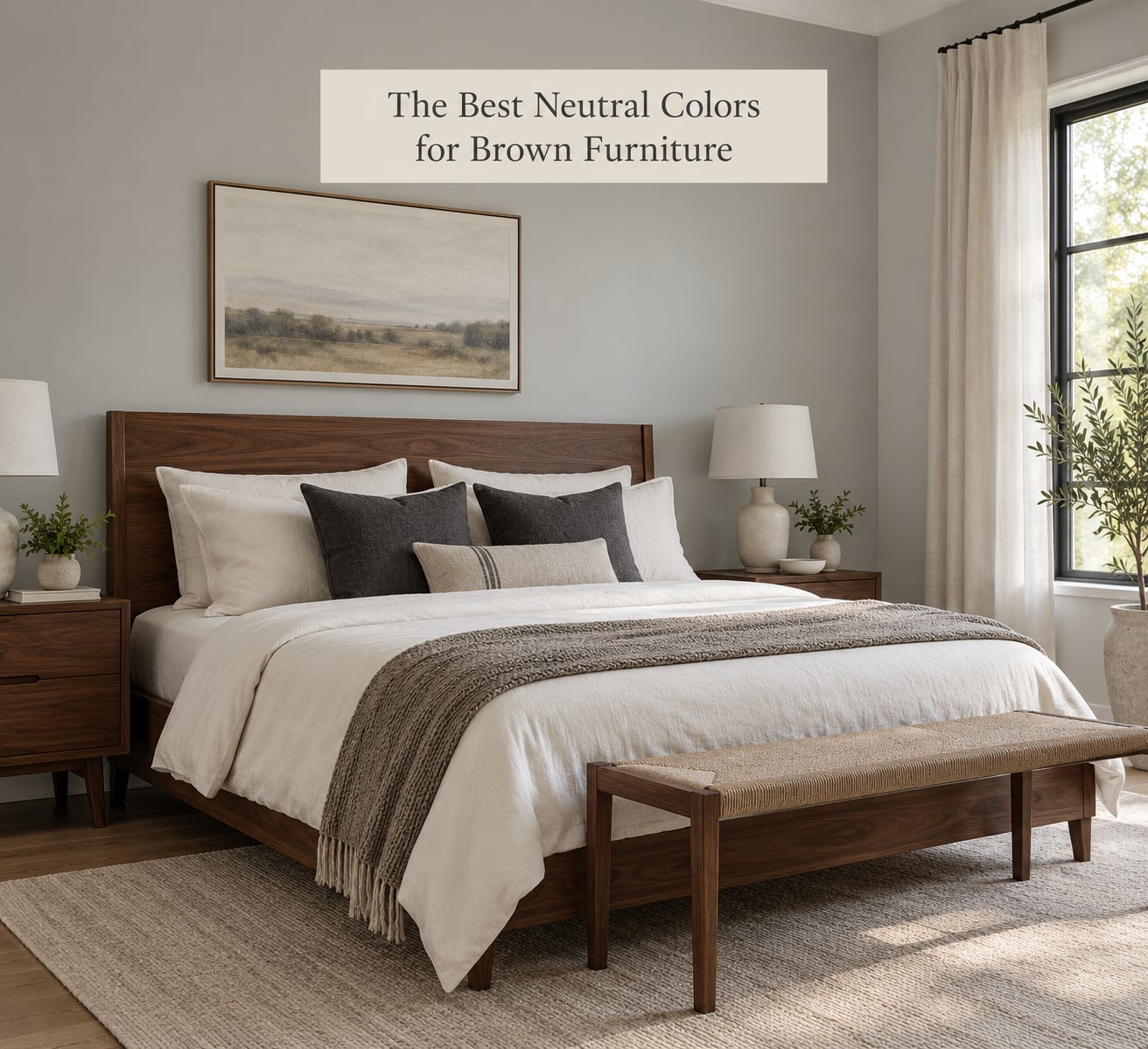
Cream, ivory, beige, taupe, soft gray, white, and black are the safest colors to pair with brown furniture, and each one changes the mood of the room rather than just decorating it.
Cream and warm white are the single most useful choice for a dark room. Cream is gentler than white and picks up the warmth already in the wood. A dark walnut bedroom with warm white bedding and cream walls feels light without feeling cold.
Beige and taupe suit a home that is mostly warm brown, but they need one darker element to stop everything from melting together. One rule decorating communities repeat constantly: nothing tan next to a tan floor, because both surfaces blur into one another. Put a charcoal throw, a black lamp, or a dark rug in the room and the beige suddenly has a boundary.
Soft gray and greige are the best answer for a red-undertone brown that looks too orange. Gray also expands a small room because it reflects light without the yellow cast of beige.
Black does something no other neutral does: it grounds the furniture instead of blending with it. Matte black hardware, a black-framed gallery wall, or one black chair will sharpen the edges of a caramel or tan leather sofa.
Warm Colors That Pair Well With Brown
Terracotta, rust, burnt orange, mustard, olive, sage, warm red, and golden yellow are the warm family that works best with red- and yellow-undertone brown. They echo the wood rather than fighting it, which is why these shades look settled instead of applied.
Terracotta is a muted orange with pink in it, and it does more than most colors to make a beige room feel lived in. Put it on pillows, a lamp base, or a single accent chair rather than a whole wall, and a cream-and-brown room gains a focal point in one move.
Rust is darker and browner than terracotta, so it sits closer to the furniture. It works as a duvet, a rug border, or a curtain when you want warmth without brightness. Burnt orange is the loudest of the three, and it needs a lot of cream around it to stay tasteful.
Mustard and ochre are yellow at full strength. They sing next to honey-toned oak and mid-century walnut, and they look tired next to a very dark chocolate sofa unless you keep them on small items like a single chair or a stack of books.
Olive and sage are technically greens, but the muted ones are warm enough to sit in this family. Sage is the safest green in the whole article because it is soft enough to pair with any undertone of brown without looking like a mismatch. A sage throw over a tan leather sofa reads calm and clean in a way that emerald does not.
Golden yellow and a deep warm red are the boldest options here. A burgundy chair against a medium-brown wall gives a dining room the weight of a proper dining room, and small doses of golden yellow on a dark sofa read as lamplight.
Cool Colors That Pair Well With Brown
Dusty blue, teal, sage, forest green, muted lavender, and soft pink are the cool family, and they are the fastest way to make brown furniture look modern. Cool colors sit opposite brown on the color wheel, so they add contrast without any risk of blending in.
Dusty blue is the safest of them. Muted and slightly gray, it softens a chocolate leather sectional and makes it look less heavy, and it works on a wall where a true navy would feel too formal. Denim blue is a step brighter and suits a casual family room.
Navy is the strongest contrast you can get against brown, and it is a genuinely long-lasting choice. Navy walls behind a tan leather sofa, or a navy rug under a walnut dining table, will hold up for years. The dark-blue-rug-and-brown-furniture pairing comes up again and again in decorating advice threads for exactly this reason: it works with both warm and cool wood.
Teal and forest green are the richer versions. They suit a room with brass or bronze hardware, and they add the deep, jewel-toned feeling people describe as classy rather than trendy.
Muted lavender is the sleeper option. A gray-purple reads as almost neutral in some lights, which makes it useful in a room that already has two other accent colors. Soft pink does the same job with more warmth, and a dusty rose wall behind a mid-brown sofa is one of those combinations that looks more expensive than it is.
When you are pairing cool accents, the piece that matters is the anchor. Pick one cool shade and repeat it in three places, then let everything else stay neutral. Two competing cool colors in a brown room is how you get a look that feels busy rather than layered.
How to Choose a Wall Color for a Room With Brown Furniture
Start with the furniture, not the paint chips. How big is the brown piece, how dark is it, and does it stand alone or share the room with other wood? A single walnut dining table in a room with white walls wants a light, quiet wall. A wall-to-wall run of dark wood built-ins wants cream or a strong accent, because the brown is already doing the heavy lifting.
Then look at the light. A north-facing or low-light room takes lighter, cooler colors, because darker walls will eat what light you have. A south-facing room with strong afternoon sun can handle a mid-tone or a deeper color, and warm light makes creamy shades glow instead of looking flat.
Next, check what you cannot change. Flooring, door frames, built-in cabinetry, and the kitchen you inherited all count as fixed color. A warm beige wall next to a warm beige floor is the mushy look renters keep asking about, so when the floor is beige, the walls should be either clearly lighter or clearly cooler.
Finally, decide what you want the room to feel like. If the answer is brighter and calmer, go light neutral. If the answer is dramatic, go bold with navy, deep green, or a dark accent wall behind a single piece. If the answer is cozy without dark, use a mid-tone like terracotta or sage.
Here is the short version, room by room.
| Room | Wall color | Accent color | Skip |
|---|---|---|---|
| Living room | Cream, warm white, or soft gray | Sage, rust, or navy | Beige on beige |
| Bedroom | Warm white, dusty blue, or blush | Olive, mustard, or taupe | Chocolate brown walls |
| Dining room | Greige, cream, or deep green | Burgundy, brass, terracotta | Two different wood mid-tones |
| Home office | Soft gray, navy accent wall | Black, brass, leather tan | Camel and beige together |
| Entryway | Deep green, ink blue, or black | Brass hooks, a patterned runner | Matching brown coat closet |
| Kitchen | Warm white, soft gray, or sage cabinet paint | Black or brass hardware | Wood cabinets plus wood floors |
If you cannot paint, the same decisions apply to textiles. A large area rug, curtain panels that run floor to ceiling, and three or four throw pillows will set the palette just as effectively as a gallon of paint, and they are reversible.
How to Mix Brown Furniture With Multiple Accent Colors
Most successful brown rooms use one dominant neutral, one main accent, one supporting color, and small repeated touches of the brown itself. That is four elements, not a palette of eight, and it is why the room looks intentional rather than busy.
The 2/3 rule is the simplest version of the same idea. Let your main color family occupy roughly two-thirds of what the eye sees, then use the remaining third for contrast. In practice that means walls, large curtains, and the sofa in the dominant family, with the accent color in a rug, a chair, artwork, and pillows.
Build it in this order. Pick the wall color first, since it is the largest surface. Choose the accent, which should be either a complement of brown on the color wheel or a soft neutral that echoes it. Then pick a supporting shade one step away from the accent, and pull the brown itself back in through the rug, the wood, or a leather ottoman.
Repeat your accent color in at least two or three places, spaced around the room. One green throw in a corner reads as an accident. Green pillows, a green book stack, and a green vase in a different part of the room read as a decision.
Textiles and materials do as much work as hue. Layer a chunky wool, a smooth velvet, and a flat cotton in the same color family so brown does not look flat and matte. Velvet in a warm brown with cream linen and a rust cushion has more depth than three shades of the same brown paint.
Metals should match your brown’s undertone. Warm brown with red or yellow undertones takes brass, bronze, and aged gold. Warm brown with a neutral or cool undertone takes blackened metal, chrome, or brushed nickel. Matte black hardware works across almost every brown and quietly pulls the room together.
One more thing: mix two different browns carefully. Dark walnut floors plus light oak cabinets is a common open-plan problem, and the answer is a wall and textile palette with enough contrast that neither wood becomes the star. Cream walls, a cream rug, and one dark anchor piece will hold both together.
Common Color Mistakes to Avoid With Brown Furniture
Clashing undertones. A yellow-undertone beige wall next to a red-undertone mahogany sofa reads dirty, not warm. Compare your swatches to each other under daylight before committing to either.
Too many similar dark shades. Dark brown sofa, dark brown curtains, dark brown rug, and dark brown walls create the mud effect that makes people say a brown room looks dated. Keep one dark anchor and lighten everything around it.
Ignoring the floor. Walls, flooring, and sofa are the three biggest surfaces in a room. If all three are warm mid-tones, nothing anchors the space, and no amount of accent pillows will fix it.
Adding another dark color to a small room. A dark brown sectional plus dark walls plus dark drapes in a 10-by-10 space shrinks it. In small rooms, let the walls go light and put the contrast in the rug and the pillows, where you can control the visual weight.
Skipping the sample step. Paint that looks right in the store looks different in your room at 8 a.m., at noon, and under lamps at night. Tape four swatches to the wall and leave them for 48 hours before you buy. This is the least-skipped and most-regretted step in decorating.
Buying the brown to match the room instead of the room to suit the brown. If the furniture stays, work around it. The rooms people regret are the ones where every element was chosen to blend with everything else.
Frequently Asked Questions
What wall color goes with brown furniture?
A light warm neutral is the most reliable choice: cream, warm white, or a soft beige. These lift the visual weight of dark wood and leather, and they give you room to use one saturated accent in a rug or pillows. If your brown has a gray or cool cast, a soft gray or greige wall works better than a yellow beige.
Does white go with brown furniture?
Yes, and white is one of the easiest ways to make a brown room feel brighter and larger. Pure white is very high contrast, so it suits a caramel or tan sofa and reads crisp next to dark walnut. If you want a softer look, use a warm white or off-white instead, which blends with the wood while still lightening the room.
What colors go with a dark brown sofa?
Dark brown needs light and cool contrast more than it needs warmth. Cream, ivory, and soft gray walls work well, as do dusty blue, sage, and navy accents. Skip another dark brown and skip beige-on-beige. A dark blue or deep green rug plus a couple of light cushions will make a chocolate leather sectional look intentional.
What colors work with medium-brown wood furniture?
Medium brown is flexible, which is good news. Terracotta, rust, mustard, olive, and sage all echo the wood, while navy, dusty blue, and soft gray give it contrast. Cream and warm white walls keep the room bright. The main thing to check is whether your flooring is a similar mid-tone, because that is where brown rooms tend to blur together.
Is gray or beige better with brown furniture?
It depends on the undertone. Beige is warmer and suits red- and yellow-undertone brown such as cherry, mahogany, or honey oak. Gray is cooler and suits neutral, walnut, or espresso brown, and it is the safer pick when the room feels too orange. If the floor is already beige, go gray so the two surfaces do not merge.
How do I test colors before painting a room with brown furniture?
Buy sample pots of two or three candidates and paint large patches on the wall that gets the most light, not just a corner. Leave them up for at least 48 hours so you see them in morning, afternoon, and evening light. Look at them against the wood, the flooring, and your existing textiles at the same time, since each one shifts how the swatch reads.
Conclusion
Start by looking at your brown furniture in daylight and naming the undertone. If it is warm, lean on cream, terracotta, mustard, and sage. If it is cool or neutral, lean on soft gray, dusty blue, navy, and forest green.
Then choose a wall color that gives you contrast rather than blending: light and airy for dark brown, a mid-tone or a clear accent for lighter wood. Paint two sample patches, leave them for 48 hours, and pick one accent color to repeat in two or three places across the room.
So what colors go with brown furniture comes down to contrast plus one repeated accent, not a longer list than that. The brown furniture does not need replacing. It needs one color that talks back to it. For more ways to make inherited pieces look like they belong in 2026, start with paint and color ideas on the site.