Color psychology in home decor is simply the practice of using a room’s colors to shape how it feels. Warm hues like terracotta and ochre raise energy and invite conversation, cool blues and greens settle the nervous system, and light neutrals reflect daylight around a space. The trick is picking colors for the feeling you want, then testing them before you commit.
Most people get stuck because they treat it as one giant decision: pick a paint color for all four walls, live with it, hope. You don’t have to. Most of the effect comes from textiles, art, lighting and furniture, and all of those are reversible.
Table of Contents
- What Is Color Psychology in Home Decor?
- How does color psychology apply to interior design?
- How Do Different Colors Affect the Feel of a Room?
- Color and mood: a cheat sheet by hue
- Warm colors advance, cool colors recede
- Light and dark values change how big the room feels
- Which Color Is Best for Each Room?
- Living room: conversational and grounded
- Bedroom: quiet and low stimulation
- Kitchen: bright and appetite-friendly
- Bathroom: clean and spa-like
- Home office: focused, not sleepy
- Entryway and hallway: decompression and welcome
- Kids’ room: calm base, changeable color
- How to Use Color Psychology in Home Decor Without Repainting the Whole Room
- A five-step way to test color before you commit
- How Do You Choose a Color Palette That Works?
- The ratio rules, side by side
- Work from what you already have
- What Color Combinations Create Specific Moods?
- How Can Lighting Change Color Psychology?
- Common Color Psychology Mistakes to Avoid
- Frequently Asked Questions
- What color makes a living room feel welcoming?
- What color is calming for a bedroom or home office?
- Does color psychology mean I must follow strict color rules?
- How do I choose decor colors that work with existing furniture?
- What is the best color scheme for a small room?
- Can renters use color psychology without painting?
- Conclusion
What Is Color Psychology in Home Decor?
Color psychology is the study of how colors influence mood, behavior and perception. Interior designers use it as a practical tool: choosing a hue for a room based on the feeling that room needs to produce, rather than on what happens to be trending.
How does color psychology apply to interior design?
Color psychology in interior design means matching color choice to a room’s job. Blue and green calm, so they suit bedrooms and bathrooms. Yellow and orange lift energy, so they work in kitchens and playrooms. Red stimulates conversation and appetite, so it earns its place in a dining room or entryway. You apply it by choosing one dominant color, one supporting hue and one accent, then checking the result under the room’s real light before painting anything.
There’s an important distinction between color psychology and color theory. Color theory describes how hues, values and saturation relate to each other on a wheel, which is about harmony and proportion. Color psychology is about the reaction a person has to those hues.
Now the honest part. The old claims — that yellow always makes babies cry, that green always reduces stress, that red always makes people aggressive — don’t survive scrutiny. Reactions vary with culture, memory and personal history. Someone who grew up in a house with red walls has a completely different association than someone who associates it with a hospital corridor.
That is why the people who get color psychology right tend to start from their own reaction rather than a chart. Pick the colors you genuinely like, then adjust the room’s job around them. The framework is useful for generating a shortlist, but your own response is the tiebreaker.
How Do Different Colors Affect the Feel of a Room?
Every hue has a family of associations, and the shade, tint and undertone matter as much as the name. A dusty blue and a deep navy are both cool, but one opens a room up and the other closes it in.
Color and mood: a cheat sheet by hue
| Hue | Typical psychological effect | Rooms it suits | Shades worth trying |
|---|---|---|---|
| Blue | Calm, lower arousal, focus | Bedroom, bathroom, home office | Soft slate, powder blue, deep navy, muted teal |
| Green | Restorative, grounded, natural | Bedroom, bathroom, living room, kitchen | Sage, olive, forest, eucalyptus |
| Yellow | Cheerful, alert, sociable | Kitchen, entryway, bathroom, kids’ room | Butter yellow, ochre, mustard, warm cream |
| Orange | Energizing, friendly, appetite | Dining room, kitchen, playroom | Terracotta, burnt sienna, rust, apricot |
| Red | Stimulating, bold, conversation | Dining room, living room, entryway | Brick, oxblood, cranberry, clay |
| Purple | Reflective, restful, creative | Bedroom, home office, reading nook | Plum, lavender, aubergine, greyed violet |
| Pink | Softening, comforting, warm | Bedroom, nursery, bathroom | Blush, dusty rose, terracotta pink |
| Neutrals | Backdrop, lets one accent do the work | Any room | Warm white, oatmeal, greige, mushroom |
Warm colors advance, cool colors recede
Warm colors push toward you and cool colors pull away. That’s why a north-facing room painted in warm cream feels cozier, while a south-facing room in cool gray can feel flat even when the space is generous. Use it deliberately: warm colors on the wall you want to feel closer, cool colors where you want depth.
Don’t push it too far. All warm and the room buzzes. All cool and it can feel unwelcoming, especially in a living room where you want guests to linger.
Light and dark values change how big the room feels
Darker and more saturated colors absorb light and advance, which makes a small room feel tighter. Pale, low-saturation colors reflect light back and make the walls feel further away.
Ceilings and large surfaces take the lightest value you can stand. That’s the single most effective move in a small room — the pale ceiling makes it read as taller, and a pale far wall makes it read as longer. Put the dark color on something small you can move: a rug, a chair, a door.
Which Color Is Best for Each Room?
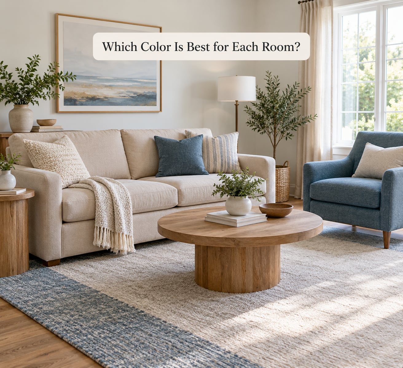
There’s no single best color for a room, only a best direction. These are starting points to test, and the palette examples are meant to be borrowed in spirit, not copied literally.
Living room: conversational and grounded
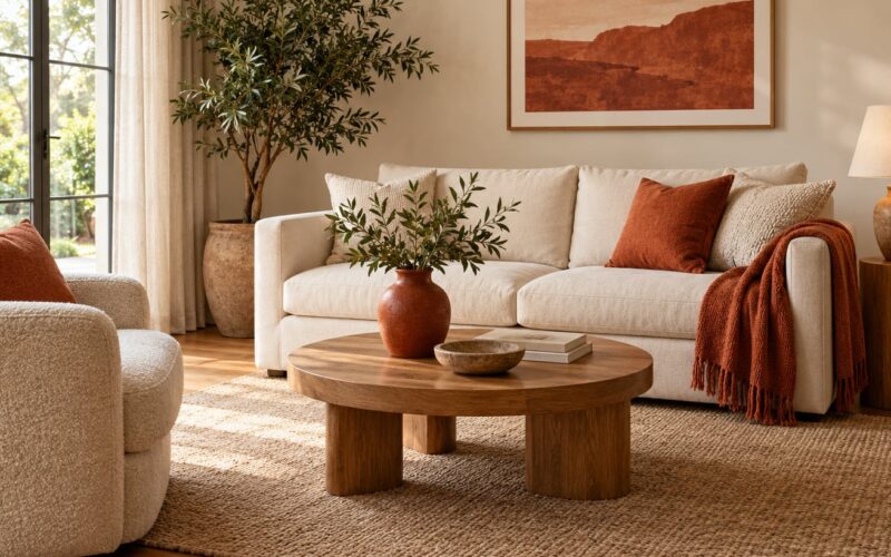
You want the room to pull people together, so warm neutrals work well as the base with one deeper accent. Try oatmeal walls, a sage or clay sofa, and rust or deep blue in the rug. If you are tempted by red walls, most people who try them end up keeping the red to a single wall or a piece of furniture and balancing it with blue or green elsewhere in the room, because a red-dominant space gets tiring after a few hours.
Bedroom: quiet and low stimulation
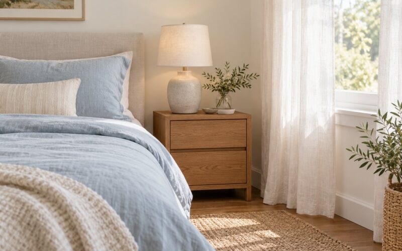
Desaturate everything here. Muted blue, soft sage, warm gray or a pale greige reads as restful because there’s less visual contrast competing at bedtime. Keep saturation low and skip the accent wall; your brain doesn’t need a focal point when it’s trying to wind down.
Kitchen: bright and appetite-friendly
Warm light colors lift a kitchen, and there’s a long-standing association between warm reds, oranges and yellows and food. Butter yellow cabinets with white counters, or soft sage uppers with warm wood lowers, both feel generous without shouting.
Bathroom: clean and spa-like
Go cool and light. Pale blue, soft aqua, seafoam or a clean warm white will make an ordinary bathroom feel like a retreat. Bathrooms have less furniture competing with the walls, so one saturated color on towels or a single wall can carry the whole scheme.
Home office: focused, not sleepy
Here’s where people overcorrect. Too much blue and it feels like waiting room. A soft blue or green on the wall behind your desk supports concentration, while a warm wood, brass lamp or terracotta accessory keeps energy up.
Entryway and hallway: decompression and welcome
Transition spaces are a good place for a saturated color, because nobody lives in them long enough to get tired of it. One coat of color in an entryway sets a tone for the whole home and makes a plain corridor feel deliberate.
Kids’ room: calm base, changeable color
Paint the walls in something restful and let the room’s personality come from things that get swapped out. Soft blue or pale sage walls with removable storage, a rug and bedding in a bright accent gives you a calm space now and an easy change later.
How to Use Color Psychology in Home Decor Without Repainting the Whole Room
Most of the psychological weight in a room sits in the things that move. If you’re a renter, or you just don’t want a two-week project, you can test a palette in an afternoon and undo it in five minutes.
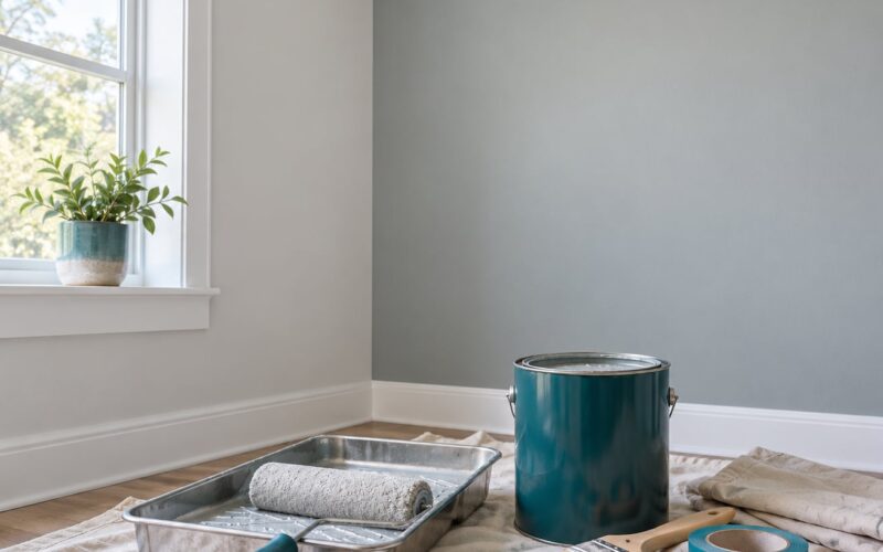
- Paint samples first. Buy sample pots of two or three candidates and paint onto roughly 2-foot boards, not the little stir stick. Move them around the room.
- Drape fabric. A duvet cover or a length of fabric over the sofa tells you more about a color in your room than a 2-inch stir stick ever will.
- Hang a large print. Buy one big piece of art in the color you’re considering. The size gives you an honest read on saturation.
- Swap small accessories. Cushions, throws, a vase and a rug in the target color, spread around rather than grouped.
- Change the bulbs first. Free, instant, and it changes how every color in the room reads. Try a 2700K warm bulb against a 4000K cool one before you blame the paint.
- Try removable panels. Peel-and-stick wall panels, temporary tile squares and tension-rod curtains give you a full surface to react to.
A five-step way to test color before you commit
- Decide the feeling first — calm, focused, welcoming, energized — and pick hues that serve it.
- Gather three or four swatches, not nine. More than that and you talk yourself out of a good choice.
- Look at them in the room in morning light, again in the afternoon, and again under your lamps at night.
- Live with the samples for two to three days. Fatigue tells you more than a first impression.
- Commit to one wall or one room first. You can extend later; you cannot easily unmake a whole house.
How Do You Choose a Color Palette That Works?
A palette that works has three roles: a dominant color, a supporting color and an accent. Roughly speaking, the dominant covers about two-thirds of what you see, the supporting fills another slice, and the accent appears in small doses.
The ratio rules, side by side
| Rule | What it means | When it’s useful |
|---|---|---|
| 60-30-10 | 60% dominant, 30% secondary, 10% accent | The best all-purpose ratio for a full room |
| 70-30 | 70% one color, 30% another | Small rooms where a third hue feels busy |
| 3-color rule | Three colors, no more | Whole-home schemes and rentals with limited budget |
| 3-5-7 rule | About 3 large, 5 medium, 7 small items per color | Layering a bedroom or living room with real objects |
| Monochromatic | One hue in many tints and shades | Low-risk rooms where you want calm and depth |
| Color blocking | Two contrasting colors in defined areas | Bolder rooms, or a way to divide an awkward alcove |
A monochromatic scheme is the most forgiving option. One hue in five or six values gives you visual interest without any risk of clash, and it’s easy to extend room to room.
Work from what you already have
Most people aren’t choosing from nothing. Floors, kitchen cabinets, appliances, a sofa you like and the hallway you have to walk through are already decided, and they’re the real constraints.
Start by reading the undertone in the wood. Oak is warm yellow, walnut is cooler and browner, and white cabinets can carry either a warm or a cool cast. Pull your accent from the same undertone family and the whole house starts to cohere. The classic version of this problem is gray walls next to a wood accent wall, and it only works once the two undertones agree.
Gray earned its reputation as the safe choice, and it’s still serviceable, but it can read dated when it’s the only thing in the room. Give it company: gray plus a deep green, gray plus rust, or gray plus natural wood grain.
What Color Combinations Create Specific Moods?
Proportion does most of the work. The same two colors in a different ratio feel like a different room entirely.
- Calm: a pale blue with warm white and light oak. Keep saturation low and let the coolest color occupy the smallest share, on the wall behind the bed or the headboard.
- Energized: mustard, terracotta and warm white. This pairing wakes up a north-facing room, which normally needs all the help it can get.
- Cozy: a warm beige base with burgundy or forest green accents and matte finishes. Matte surfaces absorb light and make a room feel softer; gloss does the opposite.
- Focused: soft white walls, a muted blue or green on the work wall, and warm wood. Avoid large areas of high-saturation color behind a desk.
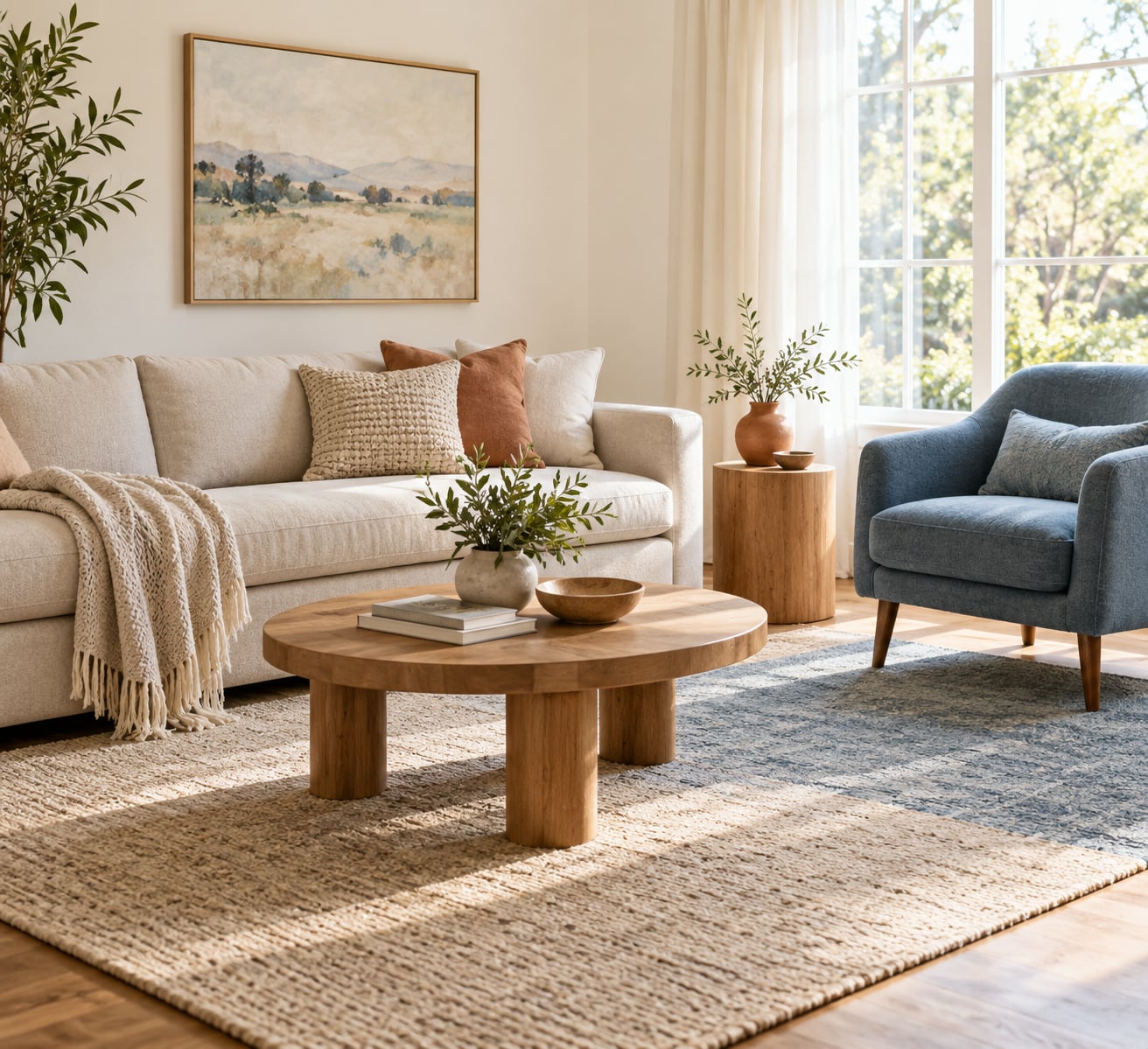
- Welcoming: cream with a dusty blue or terracotta and plenty of natural texture. Warmth comes as much from materials as from hue.
- Fresh: white and pale wood with one clear accent — a yellow, a green, a coral — used in a few deliberate places rather than everywhere.
One caution on greens and blues: use fewer of them than feels right in the moment. It’s the most common way a calm palette tips into cold.
How Can Lighting Change Color Psychology?
The same paint chip can be a different color at breakfast and at nine at night. Warm bulbs around 2700K pull yellows and oranges forward and deepen blues; cooler bulbs near 4000K make everything read crisper and slightly greener.
Daylight moves too. North-facing rooms get a cool, even wash all day, so warm creams sing there. South-facing rooms flood with yellow light most of the afternoon, which can make a warm neutral look flat or even greenish by evening.
Test your swatches in all three conditions: morning, afternoon, and with the lamps on. If a color only works at one hour, it won’t work for the room.
Common Color Psychology Mistakes to Avoid
Mistake 1: following the rules harder than your own reaction. Blue walls don’t make you calm if you hate them. Fix: treat the framework as a shortlist generator, then let taste decide.
Mistake 2: picking a color from a trend rather than the room. Colors picked for a season will date in a year. Fix: choose something you’d still be happy with if nobody else had ever seen it.
Mistake 3: too many competing accents. Four bold colors in a small room fight each other and the room reads as cluttered. Fix: pick one accent and repeat it in at least three places.
Mistake 4: deciding on a small swatch. A 2-inch dab tells you almost nothing about saturation in a large field. Fix: test on a board at least 2 feet wide.
Mistake 5: trying to fix a lighting problem with paint. A dim room painted pale will still be dim. Fix: fix the light first, then re-evaluate the color, because it will genuinely look different.
One more worth naming: the temptation to make the whole house decision in a single weekend. Color choices that feel overwhelming are usually overwhelming because they’re being made all at once. Pick one room, learn what works, then extend.
Frequently Asked Questions
What color makes a living room feel welcoming?
Warm neutrals with one deeper accent work best. A beige or oatmeal base, a sage or clay sofa, and rust, brick or deep blue in the rug and cushions reads as open and relaxed. Cool grey-blue can also feel welcoming when it’s warmed up with wood and natural texture, since hospitality comes from materials as much as hue. Test your choice at night, because a living room that only works in daylight is a living room that feels bare after dinner.
What color is calming for a bedroom or home office?
Desaturated blues and greens are the usual answer, but how you use them matters more than which one you pick. Keep the walls light, avoid a saturated accent wall, and add a warm material such as wood, wool or brass so the room settles without going cold. In an office, keep the cool colour on the wall behind the desk and let a warm lamp and wood surface carry the energy, since too much blue reads as sleepy.
Does color psychology mean I must follow strict color rules?
No. Treat it as a starting point, not a rulebook. The associations are real in general terms, but individual reactions are shaped by memory, culture and habit, so a color that calms most people might do the opposite for you. If a swatch makes you tense every time you walk past it, that reaction counts for more than any chart. Use the guidance to generate options, then keep only the ones you genuinely want to live with.
How do I choose decor colors that work with existing furniture?
Read the undertone before anything else. Oak pulls warm, walnut and grey sofas pull cool, and white cabinetry is usually warm or cool rather than truly neutral. Pull your accent from the same undertone family and the room starts to cohere on its own. If a piece is genuinely awkward, repeat its color once more in an accessory rather than fighting it, which is usually quicker and cheaper than reupholstering.
What is the best color scheme for a small room?
Light, low-saturation colors, with the lightest value on the ceiling and the wall you face most. That reflects daylight back and makes both dimensions read larger. Then put your darker, more saturated color on something small and movable, such as a rug, an armchair or a set of curtains. A two-color scheme at a 70-30 ratio is a safer bet than three colors in a space that cannot spread them out.
Can renters use color psychology without painting?
Easily, and most of the effect comes from things you can move. Drape a duvet cover or length of fabric over the sofa, hang one large print in the color you’re considering, and swap cushions, throws and a rug. For a bigger surface, use peel-and-stick wall panels or temporary adhesive tiles, and change the bulbs first since that is free and shifts how every other color reads. All of it comes down in minutes.
Conclusion
Start with the feeling, not the swatch. Decide what one room should do for you — calm you down, wake you up, make guests talk, make a small space feel bigger — then collect two or three colors that serve that job.
Test them on something you can undo: a board, a duvet cover, a big print. Look at them in the morning, in the afternoon and at night, live with them a few days, and then commit to a single wall. Once one room works the way you hoped, the rest of the house gets much easier.