To add color to a neutral room, start with textiles, art, and one large piece, match your chosen hue to the room’s undertone, and repeat that hue in at least three places at different heights. Layer in wood, metal, and greenery last. Most rooms come together in an afternoon with no tools and nothing you can’t undo.
That last part matters. The reason most people never start is not that color is hard, it’s that they’re afraid of doing too much. People buy a bold rug, hate it, and conclude that color isn’t for them. On decorating forums, one of the most common posts is titled roughly “tried adding color and now I hate it” — and the fix in almost every reply is the same. Add less, repeat more.
So here’s the order of operations. Work through it top to bottom and stop when the room looks like yours.
Table of Contents
- What You Need
- Step-by-Step
- Identify the Room’s Dominant Neutral
- Choose a Color Direction
- Test the Palette Before Buying
- Add Color at Several Scales
- Repeat Colors Throughout the Room
- Finish with a Final Balance Check
- Common Mistakes
- Frequently Asked Questions
- What is the 3-color rule in interior design?
- How many accent colors should a room have?
- What colors go with beige walls?
- What colors are replacing beige right now?
- How do I add color to a neutral room if I rent?
- Should I paint an accent wall or use accessories instead?
- Conclusion
What You Need
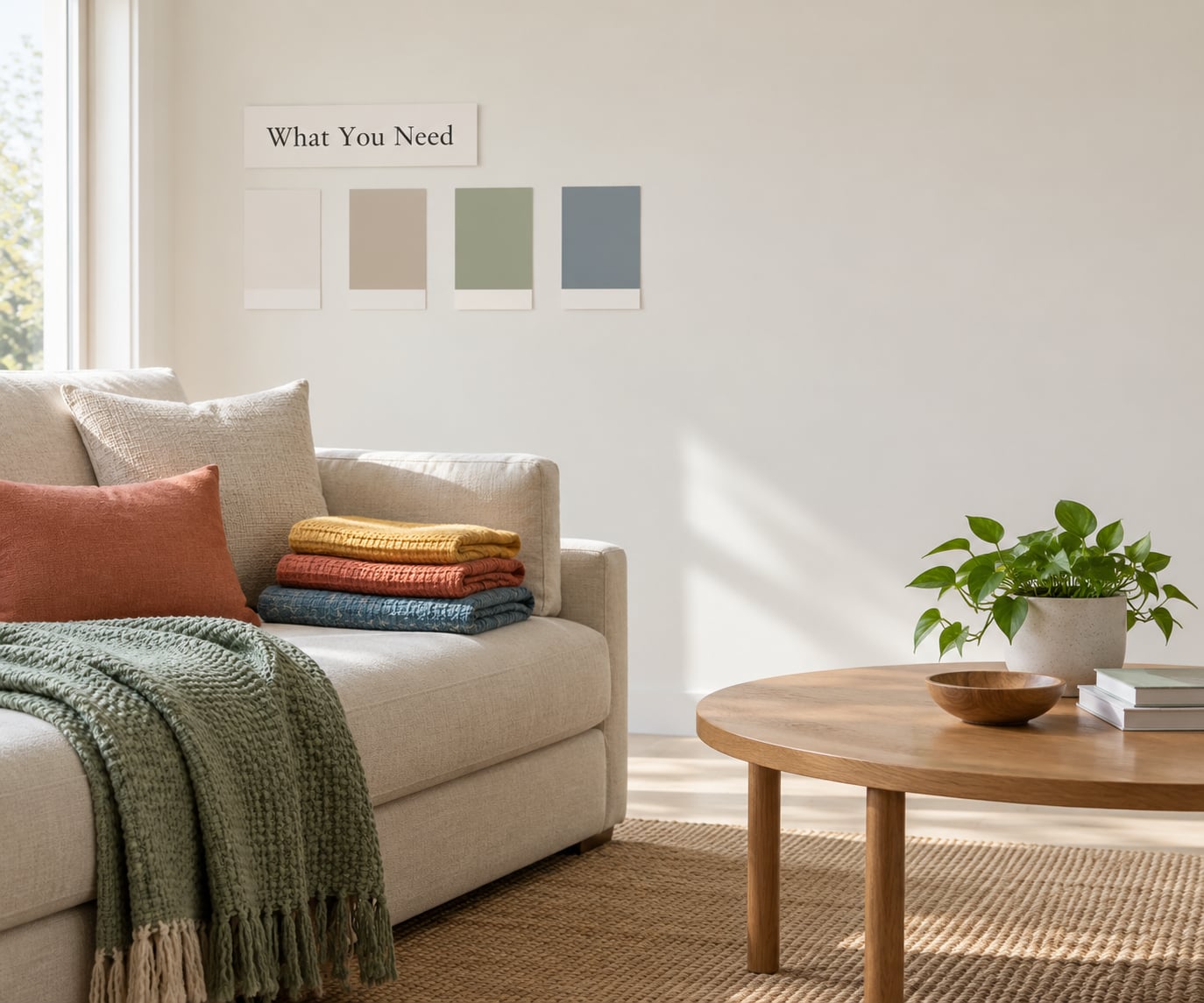
Almost nothing on this list is required. That’s the point. A neutral room is a blank surface, and the items below are just ways of testing ideas before you commit money to them.
- Paper or fabric swatches. Let you test a hue against your actual walls in real light. Takes minutes.
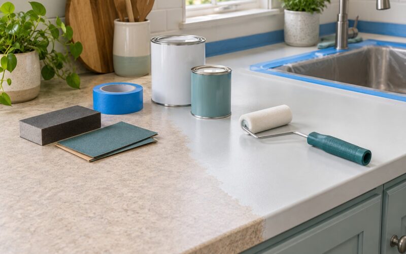
- Painter’s tape. Holds a swatch on the wall so you can live with it for a few days. Takes minutes.
- Removable wallpaper or peel-and-stick panels. A bold wall you can remove without primer or a landlord’s blessing. About an hour.
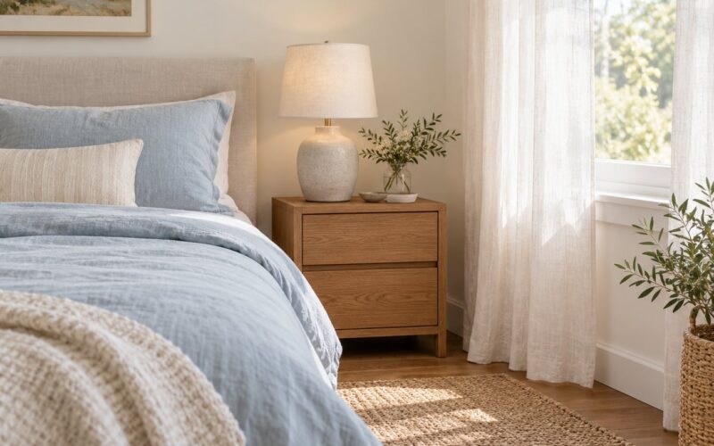
- Textiles you already own. Pillows, throws, and curtains are the fastest lever and the easiest to swap.
- One large rug. The single biggest color move in most neutral rooms, and the one people most often regret putting off.
- Artwork or a large print. Changes the perceived color of a whole wall without touching the wall.
- Live plants or cut branches. Color and movement with zero commitment.
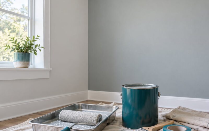
- Paint samples. Only if you own the room and are considering a wall change.
Renters, take note: everything above except the last item is removable. Nothing in this process requires a permanent wall change, and I’d argue you shouldn’t make one until the rest of the room already works.
Step-by-Step
Identify the Room’s Dominant Neutral
Every neutral leans warm or cool, and that lean decides which colors will look intentional and which will look like they wandered in from another house. Warm neutrals — beige, taupe, cream, oatmeal — have yellow, red, or golden notes. Cool neutrals — gray, greige with a blue cast, putty with a green cast — have blue or violet notes.
The test is free. Hold a plain white sheet of printer paper against the wall in daylight. If the wall looks creamy or yellow next to it, the room is warm. If it looks slightly blue or green-gray, the room is cool. Do this at more than one wall, because one room can hold two different lights, and a north-facing wall and a west-facing wall in the same space can read as two different neutrals.
This is the step people skip, and it’s the step that causes the immediate “something is wrong” reaction later. A cold white sofa in a warm beige room is a common expensive mistake, because the white pulls blue and the room splits into two temperatures. Once you know which way your room leans, you can pick colors that agree with it.
Choose a Color Direction
Pick one main color, one supporting color, and one contrasting accent. Three is the working number, and it’s a good rule for a reason — a fourth color is where rooms start to look accidental rather than chosen.
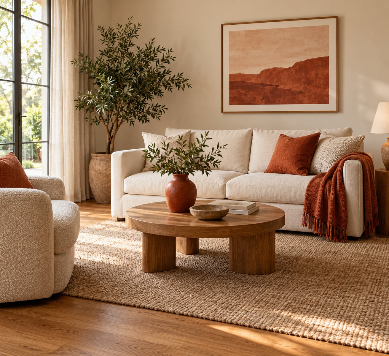
Two systems describe the same idea. The 3-color rule is main, supporting, accent. The 60-30-10 rule is proportion: about 60% of what you see is your existing neutral, 30% is a secondary tone, and 10% is the accent you’re actually trying to add. In a beige room, that might mean a rust throw, sage curtains, and a single navy vase.
Some directions that tend to hold together, mapped to the neutral underneath:
- Warm beige base: rust, terracotta, olive, marigold, deep teal, camel and cream.
- Cool gray base: steel blue, dusty blue, sage, plum, coral, charcoal.
- Creamy white base: anything. This is the one neutral with no real limit, so use the room’s wood tone and your lighting to decide.
- Wood-toned room: stay away from a second wood tone in the same family. Go for a saturated green, a deep blue, or black instead.
My favorite method is to pull the palette from an anchor piece you already own — a patterned rug, a painting, a curtain. Find the two or three strongest colors in it and treat those as your main, supporting, and accent. Your room is then coordinated by construction, and that anchor piece stops being a decision you have to live with forever.
Test the Palette Before Buying
Test before you buy, especially before you buy the big thing. Tape your swatches to the wall and look at them three times: mid-morning, late afternoon, and under lamps in the evening. Colors shift dramatically across a day, and a sage that looks perfect at noon can go gray and dusty at 8pm.
Also test two or three walls, not one. Paint and daylight are less consistent than people assume, and a swatch that disappears on one wall can still be wrong on the wall you actually see most.
Add Color at Several Scales
Color distributed across sizes reads as a decision. Color at one size reads as an object someone left there. So aim for one large element, several medium ones, and a few small ones.
Large usually means the area rug or the curtains, and those two do more for a neutral room than everything else combined. Medium is where a lot of the work happens: an accent chair, an ottoman, a side table, a headboard, a set of cabinetry. Small is the finish — a vase, a stack of books, a candle, a bowl on the coffee table.
If a room feels unfinished, the usual cause is that everything colorful is small. Two or three small objects scattered around read as clutter rather than color. One rug in a strong hue will change the perceived temperature of the entire room, and it’s the swap renters and homeowners mention most often as the highest-impact, lowest-risk change they made.
Repeat Colors Throughout the Room
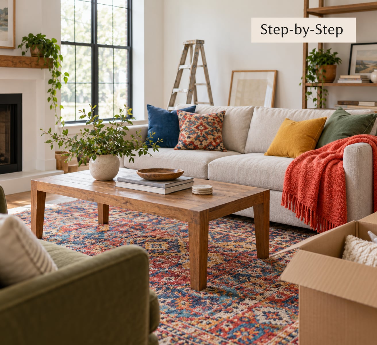
Now put your main color back into the room at least three times, at three different heights. A vase low on a console, art in the middle of the wall, a pillow on a chair up high — the eye reads those as a single deliberate choice, because they’re close enough in color to connect and far enough apart in space to look composed.
Repeat your chosen color at least three times, at different heights.
This is the rule decorators repeat most often in advice threads, and it’s the one most people have never been told. It’s also why a room with three matching throws and one matching artwork looks finished while a room with five different bright objects looks busy. Repetition is what makes inexpensive pieces read as a set.
Finish with a Final Balance Check
Stand in the doorway and look at the room. That’s the view that matters most, and it’s the one most people never check. Squint until you lose detail: the largest areas of color should still register, and no single hue should be taking over without you intending it to.
If one color has quietly taken over, move the largest piece of it rather than removing it. The rug is usually the culprit, and swapping it out or covering one end of it fixes the balance faster than anything else. Then take one photo and look at it tomorrow. Rooms that looked wrong at 6pm under artificial light often look entirely reasonable in daylight.
Common Mistakes
1. Adding four colors instead of repeating one. This is the most common failure, and it’s the one that produces the “I hate my room now” reaction. Four unrelated colors have no relationship, so the eye finds nothing to connect. Fix: pick the one color you like best, keep it, and either remove the others or bring them close enough to read as versions of the same idea.
2. Ignoring the undertone. A color that fights the room’s temperature will look wrong no matter how much you like it, and you won’t know why. Fix: the paper test, in daylight, before anything else.
3. Buying the big bold piece first. A saturated rug or a vividly upholstered sofa is the highest-risk decision in a neutral room, and the hardest to undo. Fix: test the color at small scale — a pillow, a sample board, a swatch — for at least a week before you commit to something large.
4. Changing five things at once. You learn nothing. Fix: change one thing, live with it a few days, then decide. This is slower and it works.
5. Going straight to a bold accent wall. An accent wall in a room that has no other color is a large, permanent, high-contrast move made before the easy ones. Fix: exhaust the reversible options first — art, textiles, a rug, removable panels — and treat the wall as a later decision.
On “what makes a home look cheap,” the answer is rarely a color. It’s color with no hierarchy: too many focal points, mismatched metals, a small accent doing a large accent’s job, or an all-neutral room that reads unfinished because nothing in it is ever darker than the walls.
If you’ve already overcorrected, work backward rather than starting over. Remove one object at a time, replacing it with something neutral, and live with each change for a day. Most over-colored rooms need two removals, not a redo. Then re-add your one chosen color in three places.
One more thing worth knowing: in a permanently neutral room, you can rotate the accent color seasonally. Swap the throw, the pillows, and a vase or two twice a year and the room reads refreshed without a single permanent change.
Frequently Asked Questions
What is the 3-color rule in interior design?
The 3-color rule says a room works best with one main color, one supporting color, and one accent color. The main dominates, the supporting adds depth, and the accent is the small amount of contrast the eye lands on. It pairs with the 60-30-10 proportion rule, where roughly 60 percent of the room is your dominant neutral, 30 percent is the secondary, and 10 percent is the accent. In a neutral room the 60 percent is already done for you.
How many accent colors should a room have?
Two or three is the working number for most rooms. One accent can feel thin in a large space, and four or more starts to look accidental because nothing in the room relates to anything else. The most common mistake is adding four unrelated colors rather than repeating one. Pick a main, add a supporting tone, and keep a single contrasting accent repeated in at least three places.
What colors go with beige walls?
With warm beige, reach for colors that share its golden or red undertone: rust, terracotta, olive, marigold, deep teal, and camel all sit comfortably against it. Cool blues can work too, but pick the softer, dustier versions rather than a bright primary. Hold a white sheet of paper against your wall in daylight first, and if the wall looks creamy, you have a warm room.
What colors are replacing beige right now?
Beige is not disappearing, but the flat all-beige look is giving way to rooms with more contrast built in: deeper warm woods, muddy or softened greens, and strong dark accents like charcoal and near-black used in small doses. The practical version for a neutral room is that you no longer need to lighten everything. Adding one dark element now reads as intentional in a way that another pale tone never will.
How do I add color to a neutral room if I rent?
Skip paint entirely. Area rugs, curtains, throw pillows, blankets, artwork, a colored accent chair, plants, and warm metal accessories change the color of a room completely and come out with you when you leave. If you want a bold wall, use peel-and-stick panels or removable wallpaper, and test a small section for a week before you commit to a whole wall. Rugs and curtains deliver the most color per effort.
Should I paint an accent wall or use accessories instead?
Accessories first, almost always. They are cheaper, reversible, and they tell you whether you like the color before you commit. If the room already has rugs, curtains, and art in colors you love, an accent wall adds real impact. If the room is empty of color, painting first means a large permanent decision made before you have tested anything. Paint a whole room a deeper neutral before you paint a single bold accent wall.
Conclusion
Adding color to a neutral room is a matching problem, not a decorating talent problem. Start by testing whether your neutral leans warm or cool, choose one main color with a single accent, and place that accent in at least three spots at different heights.
Do the reversible work first — rug, curtains, pillows, art, plants. Live with it a week before you touch a wall. That order costs you less, and it means every change after the first one is a decision rather than a guess.