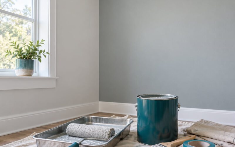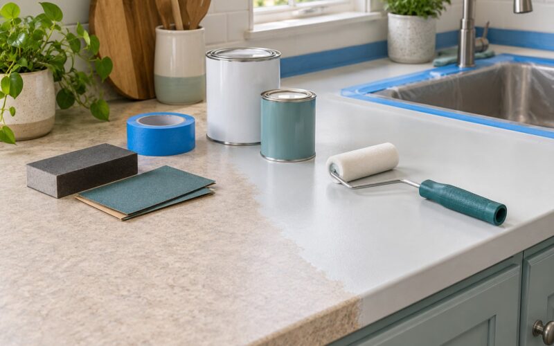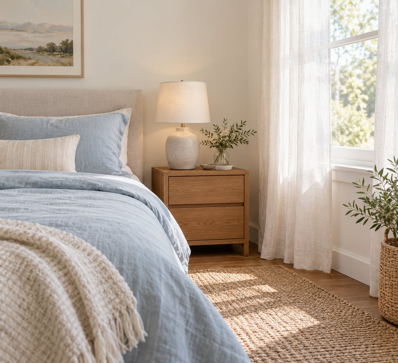
Muted blue, soft green, warm white, pale lavender, dusty pink, and low-contrast neutral palettes are generally the best places to start when you are picking a bedroom color. Short answer: cool-toned, desaturated shades tend to read as restful, and the light in your room decides which one wins.
That is the version most paint aisles hand you. The useful version is narrower. A bedroom wall is a large, constantly visible surface, so a color that feels lovely for an afternoon can turn grating by 11 p.m. when you are trying to wind down.
This guide breaks the question into ten palettes, explains what actually makes a color calming, and walks through how to test a shade before you commit a gallon to it. No trend list, just the colors that hold up at night and the rooms they work in best.
Table of Contents
- What Colors Make a Bedroom Restful?
- Why Do Some Bedroom Colors Feel More Relaxing?
- 10 Restful Bedroom Color Palettes to Try
- 10. Soft Blue and Cloud White
- 9. Sage Green and Warm Linen
- 8. Dusty Rose and Soft Cream
- 7. Pale Lavender and Pearl Gray
- 6. Warm White and Greige
- 5. Deep Blue and Soft Gray
- 4. Muted Terracotta and Sand
- 3. Pale Yellow and Light Natural Tones
- 2. Soft Black, White and Natural Wood
- 1. Your Lowest-Contrast Favorite Colors
- How Do I Choose a Restful Bedroom Color for My Room?
- What Color Combinations Should You Avoid in a Bedroom?
- How Can Lighting and Textiles Change the Feeling of a Bedroom Color?
- Frequently Asked Questions
- What is a restful color for a bedroom?
- What color is not ideal for a bedroom?
- What are the top 3 bedroom colors for sleep?
- What is the best bedroom color for a small room?
- How do I match a bedroom wall color to bedding I already own?
- Can renters test a paint color without painting a whole room?
What Colors Make a Bedroom Restful?
What colors make a bedroom restful? Muted blue, soft sage and gray-green, warm white, cream and beige, pale lavender, dusty rose, and any low-contrast neutral scheme. All of them share three traits: low saturation, modest contrast against the ceiling and trim, and a brightness high enough to bounce light around the room.
| Color | Why it feels restful | Best shade to pick | Shade to steer away from |
|---|---|---|---|
| Soft blue | Reads as calm and unhurried; associated with sky and water | Powder blue, mist blue, blue-gray | Bright sky blue, cobalt |
| Sage and gray-green | Natural association, easy to live with, warms up cool rooms | Muted sage, olive-gray | Kelly green, emerald |
| Warm white | Maximum light bounce without the glare of stark white | Warm white, soft ivory, linen | Bright optic white, stark white |
| Cream and beige | Warm, enveloping, hides dust and wear well | Oatmeal, sand, pale taupe | Yellow-leaning beige, tan |
| Greige | Neutral bridge between gray and beige; quiet background | Warm greige, mushroom gray | Blue-leaning cool gray |
| Pale lavender | Softly floral and soothing when kept desaturated | Grayed lavender, soft lilac | Vivid violet, electric purple |
| Dusty rose | Warm and comforting without the energy of pink | Blush, clay rose, faded pink | Hot pink, fuchsia |
| Deep blue | Absorbs light and creates a cocoon effect | Slate blue, muted navy | Black-blue, inky shades |
| Muted terracotta | Earthy and grounded; suits warm bedding | Faded clay, soft brick | Bright orange-red, rust |
| Pale yellow | Cheerful lift that still reads light and open | Buttery yellow, cream-yellow | Mustard, deep gold |
Why Do Some Bedroom Colors Feel More Relaxing?
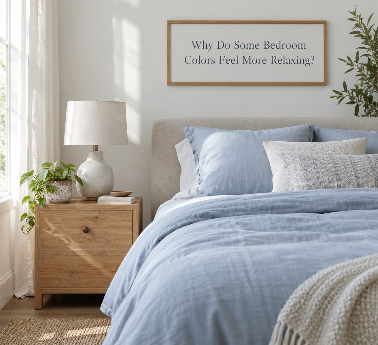
Three things matter more than the hue name on the label: contrast, saturation, and brightness. A pale blue sitting next to bright white trim and a black metal bed frame can read busier than a mid-tone green in a room where everything else is soft.
Color psychology research points the same direction. Studies on color-emotion associations, including work by Jonauskaite and colleagues, find that people reliably link darker, more saturated colors with heavier emotions and lighter, muted ones with lighter ones. Palmer and Schloss have argued that much of this is learned from our environment, which is why a light blue wall reads as calm to almost everyone and a light green one splits opinion.
There is a physical story too. Cool colors sit at the shorter, blue end of the visible light spectrum, while red and orange sit at the longer end. Warm tones at high intensity tend to raise alertness, and a bedroom painted in those tones is doing the opposite of what you want at bedtime.
The part people forget is that the wall is only one surface. Flooring, curtains, bedding, rug, and art all sit in the same visual field, and contrast between them is what the eye actually reacts to. A calm scheme is usually calm in the relationships, not in one color.
10 Restful Bedroom Color Palettes to Try
These are palettes rather than single colors, because a single swatch rarely tells you how a room will feel. The table gives you the quick read; the notes below cover the details that decide it in your house.
| Palette | Main colors | Best room conditions | Decorating role |
|---|---|---|---|
| Soft blue and cloud white | Powder blue, mist blue, cloud white | Warm, sunny, south- or west-facing | Whole-room scheme |
| Sage green and warm linen | Muted sage, oatmeal, light natural tones | North-facing or cool rooms | Whole-room scheme |
| Dusty rose and soft cream | Clay rose, cream, pale taupe | Any exposure; softens cold rooms | Whole-room or accent wall |
| Pale lavender and pearl gray | Grayed lavender, pearl gray, white | Bright, airy rooms | Accent or single wall |
| Warm white and greige | Warm white, greige, pale taupe | Low light, rentals, first paints | Whole-room neutral base |
| Deep blue and soft gray | Slate blue, dove gray, white bedding | Bedrooms with a lot of light | Headboard wall or alcove |
| Muted terracotta and sand | Faded clay, sand, warm beige | Rooms with warm wood floors | One wall plus textiles |
| Pale yellow and light oak | Buttery yellow, cream, light oak | Dark or basement bedrooms | Whole-room or one wall |
| Soft black, white and wood | Charcoal accents, white, natural oak | Larger rooms with good light | Furniture and trim accents |
| Your lowest-contrast favorites | Two or three adjacent muted shades | Any room, any exposure | Whatever you already love |
10. Soft Blue and Cloud White
Blue is the color most people guess first, and the guess is usually right. It is the hue most consistently linked with calm, and low-saturation versions avoid the nursery read that people worry about with light blue.
Keep it powdery rather than pastel-bright, and pair it with cloud white trim and off-white bedding. In a warm, sunny room a blue-gray works better than a true blue, which can look cold under warm light. In a cooler room, a mist or pale blue needs warmth from textiles: oatmeal linen, a natural wood nightstand, a tan rug.
If you already own white bedroom furniture, blue walls are an easy pairing. White goes with every blue, and you can shift the accent color later without repainting.
9. Sage Green and Warm Linen
Green reads as natural and low-effort, and the muted versions of it have been the most reliable bedroom color in use for a few years now. Sage is the safe middle: desaturated, slightly gray, never loud.
What to watch is the undertone. Yellow-leaning sage is cheerful and pairs with white and light oak. Blue-leaning gray-green is moodier and wants cream, walnut, and brass instead. Those two greens do not sit well in the same room.
On the coordinating side, natural wood finishes are the whole trick. Oak, ash, and light beech all work with a sage wall. Avoid cool gray-toned wood, which fights the warmth of the green.
8. Dusty Rose and Soft Cream
Pink gets dismissed and then sold constantly, because a low-saturation version is genuinely warm and comforting. The difference between restful and energetic is entirely in how much gray is mixed in.
Blush, clay rose, and faded pink all read as soft. Anything with a clear pink cast and high saturation starts competing with the bedding and the art. Pair rose walls with cream bedding and one deeper accent, maybe a rust pillow or a dark walnut frame, so the eye has somewhere to rest.
If the room is already full of warm wood and beige furniture, a rose wall ties it together better than another neutral would.
7. Pale Lavender and Pearl Gray
Lavender works as an accent far more often than it works as a full-room color. Used on one wall behind the bed, or on the headboard wall, it adds a soft floral note without turning the room into a boutique.
Keep it grayed. A lavender mixed with a little gray behaves like a cool neutral; a lavender mixed with more pigment starts reading sweet. Pearl gray and soft white keep it in check, and warm wood on the nightstands offsets the coolness.
This one works in both modern and traditional rooms. In a traditional space, pair it with cream trim and a muted taupe; in a modern one, let it run with concrete-look accessories and a single black line.
6. Warm White and Greige
Warm white is the most underrated restful color and the one that makes a small room feel bigger. It bounces more light than any other option and never turns cold, because the yellow and pink undertones cancel out the blue that reads as clinical.
The risk is blandness, and the fix is texture and contrast rather than color. Add a linen headboard, a chunky wool throw, a woven rug, and one or two darker objects so the room has a focal point. Wood floors or a wood-tone plank look will do more for a warm white room than a second coat of color.
Greige is the same idea with a bit more body. It hides scuffs, works with almost any bedding, and suits anyone who is not ready to commit to a color family.
5. Deep Blue and Soft Gray
Some people want the opposite of airy: a bedroom that wraps around them. Deep blue on the wall behind the bed does that better than any other paint color, and it works in rooms that get strong daylight.
The trick is proportion. One wall of slate blue, with the rest in soft gray or warm white, keeps it from becoming a cave. Light-colored bedding, a reflective mirror, and a metal or glass lamp base bounce light back into the room.
In a room with one window and no artificial light, skip this one and use a muted blue instead.
4. Muted Terracotta and Sand
Warm bedrooms are usually an afterthought in color articles, which is a shame, because the earth tones are among the most restful options available. Faded clay, soft brick, and sand read as grounded and enveloping rather than stimulating.
Use the strongest shade on one surface only. A terracotta headboard wall, a painted wardrobe, or a few cushions is enough; full-room terracotta in a small space closes in fast. Sand and warm beige on the other walls let it breathe.
This is also the easiest palette if your floor is already warm wood. Match the undertone to the floor and the room will look considered without effort.
3. Pale Yellow and Light Natural Tones
A dark bedroom often needs light more than it needs calm. Buttery yellow with cream walls and light oak is one of the few schemes that makes a basement room look bigger while still feeling gentle.
Muted or deeper yellows are harder. Mustard and gold lean energetic at night, which is the opposite of the goal. If you love a strong yellow, paint it on the inside of a wardrobe or a small alcove rather than the wall behind the bed.
Pale yellow also does useful work in a gray room. It warms up cool light and balances a cool-toned scheme without adding another shade of gray.
2. Soft Black, White and Natural Wood
Some calm comes from simplicity rather than softness. A bedroom in white and natural wood with a few matte black accents reads as ordered and quiet, and it suits anyone who finds pastel rooms infantilizing.
Black works as a line, not a field. Bed frames, curtain rods, lamp bases, and picture frames give a room structure while leaving the walls light. Full black walls make most bedrooms feel smaller and heavier, and they absorb the light that keeps a bedroom usable in the evening.
Warm the whole scheme with wood, linen, and a warm bulb. Without those, black and white can turn cold and institutional fast.
1. Your Lowest-Contrast Favorite Colors
The most restful room in any house tends to belong to the person who painted it a color they actually like. Preference is real data, and it beats a color theory rule that says blue is better.
Build a palette from the colors you already own. Pick two or three that sit next to each other on the color wheel and are close in lightness, then use them in the same ratio on walls, bedding, and textiles. A warm terracotta throws, an oatmeal duvet, and cream walls are a complete bedroom scheme built almost entirely from things in a closet.
Keep contrast low, and let texture do the interesting work. Linen, wool, wicker, and unfinished wood add depth without adding visual noise, and they are the cheapest way to make a simple palette look finished.
How Do I Choose a Restful Bedroom Color for My Room?
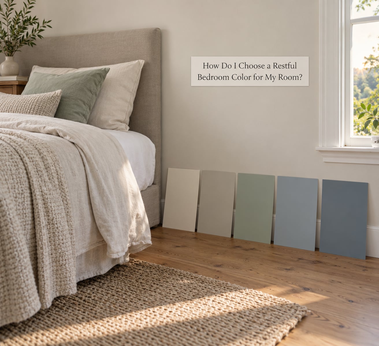
Test before you buy. Paint chips on a card look nothing like a wall in a room, and a color that flatters you at noon can turn gray by 8 p.m.
Get large samples rather than chips. Most paint stores will sell a quarter-size or larger board, and it is worth the trip. Tape one up where the wall will be, not in a corner, and leave it there for a full day and night.
Look at it three times: early morning, midday, and after dark with your normal lamps on. The third look is the one that decides it, because that is when the room is actually used. Fluorescent bulbs at 4000K or higher will make almost any warm color look gray, so test under your own bulbs.
Next, put the sample against your real things. Hold it near the bedding, the curtains, the floor, and the furniture. Most disappointing paint jobs come down to an undertone that quietly disagrees with warm oak floors or a yellow-ish duvet, not a bad color choice.
Finally, ask about the light reflectance value. A higher LRV means more light comes back into the room, which helps small or dim spaces feel open. Anything in the region of 60 to 80 is a reasonable target for a bedroom that needs to feel airy.
If you rent, there is no need to paint a whole room. A painted headboard wall in a peel-and-stick or sample-size format, a large art canvas, or a fabric drop behind the bed does the same job for a fraction of the commitment.
What Color Combinations Should You Avoid in a Bedroom?
Avoid high-contrast pairings rather than entire hue families. A bright red wall next to crisp white trim is a lot of visual information at once, and at 10 p.m. it is still doing that.
The combinations that most often make a bedroom feel restless are cool gray next to yellow-beige, because the undertones cancel each other and the room looks slightly ill; pure white trim against a warm off-white wall, which makes the trim look blue and grubby; and any pairing where the wall, bedding, rug, and curtains are all different depths of the same color.
Bold colors are not the problem. A deep green or burgundy wall in a room full of white bedding can be exactly the cocoon effect someone wanted. The fix is always the same: pick one bold surface, keep the rest low-contrast, and let it get darker toward bedtime rather than lighter.
What does tend to keep people up is scattered color. Three or four competing accent colors with no clear focal point make the eye keep moving. Pick one accent hue and repeat it.
How Can Lighting and Textiles Change the Feeling of a Bedroom Color?
The same paint reads differently at 8 p.m. than at noon, mostly because of the light. Warm bulbs in the 2200 to 2700K range make blues and grays feel softer and more beige, while cool daylight bulbs push warm whites toward yellow and make cool colors look flatter.
North-facing rooms get steady cool light all day and can wash out warm colors, which is why they suit gray-greens and blues. South- and west-facing rooms get strong warm light that flatters cream and clay tones but can make a yellow wall glow.
Textiles carry more color than most people expect. Curtains that reach the floor add the wall color’s height and vertical line, and heavy lined drapes in a muted neutral will make any paint look softer. Bedding follows the same rule: a duvet in a solid muted tone does more to calm a room than a patterned comforter.
Paint sheen matters too. Flat and matte finishes scatter light and look softer, which suits a bedroom. Eggshell reflects a bit more and shows less scuff, which matters in a kids room or a room with a lot of contact.
Frequently Asked Questions
What is a restful color for a bedroom?
A restful color is a muted, low-contrast shade that does not demand attention, usually with a mid-to-high lightness. Muted blue, sage green, warm white, cream, greige, pale lavender and dusty rose all qualify. Color-emotion research consistently links lighter, desaturated colors with calmer feelings, so aim for a shade that reads as soft on your wall rather than bold on a paint chip.
What color is not ideal for a bedroom?
Bright and heavily saturated colors tend to be the least restful: vivid red, orange, strong yellow, cobalt and hot pink. Deep black and dark brown can make a bedroom feel heavy and smaller. That said, none of them are banned. Use them on one surface only, such as a headboard wall, and keep bedding and textiles in muted neutrals so the room stays calm.
What are the top 3 bedroom colors for sleep?
Muted blue, soft sage green, and warm white or greige are the three most reliable picks. Blue is the color most often linked with calm in sleep research, green adds a natural association and works in cool rooms, and warm white bounces the most light while staying comfortable at night. Which one wins depends on your room’s light and the bedding you already own.
What is the best bedroom color for a small room?
A light, low-saturation color with a high light reflectance value will make a small bedroom feel more open. Warm white, soft cream, pale sage, and light greige all work, along with white or off-white trim to keep lines crisp. Avoid deep blue, black, and dark brown on all four walls, and let bold colors live on a single accent wall instead.
How do I match a bedroom wall color to bedding I already own?
Pull the wall color from the bedding instead of the other way round. Look at the comforter in daylight, decide whether it leans warm or cool, and pick a wall shade in the same family one or two steps lighter. Then check the undertone against your floor and curtains, because those two usually decide whether a scheme looks intentional.
Can renters test a paint color without painting a whole room?
Yes. Most paint stores sell large sample boards that you can tape to the wall and live with for a day and a night, which is the cheapest and most reliable test. For a bigger idea, paint a single wall in a rental-friendly peel-and-stick product, or use a large canvas and fabric drop behind the bed to judge the color at scale.
Start with one of the ten palettes and tape up a large sample of it tonight. Look at it in the morning and again under your own lamps after dark, and match it to the bedding and floor you already have before you buy anything.