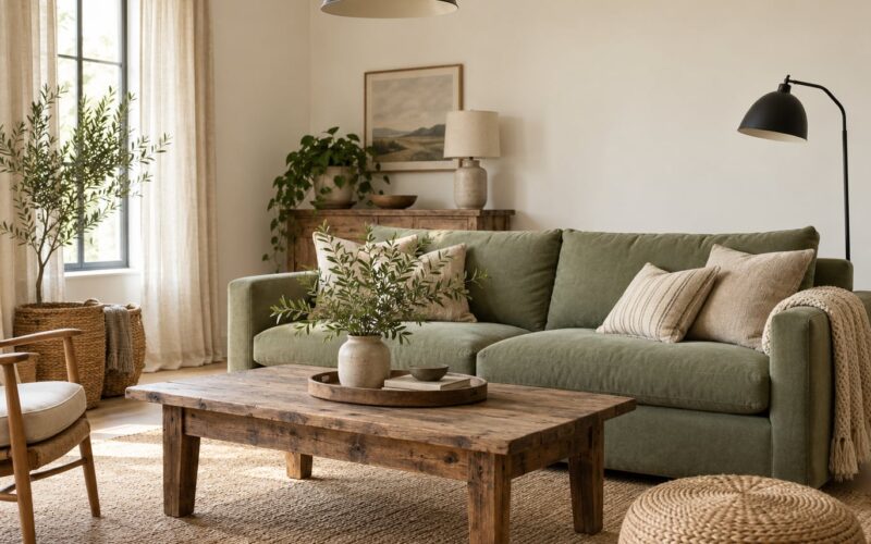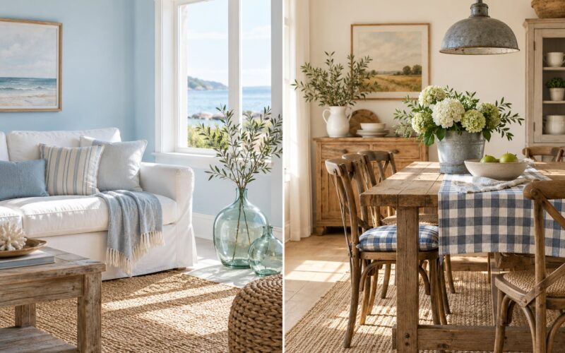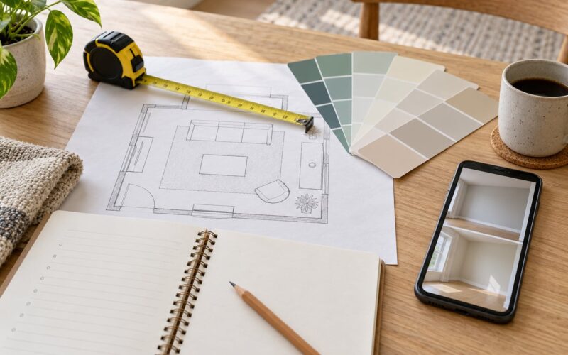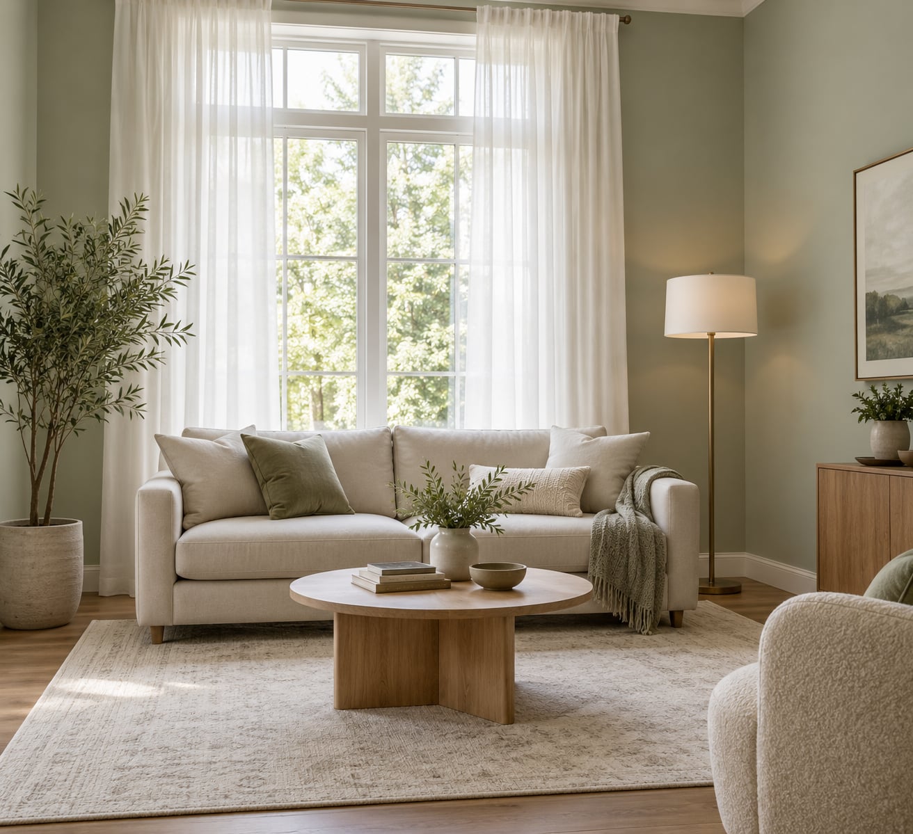
Most small rooms are not actually small. They are arranged so the eye hits a crowded outline instead of open floor, and that is what makes a space feel tight. The decorating mistakes that make rooms look smaller almost always come down to four things: scale, light, color and how the furniture flows, and every one of them can be corrected in a weekend without moving a wall.
This guide is written for people who rent, own a condo, or just have one awkward room that never seems to open up. There are no products to buy and no renovation to plan. You measure, you shift a few things, and the room changes.
Table of Contents
- Decorating Mistakes That Make Rooms Look Smaller at a Glance
- 1. Using Furniture That Is Too Large for the Room
- Why an oversized sofa swallows a small room
- Test scale on the floor before you buy
- 2. Blocking Windows with Heavy Furnishings
- 3. Choosing Furniture in Very Dark or Heavy Colors
- 4. Ignoring the Scale of the Area Rug
- 5. Packing Every Surface with Small Decorations
- 6. Using Too Many Different Patterns at Once
- 7. Hanging Curtains Too Low and Too Narrow
- 8. Choosing Paint and Wall Colors That Flatten the Room
- 9. Making the Ceiling Feel Lower with Dark Elements
- 10. Arranging Furniture Against Every Wall
- 11. Skipping Layered Lighting
- 12. Ignoring the Visual Line from the Entryway
- Frequently Asked Questions
- How do I make a small room feel bigger?
- How do I make my room look smaller on purpose?
- What is the 3-5-7 rule in decorating?
- What makes a home look tacky?
- Should furniture go against the wall?
- What color makes a small room look bigger?
- Conclusion
Decorating Mistakes That Make Rooms Look Smaller at a Glance
Here is the whole list in one table. The last column is the number to actually measure, because vague advice is what keeps people stuck.
| Mistake | Why it shrinks the room | The fix | The spec |
|---|---|---|---|
| Oversized furniture | Consumes the floor the eye uses to judge depth | Scale down or use a slim profile | Sofa at about two-thirds of the wall |
| Blocking windows | Kills the one thing that makes a room feel deep | Move tall pieces to a blank wall | Keep the window wall clear to the trim |
| Big dark pieces | Absorbs light and reads as a hole in the room | Lighter upholstery, pale legs, one dark anchor | Light color on the largest surface |
| Wrong rug size | Breaks the seating group into floating islands | Buy bigger, or lay it longways | Front legs of seating on the rug |
| Cluttered surfaces | Removes negative space, the eye stops travelling | Empty half of every surface | Three objects per surface, varied in height |
| Too many patterns | Nothing wins, so the eye reads noise | One pattern, one quiet partner | Repeat one color across both |
| Short, narrow curtains | Frames the window tightly and drops the ceiling line | Hang high and run past the trim | Rod 6 to 8 inches beyond trim each side |
| Dark or flat walls | Makes the boundary of the room feel close | Light, coordinated wall color | Same family as the trim and floor |
| Heavy ceiling elements | Visually lowers an already low ceiling | Ceiling color matched to the walls, slim fixtures | Ceiling painted the wall color |
| All furniture on walls | Empty center, crowded perimeter | Float a piece or two and group conversationally | 2 to 3 inches off the wall, walkway 26 to 36 inches |
| One overhead light | Throws shadows into every corner | Add two or three sources on dimmers | Three light sources per room |
| Crowded entry sightline | The first view into the room is blocked | Clear a focal path in, then to the far wall | One focal point visible on entry |
1. Using Furniture That Is Too Large for the Room
An oversized sofa does not just take up space, it takes up the space the eye measures the room by. When one piece fills most of a wall, the remaining floor looks like leftover rather than breathing room.
Why an oversized sofa swallows a small room
Think about what you see when you walk in: a wall of upholstery, a strip of floor in front of it, and no depth. A sectional in a 10 by 12 room does that faster than anything else.
The fix is scale, not sacrifice. A loveseat in the same spot can read as a roomy sitting area with a conversation zone around it. If you love the big sofa, drop the coffee table and use a nesting pair, or drop to an ottoman that tucks under when guests leave.
Test scale on the floor before you buy
Tape the footprint of the piece on the floor with painter’s tape and live with it for a day. People do this in renter forums constantly, and it is the cheapest scale test there is. Walk around it at standing height, and sit in the taped square.
Here is the cheat sheet I keep coming back to. These numbers work in almost any rectangular room.
| Element | Working measurement |
|---|---|
| Sofa length | About two-thirds of the wall it sits against |
| Walkway clearance | 26 to 36 inches |
| Sofa to coffee table | 8 to 18 inches |
| Space between chairs | 4 to 12 inches |
| Area rug | Front legs of the seating rest on it |
| Curtain rod width | 6 to 8 inches past the trim on each side |
| Artwork above a sofa | Bottom edge 6 to 8 inches above the back |
| Furniture off the wall | 2 to 3 inches, enough to see floor beneath |
2. Blocking Windows with Heavy Furnishings
A window is the cheapest depth device in any room, because daylight reads as distance. Put a tall bookcase or an oversized cabinet in front of one and you trade that depth for a flat wall.
Move tall pieces to an interior wall and give the window wall to something low: a slim console, a small armchair, or nothing at all. Even a wide but short piece keeps the light moving through.
On a renter budget, the same principle applies to what you hang. Anything dark and heavy on the window trim chops the opening in half visually. Light, sheer panels or a slim blind leave the glass visible.
3. Choosing Furniture in Very Dark or Heavy Colors
Dark, matte upholstery in a dim room behaves like a hole. The eye reads it as depth in the wrong direction, a recess where a room should be.
This one is genuinely debated, so be honest with yourself about your light. In a bright south-facing room, one substantial dark piece reads as an anchor and looks great. In a north-facing or basement room, the same piece turns the whole space into a cave.
The compromise most decorators land on: keep dark color for one medium-sized anchor, and put your lightest color on the largest surface. Swap the sofa’s legs for pale wood and the piece instantly gets taller and lighter too.
4. Ignoring the Scale of the Area Rug
A rug that is too small is the most common scale error I see, and the fastest one to fix. If only the front feet of the sofa and chair touch it, the rug reads as a mat on the floor rather than a room within the room.
The fix is size. In a small living room, buy the rug you want and then buy one size up. A 5 by 8 works for a tight seating group where a 4 by 6 would float uselessly in the middle.
In a long, narrow room, lay the rug parallel to the longest wall instead of across it. That one orientation change widens the room more than most people expect. Stretchers under a slightly small rug are an option if the size itself is wrong, though they never beat buying bigger.
5. Packing Every Surface with Small Decorations
Visual clutter does something specific: it stops the eye. When every surface is occupied, the gaze has nowhere to travel, and a room with plenty of floor reads as packed.
Empty half of each surface and the room gains measurable space. I like a limit of three objects per surface, with at least one of them taller than the others so the eye moves up.
This is not about stripping personality. Collectors can declutter by moving a third of a collection to a shelf, a cabinet, or out of the room entirely, and the visible part looks better for the editing. Empty space is not wasted space; it is what lets the room read as a room.
6. Using Too Many Different Patterns at Once
A striped sofa, a floral rug, a checked throw and a patterned curtain give the eye four things to resolve at once. Nothing becomes the focal point, so the whole space flattens into noise and reads smaller.
Pick one pattern as the voice and let everything else be quiet. A patterned rug can work with plain curtains and solid cushions, especially if you repeat one color from the rug in each of the solid pieces.
Two patterns can coexist if they share a color and are separated by scale. A fine stripe beside a large floral looks intentional; the same two at similar scale looks like a mistake.
7. Hanging Curtains Too Low and Too Narrow
Curtains hung just above the window and stopping at the sill box the window in, which makes the wall look shorter and the room tighter. Hanging them high and running the panel well past the trim does the opposite: the eye travels upward and outward.
The rod should sit 6 to 8 inches beyond the window trim on each side, and higher than the window casing, ideally within a foot of it. Then let the panels reach the floor, or puddle slightly in a formal room.
Curtain width matters as much as height. A panel that is bunched to one side leaves gaps of bare wall that chop the opening into pieces. Double the width of the window is a reasonable minimum, and light color or sheer fabric keeps the light coming through.
8. Choosing Paint and Wall Colors That Flatten the Room
Wall color sets the emotional range of the room before you put anything in it. Very dark, heavily contrasted treatments make the wall boundary feel pronounced, and your eye stops at it rather than traveling past.
Lighter does not have to mean white. A soft warm gray, a muted sage, a dusty blue or a pale clay all reflect more light than a flat dark shade while still reading as a color. Many people paint the ceiling and walls the same color, and the room gains height for free.
One rule of thumb: keep the wall color in the same family as the floor and trim. When everything relates, the room reads as one continuous volume. When three different tones fight, the corners start looking like edges.
9. Making the Ceiling Feel Lower with Dark Elements
Low ceilings are fixed, but the sense of a low ceiling is not. A white ceiling with dark walls and a heavy dark fixture lowers a room far more than a plain 8 foot ceiling does.
The easiest fix costs one gallon of paint: take the ceiling color down to the wall color. The eye stops reading a hard line where the wall meets the ceiling, and the surface appears to continue.
Then swap bulky overhead fixtures for slim pendant lights or a flush mount, and add something tall and light on the floor, like a floor lamp, a narrow mirror, or a plant in a pale pot. A vertical element draws the eye up and borrows height.
10. Arranging Furniture Against Every Wall
This is the layout mistake that shows up in almost every small-room complaint I have read. Push everything to the perimeter and you get a crowded border around an empty center, which reads as awkward rather than generous.
Pull one piece 2 to 3 inches off the wall and, if it fits, angle it slightly. That small change makes it read as a grouping instead of an object on display, and the floor line underneath becomes visible, which is what actually creates the sense of depth.
Float a sofa in the room if it works, or set two chairs near each other at an angle rather than splitting them across the space. Group pieces into conversation zones and leave a genuine walkway of 26 to 36 inches. Empty floor you can move through is more valuable than a symmetric arrangement.
11. Skipping Layered Lighting
A single ceiling light is the reason so many small rooms feel closed after dark. One overhead source throws shadows into every corner, and corners that stay dark make the walls read as closer together than they are.
Three sources is the working minimum: an overhead for general light, a floor or table lamp for a warm pool of light, and something low like a small lamp on a shelf. Put them on dimmers if you can, and the room transforms at dusk.
Light colored lampshades, a glass table, or a pale rug all bounce what you have around the room. In a room with no window, a large mirror on one wall aimed to catch the light from another buys you the effect of a second window.
12. Ignoring the Visual Line from the Entryway
The first view into a room sets its size more than any other single moment. Entering and meeting a bulky console table, a tall cabinet, or a wall of small framed things tells you immediately that the space is tight.
Clear a path from the door to the far wall and put one focal point at the end of it: a mirror, a piece of art, a lamp, a view out a window. One clear destination gives the eye something to travel toward, and depth is exactly that, something to travel.
This also solves the awkward corner problem. A small entry nook with a slim bench and a single mirror reads as a designed moment instead of a catch-all, and it costs nothing but an edit.
Frequently Asked Questions
How do I make a small room feel bigger?
Start with scale and light. Keep the largest furniture piece at about two-thirds of its wall, add two or three light sources instead of one overhead, hang curtains 6 to 8 inches past the window trim and near the ceiling, and clear half of every surface. Then float one piece off the wall by 2 to 3 inches so the floor line shows underneath. These changes alter perception, which is the part you control.
How do I make my room look smaller on purpose?
Push every piece of furniture against the walls, drop the ceiling an inch or two visually with a dark paint color, hang short curtains that stop at the sill, choose one very dark tone for the walls and floor, and fill every surface with objects of similar height. A rug smaller than the furniture group and a single overhead light will finish the effect.
What is the 3-5-7 rule in decorating?
It is a grouping guideline, not a law: place three objects, five objects, or seven objects in a cluster. Odd numbers look intentional where even numbers look accidental. The rule breaks down whenever items are the same height or evenly spaced, so vary the tallest, middle and shortest piece and keep the spacing irregular.
What makes a home look tacky?
Usually it is not one object, it is a mismatch of scale and a lack of a plan. Furniture sized for a much larger room, art hung too small on a wide wall, three competing patterns, and everything crowded onto every surface are the recurring offenders. A room with fewer pieces, one focal point and a limited color palette almost always reads as more expensive.
Should furniture go against the wall?
Some of it should. Large pieces like a sofa or a bed often look awkward floating alone in a small room. But pushing every piece flush to the perimeter leaves an empty center, which is the layout people complain about most. Floating one or two chairs or a small table, then grouping them conversationally, restores depth without blocking walkways.
What color makes a small room look bigger?
A light, low-saturation color reflects more of the daylight you already have. Soft warm grays, pale sage, muted blue and light clay all work, and painting the ceiling the same color as the walls adds apparent height. Skip high-contrast accent walls in dim rooms, where they create a hard boundary the eye stops at.
Conclusion
Start with a tape measure and the room’s real dimensions, then find the single biggest visual obstruction. In most cases that is one oversized piece of furniture or a blocked window, and fixing just that one thing changes the room more than a weekend of rearranging small objects.
After that, pick one source of light to improve and let the rest go until next weekend. Decorating mistakes that make rooms look smaller are corrections, not a shopping list, and almost all of them are reversible before you spend anything. Most of the design principles here have not changed in 2026, and they will not need to next year either.