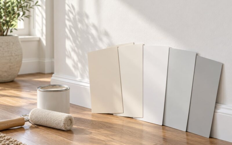
If your room gets warm light or has wood floors, warm white paint for walls looks softer and easier to live with. Cool whites suit bright rooms with cool light, gray floors, or black and chrome finishes. Test both on your own walls before you buy, because store lighting lies to everybody.
That is the short version. The longer version is that both options are white, and the difference sits in the undertone hiding underneath the white. Paint companies name colors like White Dove and Alabaster, which tells you almost nothing about temperature. You have to read the swatch.
Here is how to do that, what your room’s direction of light does to the decision, and how to test samples properly.
Table of Contents
- Warm White vs Cool White Paint for Walls at a Glance
- What Is the Difference Between Warm White and Cool White?
- How Lighting Changes Warm White and Cool White
- Warm White vs Cool White Paint for Walls: Which Matches Your Decor?
- Which Rooms Look Best in Each Color Temperature?
- How to Test Warm and Cool White Paint Before You Buy
- Which Should You Choose?
- Frequently Asked Questions
- Is warm white or cool white better for walls?
- What color is considered warm white?
- What color is considered cool white?
- Does warm white make a room look smaller?
- Should walls, trim, and ceilings be the same white?
- How can I tell if a white paint swatch is warm or cool?
- Conclusion
Warm White vs Cool White Paint for Walls at a Glance
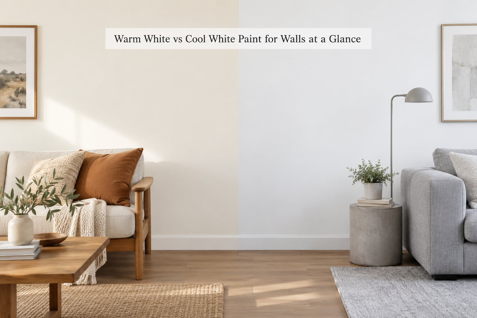
| Factor | Warm White | Cool White |
|---|---|---|
| Undertone | Yellow, red, orange, or pink | Blue, green, violet, or gray |
| Mood | Soft, cozy, lived-in | Crisp, clean, contemporary |
| Best light | North-facing, shaded, dim rooms | South-facing, bright, sunlit rooms |
| Typical LRV | 82 to 90 | 88 to 94 |
| Pairs with | Oak and walnut floors, warm woods, brass, beige textiles | Gray floors, black accents, chrome, cool stone |
| Main risk | Reads yellow or dingy over four walls | Reads gray or institutional in low light |
| Sheen that flatters it | Eggshell, which softens the warmth | Flat or matte, which avoids a blue sheen |
Neither column wins on its own. What decides it is the light your room already has and the materials you cannot easily replace.
What Is the Difference Between Warm White and Cool White?
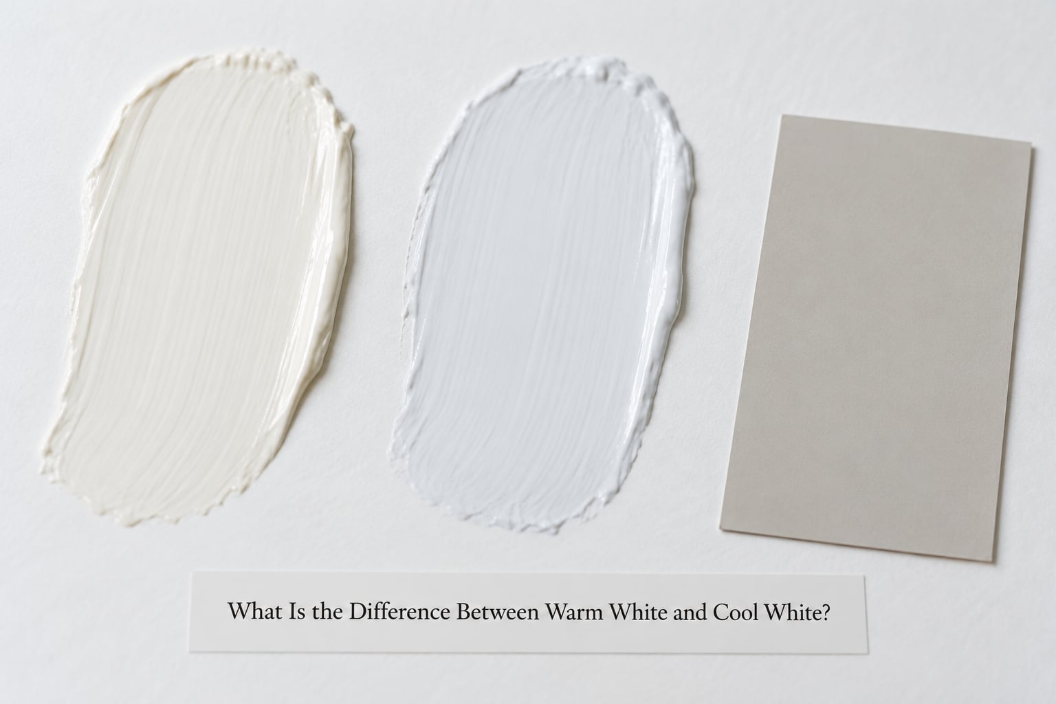
Warm whites carry yellow, red, orange, or pink undertones. Cool whites carry blue, green, violet, or gray undertones. That is the entire difference, and it is easier to see than you would expect once someone points it out.
The undertone is the hue hiding beneath the white. Most whites are mixed with a small amount of a second color, and that trace amount decides the mood. A white with a touch of yellow or red feels like daylight indoors. A white with a touch of blue or gray feels like a crisp morning.
White paint is rarely a pure optical white. Manufacturers tint whites slightly so they cover in one coat, and pigments age. The result is that when you hold two chips side by side, your eyes read the difference instantly and often read it as different colors rather than different whites.
Painters also talk about LRV, short for Light Reflectance Value, which runs from 0 to 100. Zero absorbs all light, 100 bounces all of it back. Most interior whites land between 80 and 92, and anything under about 80 starts to hold onto shadows in a dim room.
A third category deserves a mention because it solves more problems than people expect. Neutral whites have almost no leaning. They read clean under warm bulbs and steady under daylight, which makes them the safe choice for rentals, ceilings, and rooms you might redecorate in a few years.
How Lighting Changes Warm White and Cool White
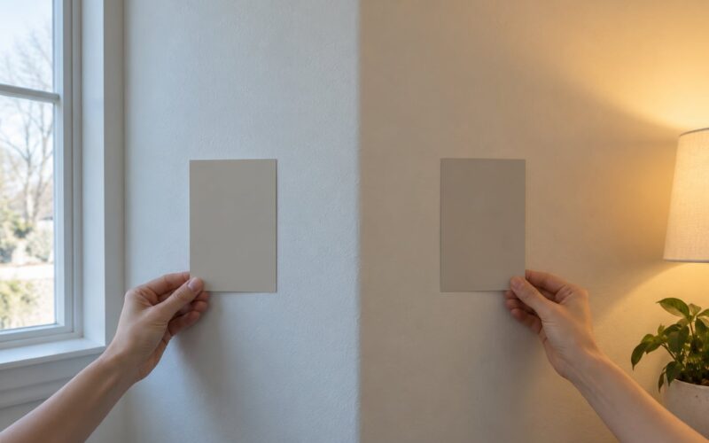
Paint does not have a fixed color. Daylight from a different direction carries a different color temperature, and it pushes the same can of paint in opposite directions depending on the hour.
North-facing rooms get steady, cool daylight with no direct sun. This is the classic case for a warm white. Cool whites in north light tend to look gray and flat, and people describe the room as feeling like an office.
South-facing rooms get warm direct sun for much of the day. Warm whites here drift toward yellow, especially in winter when the sun sits low. A neutral or slightly cool white holds its balance better.
East-facing rooms wake up with warm morning sun and spend the afternoon in cooler reflected light. Most whites behave here, so pick for your furniture rather than the orientation.
West-facing rooms take the strongest warm light late in the day. Warm whites glow in the evening and can go creamy after a few hours of direct sun.
Artificial light matters as much as orientation. Warm bulbs around 2700K push everything yellow, so a warm white under warm bulbs can look dingy by evening. Cool bulbs near 4000K reveal blue and gray casts that daylight hides.
The problem is that paint stores are lit with whatever is cheapest, usually cool fluorescent tubes. Every chip in the fan deck looks identical under those lights, and the difference only appears once the paint is on your own wall. That is the single most common reason a white goes wrong.
Warm White vs Cool White Paint for Walls: Which Matches Your Decor?
Start with the floor, because you will not replace it this decade.
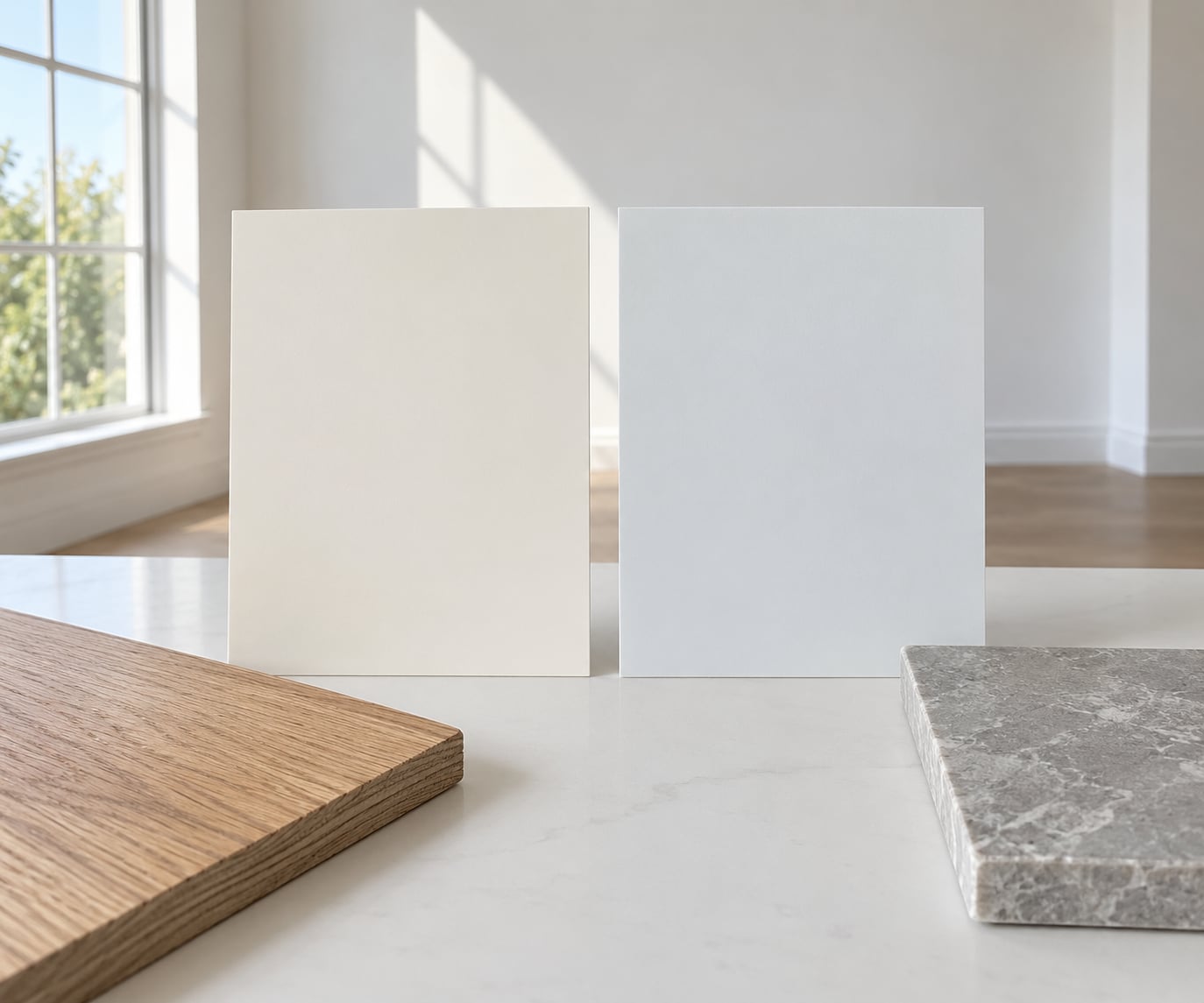
Oak, walnut, pine, and cherry floors pull warm. Against those floors, a warm white wall continues the same family and the whole room reads as one thing. A cool white next to honey oak creates a faint color clash that people often describe as the walls looking dirty.
Gray, bleached, or cool-toned floors do the opposite. A cool white wall echoes the floor’s undertone and makes the gray look deliberate rather than washed out. If you have gray floors and warm floors in the same house, warm white is usually the calmer compromise for the rooms that connect them.
Cabinetry and counters come next. Cream or warm-white shaker cabinets want warm walls. Gray, navy, or flat-black cabinets look sharp against a cool white, though a soft warm white also works if you want the kitchen to feel less severe.
Hardware gives you an easy read. Brass, bronze, and oil-rubbed copper pull toward warm white. Chrome, brushed nickel, and matte black pull toward cool white. If you are replacing hardware eventually, let the metal decide for you.
Textiles are quieter but they matter. Linen, oatmeal, camel, terracotta, and rust read warm. Camel and slate fabrics, cool blue-grays, and white bouclé read cool. You do not need every item to agree, you just need the walls to agree with the largest surfaces in the room.
Style follows the same pattern loosely. Colonial, mid-century, and traditional homes usually have warm woods and warm bulbs, so warm whites suit them. Very modern apartments with concrete floors and track lighting tend to read better in a cool or neutral white. Treat this as a tendency, not a rule.
Which Rooms Look Best in Each Color Temperature?
Warm whites work hardest in rooms that need softness. Bedrooms, living rooms, entryways, and any north-facing or shaded room benefit from them, because the warm undertone makes the light that arrives look kinder.
Cool whites earn their place where you want crispness. Bathrooms, kitchens with cool cabinetry, basements, and south-facing rooms with strong daylight look clean and current in them, and cool whites can make a small bright room feel more open.
Where cool whites go wrong is low light. A dim room with a cool white reads gray from across the space and almost dingy up close. If a room feels dim to you, pick a warm or neutral white with an LRV of 84 or higher and move on.
One trend note for 2026. Designers and paint stores have been leaning warm for several years now, and warm whites have moved from safe to fashionable. That does not make a cool white wrong in your house. It does mean you will have a much easier time finding warm options at the store than cool ones that are genuinely bright.
How to Test Warm and Cool White Paint Before You Buy
A paint chip tells you the color. It does not tell you how that color behaves in your room at 8am, at noon, and at 9pm with lamps on. Testing is where the money is actually saved.
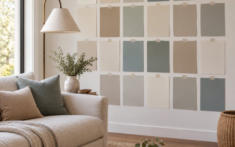
Get sample pots, not chips. Most stores sell quart or larger samples for a few dollars. Paint them on the wall in the spot you are considering, not on a separate swatch board hung somewhere else.
Use a large sample. A chip the size of a business card is smaller than most light fixtures. A painted sample about a foot square shows you how the light rakes across it.
Look at it three times. Morning, mid-afternoon, and evening with your usual lamps switched on. Most paint colors need at least 24 hours to fully cure and settle, so give it a night before deciding.
Put it next to what matters. Hold the sample against your floor, your cabinets, and a piece of the fabric you plan to use. Undertones that look subtle in isolation become obvious in company.
Paint cardboard as a second opinion. A designer method I like is to paint two or three coats of each candidate on white cardstock, let it dry fully, and prop the cards around the room where the light changes most. This costs almost nothing and it settles arguments in a household fast.
Do not skip this on textured walls. If your walls are textured, a smooth sample board will flatter the paint. Texture scatters light and can mute an undertone, so test on the actual wall or on a scrap piece with the same texture.
Once you have a winner, buy the whole room in one sheen. Different sheen levels across a single wall look wrong even when the color is identical.
Which Should You Choose?
Choose warm white if your room faces north, feels dim, has wood floors, brass or warm metals, and you want the space to feel softer and lived in. Choose cool white if your room is bright and south-facing, your floors or cabinets are gray or black, and you want a clean and current look.
Choose a neutral white if your lighting swings, you are renting, you are unsure what you will keep in the room, or you plan to resell within a few years. Neutral is boring in a useful way, and it will not fight anything.
Pick whichever one you tested, not whichever one someone on the internet promised is universally right. There is no white that flatters every room, and any guide that says otherwise has not seen your light.
Frequently Asked Questions
Is warm white or cool white better for walls?
Warm white is better for dim, north-facing rooms, wood floors, and warm metals because its undertone softens the light that arrives. Cool white is better for bright, south-facing rooms with gray floors, black cabinetry, or chrome hardware. There is no universally better option, so test both samples on your own wall before committing.
What color is considered warm white?
Warm whites read as cream, ivory, or soft beige because they carry yellow, red, orange, or pink undertones. A warm white never looks truly neutral next to a cool white. Popular examples include Sherwin-Williams Alabaster and Benjamin Moore White Dove. The warmth is subtle on a chip and obvious across four walls.
What color is considered cool white?
Cool whites have blue, green, violet, or gray undertones, so they read as bluish, greenish, or slightly stark. Sherwin-Williams Chantilly Lace and Benjamin Moore Decorator’s White are common examples. In low light or north-facing rooms, a cool white often reads gray or institutional within a few months of painting.
Does warm white make a room look smaller?
Not really. Room size is driven mostly by light and value, not undertone. A very dark warm white will close a room in, but a bright warm white with an LRV of 84 or higher reads open. If a small room feels tight, raise the LRV first and choose the undertone second based on your flooring and hardware.
Should walls, trim, and ceilings be the same white?
They do not have to match, but they should share a temperature. Painting trim and doors in the same formula as the walls always works. A slight two-tone look, slightly brighter trim against a softer wall, also works when both are the same temperature. Mixing a warm wall with a cool trim reads as a mistake from across the room.
How can I tell if a white paint swatch is warm or cool?
Hold the swatch next to a sheet of plain white printer paper in indirect daylight. A warm swatch will look creamy or yellow beside the paper, and a cool swatch will look bluish or gray. Then check it under the lamps you actually use at night, because warm bulbs can turn a neutral white visibly yellow by evening.
Conclusion
Pick a temperature that matches your light and your floors, then let a sample on the wall make the final call. Gather two or three candidates, look at them morning and night, and check them against the wood and stone already in the room.
The white that survives that test is the one to buy. Everything else is a name on a fan deck.