Paint looks different on the wall than on its sample because a small chip and a twelve-foot wall are not the same object seen twice. The chip is printed with ink, the tester pot uses a thinner formula than the paint you buy, wet paint is darker than dried paint, and the light, sheen, primer and surface colour all shift what your eye reports back to you.
A small mismatch is normal and almost nobody notices it. A large one usually has a specific cause you can find in about ten minutes of checking, and this guide walks through those causes in the order they are worth ruling out.
Table of Contents
- Why Paint Looks Different on the Wall Than the Sample
- What Changes When Paint Goes From Sample to Wall
- How Paint Samples Are Made, and How Accurate Each One Is
- How Lighting Changes the Color You See
- Why Wall Color and Texture Affect the Finish
- How Paint Sheen Changes a Color
- Why Application Matters
- How to Test Paint Before Painting the Wall
- What to Do If the Dry Wall Color Is Not Right
- Frequently Asked Questions
- Why does paint look lighter when it dries?
- Can I trust a small paint sample to choose a wall color?
- Should primer color match the paint color exactly?
- Why does the same paint look different in different rooms?
- How long should I wait before judging a paint sample?
- What to Check First
Why Paint Looks Different on the Wall Than the Sample
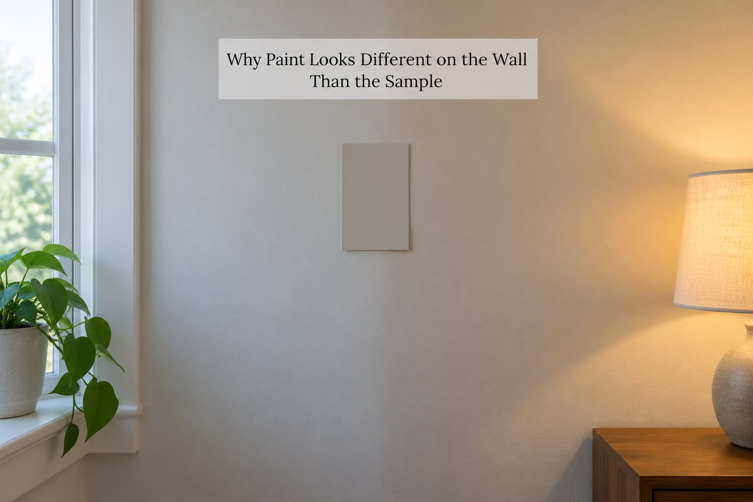
Colour is a relative thing. What you see depends on the light hitting the surface, how much of that light the paint reflects, how big the area is, and what colours sit right next to it. Change any one of those and the identical paint reads differently, which is why the same colour can look true on a white door and grey on the warm yellow wall beside it.
Seven causes account for nearly every surprise:
- The sample is ink, not paint. Paper chips and fan decks are printed, and ink reflects light very differently from a pigmented film.
- The tester pot is not the paint. Sample formulas often carry less pigment and different binders than the gallon you buy.
- Wet paint reads darker. Paint loses moisture as it cures, so the dried colour is lighter than what you saw in the tray.
- The lighting changed. Bulb colour temperature, window direction and time of day all tint what lands on the wall.
- Size and texture. A chip cannot show how a colour behaves across a broad surface or how it settles into a textured wall.
- Sheen. Flat absorbs light and looks deeper and softer; satin and semi-gloss reflect light and look brighter and more contrasty.
- The wall underneath. Primer colour, old paint showing through and patches all bleed into the final shade.
What Changes When Paint Goes From Sample to Wall
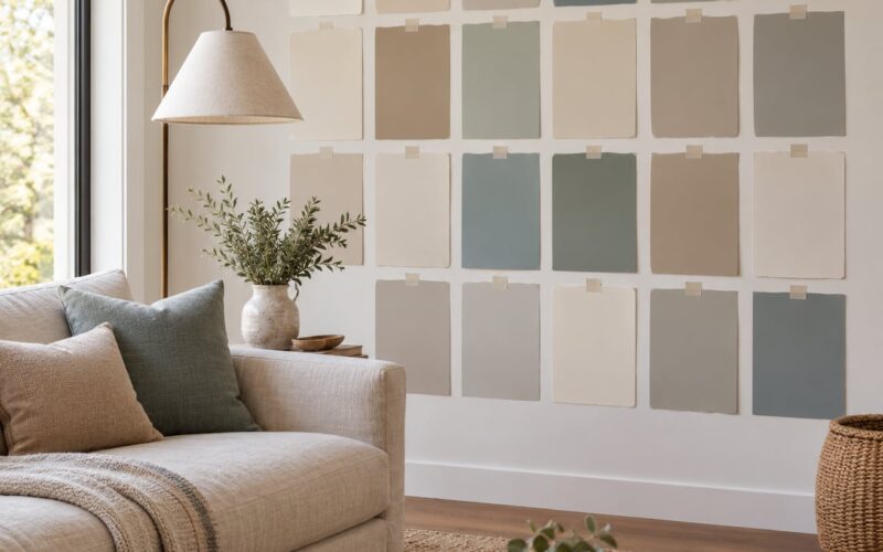
A fan-deck chip is roughly three inches square, printed on paper or plastic, and coated in ink. You hold it inches from your face in a store under bright overhead light. Nothing about that situation matches a wall.
A dried test swatch gets closer. If you paint a real sample onto card, let it cure fully and view it from across the room, you have removed three of the seven variables at once.
A full wall adds area, texture, corners, shadows and the furniture in front of it. That last part matters more than most people expect, and colour researchers call it simultaneous contrast: the eye judges a colour against its neighbours, so the same beige beside a deep blue sofa will read warmer than the identical beige beside warm oak floors.
How Paint Samples Are Made, and How Accurate Each One Is
| Sample type | How it is made | How accurate it tends to be |
|---|---|---|
| Paper chip or fan deck | Ink printed on card | Lowest. Undertones shift most on walls |
| Peel-and-stick sample | Real paint on a peel-off sheet | Better, but usually one thin coat and no texture |
| Tester pot | Small tin of tinted paint | Close, though the formula can differ from the gallon |
| Painted board or drywall offcut | Full paint, full sheen, on a wall surface | Best of the options, still short of the whole room |
Two dollars at the counter buys you the least informative object. Reddit’s r/paint consensus lands on lighting plus scale as the two biggest reasons a chip misleads, and that matches what happens when you get the sample home and put it on the wall.
How Lighting Changes the Color You See
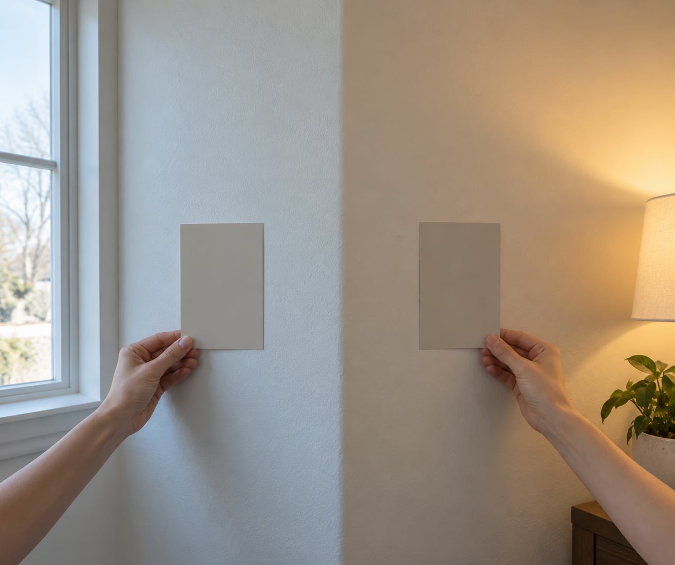
Light does not just reveal colour, it adds to it. A warm bulb pushes everything toward yellow and red; a cool bulb pulls it toward blue. The same grey wall reads noticeably different at 2700K than at 5000K, which is why a colour that looked perfect in the store can look flat and grey in a living room at nine at night.
North-facing rooms get steady cool daylight with no direct sun. Colours there usually read cooler and cleaner, and warm yellows and creams can look flat. South-facing rooms get strong direct light for much of the day, which washes out light colours and shows every roller texture you own.
East-facing rooms get bright, low-angle morning sun and cooler light the rest of the day. West-facing rooms do the opposite, and they also carry the strongest colour shift in the evening as the light goes amber.
| Room direction | Light quality | What it does to colour |
|---|---|---|
| North | Consistent, cool, indirect | Colours read cleaner and cooler; warms can mute |
| South | Strong, direct, most of the day | Light colours wash out; texture shows |
| East | Warm low sun, cool later | Colour shifts noticeably between morning and evening |
| West | Cool mornings, amber evenings | Warmest light of the day lands on the wall at night |
| No windows | Whatever bulb you fitted | Your bulbs decide the colour, entirely |
Three checks are worth doing before you fall for a colour. Look at the sample in the room’s most-used natural light, then again at night with your own bulbs on. Hold it near the floor, the woodwork and the sofa, not against bare wall.
Why Wall Color and Texture Affect the Finish
Texture gets blamed more than it deserves. A heavily textured wall does scatter light and make a colour look uneven, but the colour you actually end up with is decided by what sits underneath the paint.
Primer matters here. A white or tinted primer gives one starting point, and paint applied over it lands close to the formula’s intended colour. A dark primer, or bare patching compound over a dark stain, will pull the final shade in a visible direction.
Old paint bleeding through is the most common cause of a patchy wall. Fresh paint over a faded, sun-bleached wall can cover in the morning and show through by evening, which reads as a colour change rather than an application problem.
Porous surfaces drink the first coat. That is why the second coat looks more even and slightly cleaner than the first. If a colour seems to shift between coats, that is the seal happening, not a mistake.
How Paint Sheen Changes a Color
Sheen is the single most under-discussed variable, and it changes a colour more than most people expect. Flat and matte surfaces scatter light back at you, which softens contrast and makes a colour look deeper and more muted. Higher sheens reflect light back off the surface, which brightens the colour and can make the same shade look sharper and more saturated.
| Finish | How it handles light | How the colour tends to read |
|---|---|---|
| Flat / matte | Absorbs and scatters | Soft, deeper, muted; unforgiving of texture |
| Eggshell | Slight sheen | Close to flat with a little more life |
| Satin | Moderate reflection | Brighter and more contrasty than eggshell |
| Semi-gloss | Strong reflection | Crisper, richer, shows surface flaws |
| Gloss | Maximum reflection | Very bright and hard; reads differently in every room |
Test in the sheen you will actually paint. A flat sample of a satin colour will read softer and duller than the wall ever will, and you will end up second-guessing a colour that was never wrong.
Why Application Matters
Sometimes the colour is right and the wall is not. Uneven paint reads as a different colour to almost everyone, and it is the most common complaint in DIY painting threads.
Roller nap is the first variable. A short-nap roller on a textured wall leaves a stippled finish that catches light in bands. A long-nap roller on a smooth wall pushes paint into a thinner layer that dries patchy.
Paint thickness comes next. Two thin coats beat one heavy coat every time, and a heavy coat that has not skinned over can dry with a slightly different colour at the edges than at the centre. Not stirring the can properly is the quiet culprit behind a lot of this. Pigment settles at the bottom, and the first few minutes of the second coat are lighter than the last.
Laying off too hard while the roller is still loaded leaves streaks that stay visible. And judging a wall before it has dried is asking for the wrong answer every time.
How to Test Paint Before Painting the Wall
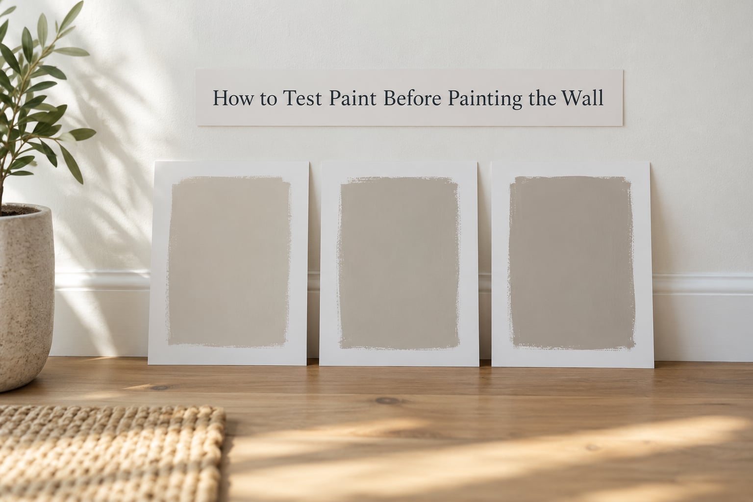
Testing costs a weekend and a few sample pots. Skipping it costs a gallon per coat plus the furniture move. Here is the protocol that works.
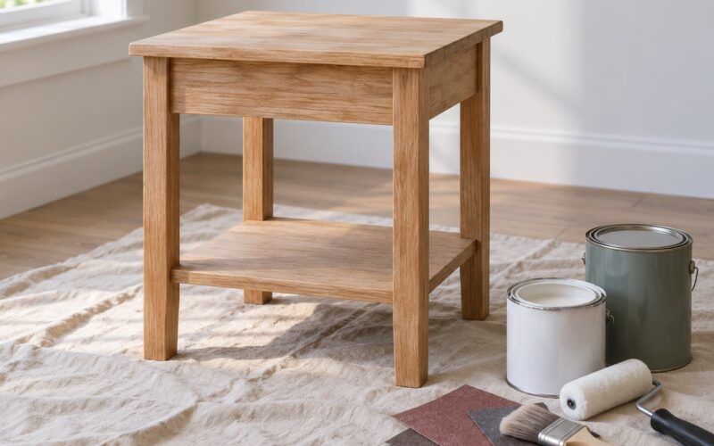
- Buy actual sample pots rather than relying on a chip, and pick up two or three close alternatives rather than one.
- Note the exact colour name, code and sheen on the label before you start. You will not recognise it later.
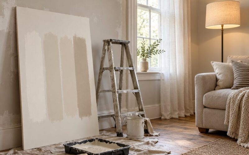
- Paint each onto a large card, at least a foot square, in the sheen you plan to use. Apply two coats so the result matches a finished wall.
- Let them cure for the full time printed on the label, which is often longer than you expect.
- Stand the cards up vertically, leaning on the wall you intend to paint, not flat on the floor.
- Look at them morning, afternoon and evening, under daylight and under your own bulbs.
- Move them next to the floors, the sofa, the cabinets and the woodwork they have to live with.
If you want a patch on the wall itself, test over the colour that will be there afterwards, not over the old colour you are about to cover. Experienced decorators often find that painting over a strong existing colour tells them more than a patch on a white wall, which flatters almost everything.
What to Do If the Dry Wall Color Is Not Right
If the difference is slight, live with it for a few days before acting. Windows in a room change how a wall reads, and most small differences settle down once the furniture is back in.
If the difference is real, work through this order. Check the sheen on the can against the sheen on the wall, then check whether the primer was white, grey or tinted. Confirm the base colour, since dark bases hold more pigment and shift lighter colours noticeably.
Let the wall finish curing before you decide. Paint that has not fully hardened keeps reflecting differently for days, and plenty of people have repainted a wall that was about to look fine.
Then ask the manufacturer. A paint store can read the batch code on the original can and tell you what base and formula went into it, which often settles the question in one conversation.
A second corrective coat is usually the practical fix, tinted rather than straight from the original formula, and always tested on a hidden corner first. If the first colour was genuinely wrong, or two coats have not evened out, stripping back to a clean surface is the honest starting point.
One more thing worth knowing: if the room is already finished and you want a matched touch-up later, keep the leftover paint in a sealed can with the label. Fresh paint matched to an old wall is where metamerism bites, and two colours that matched perfectly in the morning can diverge under evening light.
Frequently Asked Questions
Why does paint look lighter when it dries?
Paint loses water and solvents as it cures, so pigment particles sit closer together and more light comes back to your eye. The wet film also has a glossy water surface that darkens what sits under it. That is why a fresh coat looks alarming on the ladder and settles into its true shade on the floor.
Can I trust a small paint sample to choose a wall color?
Only as a starting point. A three-inch chip is printed ink, so it cannot show you how undertones behave across a wide surface or how the colour interacts with your furniture. Use it to narrow two or three options down, then confirm with a sample pot painted on a large card in the room itself.
Should primer color match the paint color exactly?
No, it does not need to match. A white or lightly tinted primer is usually better, because it gives the topcoat one consistent starting colour to sit on. What you want to avoid is a primer or patch that contrasts strongly with the topcoat, since any difference shows through and pulls the final shade.
Why does the same paint look different in different rooms?
Because the light changes and the surroundings change. Window direction, bulb colour temperature, shadows and the colours of the floor, sofa and woodwork all feed into how your eye judges the paint. Painters who work on colour matching call this field matching, and they treat aged or differently sheened walls as the hardest cases.
How long should I wait before judging a paint sample?
Wait for the full dry time printed on the label before deciding anything. A card can be handled once it is touch-dry, but the colour keeps settling and the sheen keeps developing as the coating cures. Testing across one full day and night gives you daylight and lamp-lit views of the same sample.
What to Check First
Start by putting the dried sample and the dried wall side by side in the room’s strongest natural light, then look again at night with your own bulbs on. If they diverge, check sheen first, then primer and base colour, then how the paint went on.
Most of the disappointment behind this question comes from judging a colour off a printed chip in a store, or from looking at a wall before it has cured. Testing a real sample upright, at wall scale, in the actual sheen, for the full drying time on the label, prevents nearly all of it.