Learning how to pick a paint color for a dark room comes down to three things: pick a light enough color, give it a warm undertone, and test it at wall scale in your own light before you buy a gallon. Measure how much light the room actually gets, set a target on the Light Reflectance Value scale, then sample. It takes a weekend and it saves you from repainting a room you already hate.
Most people get this wrong in one of two directions. They paint a dim room bright white, it looks stark and clinical by evening, or they grab a swatch in a showroom and trust it — then watch it go flat and grey on their own wall by Tuesday.
Here is the honest bit: there are two valid goals, and you should pick one before you pick a colour. A room can be made to feel more open, or it can be made to feel enveloping and cosy. Both work. The colours, the sheen and the lighting all follow from that decision rather than the other way round.
Table of Contents
- What You Need
- Step-by-Step
- Assess the Room’s Light Before Choosing a Color
- Choose a Color Family That Suits the Room
- Compare Undertones Instead of Just the Color Name
- Test Paint Samples at Different Times of Day
- Choose the Right Paint Finish and Sheen
- Common Mistakes
- Frequently Asked Questions
- What is the best paint color for a room with little natural light?
- Should I use white paint in a dark room, or will it look stark?
- Do cool or warm paint colors make a dark room look better?
- How many paint colors should I test before choosing one?
- How do I choose a paint color that works with dark wood floors?
- Can a dark room look brighter after painting it a light color?
- Conclusion
What You Need
The whole kit is cheap and mostly reusable, which is the point — you are buying information, not paint.
- A colour wheel or undertone fan. A physical one you can hold next to a wall beats an app every time.
- Swatch decks from at least two brands. Compare ranges side by side rather than falling for the first shelf that looks nice.
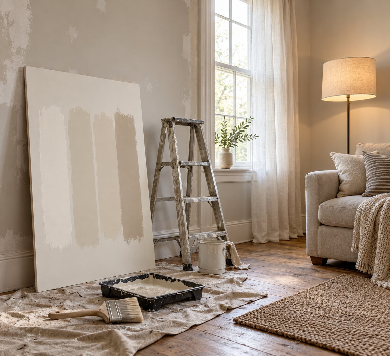
- Sample pots, or large sample boards. Sample pots are small but accurate. Boards you can move around are better for checking a whole wall. Aim for patches at least 30 cm square — a chip the size of a business card tells you almost nothing.
- Painter’s tape. For clean patch edges, and so you can move or relabel a patch as your thinking changes.
- A sheet of white poster board. Paint your sample onto this. It stops a bold existing wall colour from skewing your judgement, which is a real problem in a freshly emptied room.
- Your phone. Photos fool you about colour, but they are excellent for noting which patch is which and when you looked at it.
- An adjustable lamp if you have one. Being able to compare warm bulbs against daylight bulbs at night solves most of the guesswork.
- A dust sheet and a step ladder. For the actual patch-up day.
One more thing worth knowing before you start: the Light Reflectance Value, or LRV, is a 0 to 100 rating of how much visible light a paint reflects. Zero absorbs everything, as black does; 100 reflects everything, as white does. Most brands print it on the back of the swatch or list it on their website. That single number removes an enormous amount of guesswork.
Step-by-Step
Assess the Room’s Light Before Choosing a Color
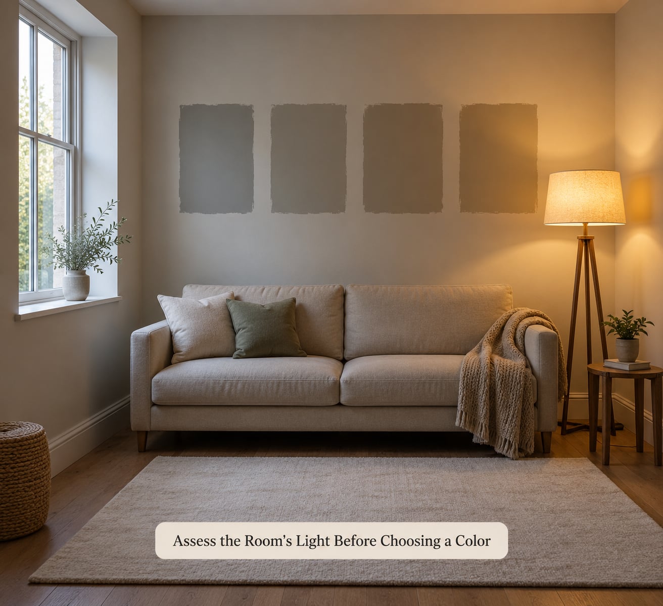
Watch the room three times before you decide anything: mid-morning, early afternoon, and after dark with the lamps on. A room that looks fine at 2 pm can be genuinely gloomy at 8 pm, and that is usually the time you are in it.
Orientation sets the tone. North-facing rooms get indirect, bluish light through the year and are the hardest case. South-facing rooms get the most direct sun and forgive almost anything. East-facing rooms have sharp morning light, west-facing rooms get a warm evening glow that flatters warm colours beautifully.
Then count the obstacles: window size, whether a neighbour’s building or a big tree blocks it, how many walls the light hits before it lands, ceiling height, floor finish, and how much dark furniture is already in there. Dark walnut floors and a black sofa will eat reflected light that a pale oak floor and a linen couch would bounce back.
Be honest about the fixtures too. If the room is lit by a single tired bulb on an old fitting, no paint colour will rescue it. Replacing the fitting or adding a second light source usually makes more visible difference than changing from one off-white to another. Fix the light first, then paint.
Choose a Color Family That Suits the Room
Start by naming your goal in one sentence, because it decides everything after it.
Brightening strategy. You want the room to feel more open. Aim for LRV 55 to 70 and warm-leaning neutrals: off-white, greige, soft taupe, camel, a warm putty, a dusty pink, or a muted lavender. Colours with a bit of saturation and less black in the base read brighter than flat greys, because grey in a dim room has nowhere to go.
Enveloping strategy. You want depth and intimacy. Drop to LRV 15 to 35 and choose a rich, warm-saturated colour: olive, forest green, terracotta, deep clay, inky blue-green, oxblood. Paint the ceiling the same colour as the walls so the room has no hard edges, and add layered lighting. This looks considered rather than cave-like, and it is a genuinely good option for a bedroom, a snug or a library.
Here is how the numbers line up:
| LRV range | How it behaves | Suits |
|---|---|---|
| 70 and above | Bounces the most light but can read clinical; shows every scuff | South-facing rooms; ceilings painted to match the walls |
| 55 to 70 | Bright and comfortable, warm tones still visible | North-facing rooms, basements with a small window, hallways |
| 40 to 55 | Balanced, still reads light at night | Small rooms, home offices, north-facing bedrooms |
| 15 to 35 | Absorbs light and wraps the room in colour | Moody goal, accent walls, rooms with good artificial lighting |
| Under 15 | Reads almost black, hides dust beautifully | Single feature walls, cabinets and millwork |
For named starting points, these are well-known shades that designers reach for in low light. Check the LRV printed on the current swatch, since brands reformulate.
- Bright and warm: Benjamin Moore Simply White, Sherwin-Williams Pure White, Benjamin Moore Pale Moon, Benjamin Moore Revere Pewter.
- Warm mid-tones: Frenchic Nougat and Dusky Blush, Farrow & Ball Mahogany, Sherwin-Williams Van Dyke Brown, Benjamin Moore Norwich Brown.
- Moody but lively: Benjamin Moore Hale Navy HC-154, Benjamin Moore Kendall Charcoal HC-166, Benjamin Moore Salamander 2050-10, Benjamin Moore Evening Dove 2128-30.
- Greens that hold up in dim rooms: Frenchic Victory Lane, Benjamin Moore Night Owl, Morris & Co Morris Trellis, Portola Paints Montauk.
Compare Undertones Instead of Just the Color Name
Two colours with the same name from two brands can be opposite in temperature. Ignore the name and look at what sits underneath: a yellow base, a red base, a blue base, a green base or a violet base.
Yellow, beige and red bases feel warm and they add the sense of sunlight to a room. Under cool north light these are the safest bet. Blue and violet bases look crisp in a bright room but can go cold and grey in a dim one, and green bases split the difference in a useful way.
Blues are not banned in a north-facing room — a lot of people assume they are. The ones that hold up are blues with grey and a little green mixed in, which reads as blue-green rather than primary blue. Think of the direction of Farrow & Ball Hague Blue or Sherwin-Williams Chelsea Mauve rather than a true navy, and test two or three on the same wall.
Match the undertone to what is already fixed in the room. Warm undertones sit naturally against oak, walnut and brass. Cool undertones sit better against grey stone, stainless steel, concrete and cool grey cabinetry. If you have dark wood floors, a warm yellow or red base will bridge the gap instead of fighting it.
Test Paint Samples at Different Times of Day
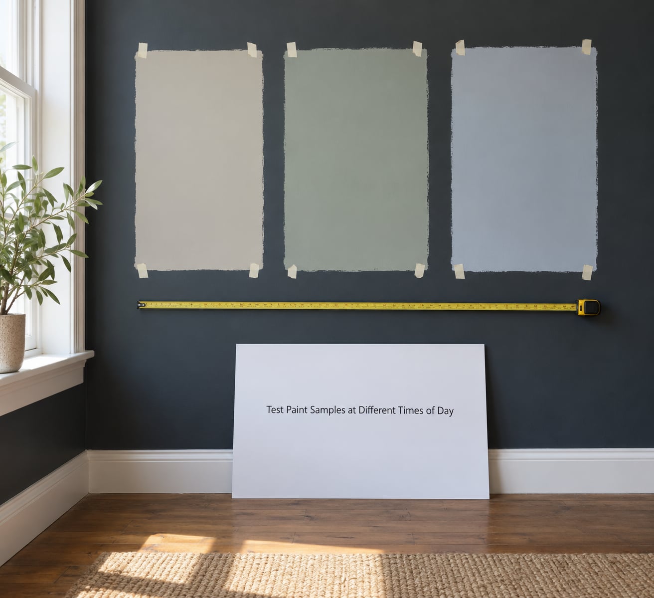
Sample patches need three visits and a full dry. Paint on day one and you are reading wet paint, which looks darker and shinier than it ever will. Look again the next morning, then again at night with your normal lights on. Only then decide.
Put at least three patches on the same wall so they compete fairly, and put a fourth on the wall you actually want to change. Move them if the light differs between walls — a colour can look good opposite the window and heavy on the far wall.
Check them against white paper. This sounds fussy but it solves the most common regret in DIY forums: the previous owner’s strong colour still sits underneath and tints everything you look at, so you pick something to fight it rather than something you like. A metre of white poster board with the same paint on it gives you an unbiased read.
Paint looks different at home than in the store, and it should. Store lighting is bright, even and usually around 4000K. Your lamp at night might be 2700K. The same wall colour can look flatter, warmer or greyer in either direction, which is exactly why the patches go on your wall rather than in your hand.
Choose the Right Paint Finish and Sheen
Finish changes how much light comes back at you, and in a dim room that difference is obvious.
| Sheen | Light behaviour | Where it makes sense |
|---|---|---|
| Flat | Absorbs light, disappears into the wall | Ceilings in bright rooms; not a brightening tool |
| Matte | Very little reflection, hides texture badly but shows no glare | Modern ceilings, bedrooms where glare is unwanted |
| Eggshell | A soft sheen that returns a little light | Most walls in most dim rooms; scrubbable enough for family life |
| Satin | Noticeable reflection, adds brightness | Hallways, basements, small rooms where brightness is the goal |
| Semi-gloss | Strong reflection, picks out every flaw | Bathrooms, kitchens, doors, skirting and trim |
| Gloss | Maximum reflection, unforgiving | Trim and cabinetry in a room you want to feel bright |
For a room you are trying to brighten, eggshell to satin is the practical range. For a moody room, matte keeps the colour soft and velvety, but pair it with layered lighting or the walls will look flat after sunset. Trim in semi-gloss or gloss in the same or a slightly lighter value lifts the whole room by drawing clean lines around the edges.
Common Mistakes
Almost every paint regret people describe online traces back to one of these.
- Choosing from a chip the size of a postcard. Small samples exaggerate whatever the light is doing at that moment. Fix: never buy a gallon before a patch at least 30 cm square has lived on your wall for a day.
- Testing under one light condition only. A colour judged at noon and never again at night is the most common single error. Fix: three visits, morning, afternoon, evening.
- Judging wet paint. It looks deeper and glossier than the dry finish for the first few hours. Fix: wait until the patch is fully dry and has stopped smelling before you have an opinion.
- Ignoring the colour you already have. A strong existing wall tints every new sample around it. Fix: paint onto white poster board as well as the wall.
- Going cool by default. Neutral colours in a dim room drift grey and flat without you noticing. Fix: push the undertone warm with yellow, beige or red and compare them side by side.
- Painting the ceiling a different value. A bright ceiling over darker walls boxes a small room in. Fix: same colour on walls and ceiling when you want the boundaries to disappear, and switch on the light rather than the colour.
- Buying paint before deciding on sheen. Sheen changes quantity too, and a satin wall in a hallway needs more coverage than you expect. Fix: settle colour family and sheen together, then measure the walls and buy one extra coat’s worth for cut-ins.
If you are repainting several rooms at once, choose the colour in one well-lit room first, then test it in a dim one before you commit to the whole house. A colour that survives both is the safe one.
Frequently Asked Questions
What is the best paint color for a room with little natural light?
A warm, light neutral with an LRV above 55 usually works best. Off-whites with a yellow or beige base, soft taupes, warm greiges and camel tones read brighter than cool greys in low light. Colours with some saturation and less black in the base also help, because pure greys have nowhere to reflect to. Always test at wall scale, since stores are far brighter than most dim rooms.
Should I use white paint in a dark room, or will it look stark?
White bounces more light than any other colour, but it also shows every scuff and takes on the colour of your light bulbs, so it can look clinical after dark. A warm off-white with an LRV in the 60s is usually the safer bet in a dim room. If you do go pure white, pair it with semi-gloss trim and layered lighting so the edges of the room stay visible.
Do cool or warm paint colors make a dark room look better?
Warm colours almost always read better in low light. Yellow, beige and red bases add the feeling of sunlight and hold their colour when daylight is scarce. Cool blues, violets and true greys can look flat and grey in a dim room, though a blue mixed with grey and green can work well, especially as a moody scheme. North-facing rooms are the strongest case for warming the undertone up.
How many paint colors should I test before choosing one?
Three to four is the sweet spot. Put at least three on the same wall so you can compare them directly, and add a fourth on the wall you actually want to change, because light differs between walls. Test more if you are torn between two families, but narrowing to two or three before sampling saves paint and stops you second-guessing forever.
How do I choose a paint color that works with dark wood floors?
Go warm. Dark walnut, oak and mahogany floors carry yellow, red and brown undertones, and a wall with a warm yellow, beige or clay base blends with them instead of clashing. Avoid cool greys and blue-greys, which pull against the wood and make both look flat. A lighter warm neutral on the walls keeps the floor as the feature; a deeper warm colour above a dark floor works if the lighting is strong.
Can a dark room look brighter after painting it a light color?
Partly, and the honest answer is that paint cannot manufacture light. Moving from a dark colour to LRV 55 or above reflects far more of what light you already have, so the room reads noticeably more open. For a dramatic change, paint walls and ceiling the same light value, use eggshell or satin, and keep trim crisp. Replacing old light fittings at the same time gives you a much bigger jump than any colour swap.
Conclusion
How to pick a paint color for a dark room comes down to watching before you choose. Spend an evening in the room at three different times, decide whether you want it brighter or cosier, set your LRV target, then let a warm undertone do the rest.
Gather three or four large samples, paint them on the same wall and on white poster board, and give them a full day and night before you spend anything. That one weekend of patience is the whole method. Everything else is detail.