Paint colors flow from room to room when every wall color sits in the same undertone family, one neutral repeats in the rooms you always see together, and a single accent hue reappears across the house. That is the whole trick: repetition, not matching. Pick a light warm neutral as your base, decide where your sightlines are, and test two or three candidates on real walls before you buy a single gallon.
Knowing how to choose paint colors that flow room to room comes down to those two decisions: which rooms set the palette, and which undertone they all share. Get either one wrong and the house reads as a collection of separate rooms. Most people get paint wrong in one of two ways. They treat each room as a separate decorating decision, so the beige in the bedroom has nothing to do with the gray-green in the living room. Or they pick one color for the whole house, then wonder why it feels flat and boring. The workable middle ground is a small palette of six tones with defined jobs, tested properly.
Table of Contents
- What You Need
- Step-by-Step: How to Choose Paint Colors That Flow Room to Room
- Start with the rooms you see together
- Read the light in each space
- Find your shared undertone
- Test before you commit
- Common Mistakes
- Frequently Asked Questions
- Should the entire house be painted the same color?
- What is a good paint color palette for a whole house?
- What is the 3-color rule in interior design?
- What is the 60-30-10 rule for painting?
- How long should I test paint swatches before painting?
- Do paint colors have to match between rooms?
- Conclusion
What You Need
Gather these before you fall in love with a swatch. It keeps the decision from becoming a six-week standoff with a wall.
- A paint deck or fan deck. The big cardboard swatch book every store carries free. Ignore the top row, which is where you fall in love with everything.
- Sample pots. Usually a few dollars each, and worth it for the two or three colors that survive the deck.
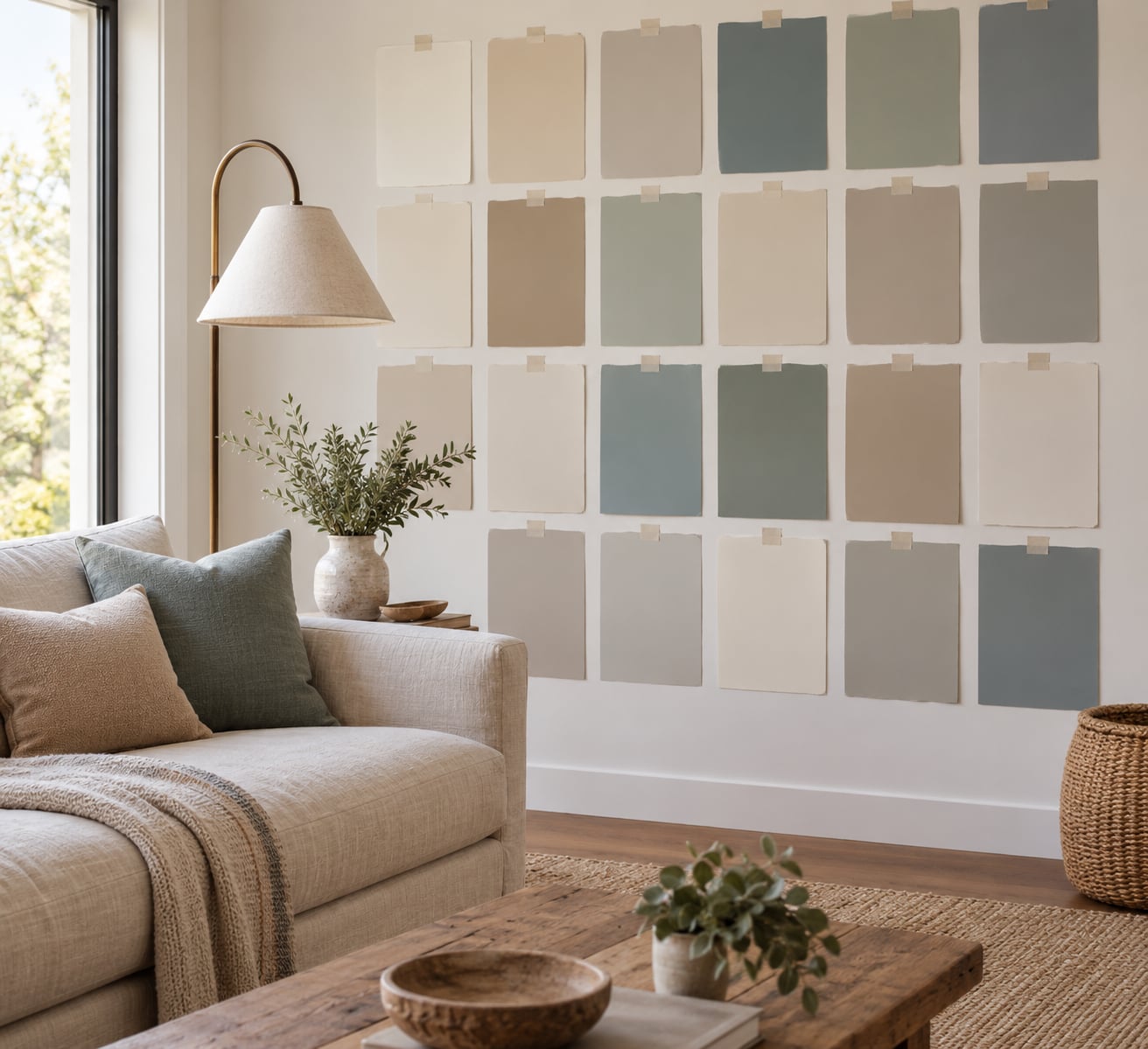
- Painter’s tape and kraft paper. For building your own sample board, one square of each color on the same paper.
- A rough room map. A floor plan with the doors and openings marked, so you can see which rooms share a sightline.
- Your fixed finishes. Flooring, kitchen cabinets, countertops, tile and backsplash. These are not negotiable, so put them on the board first.
- Your furniture and textiles. Upholstery, drapes, rugs and art. These carry undertones too, and paint has to agree with them.
- Lighting notes. Which way rooms face, how many windows, and what color temperature your bulbs are.
- Step ladder and a drop cloth, if you plan to test large patches rather than small ones.
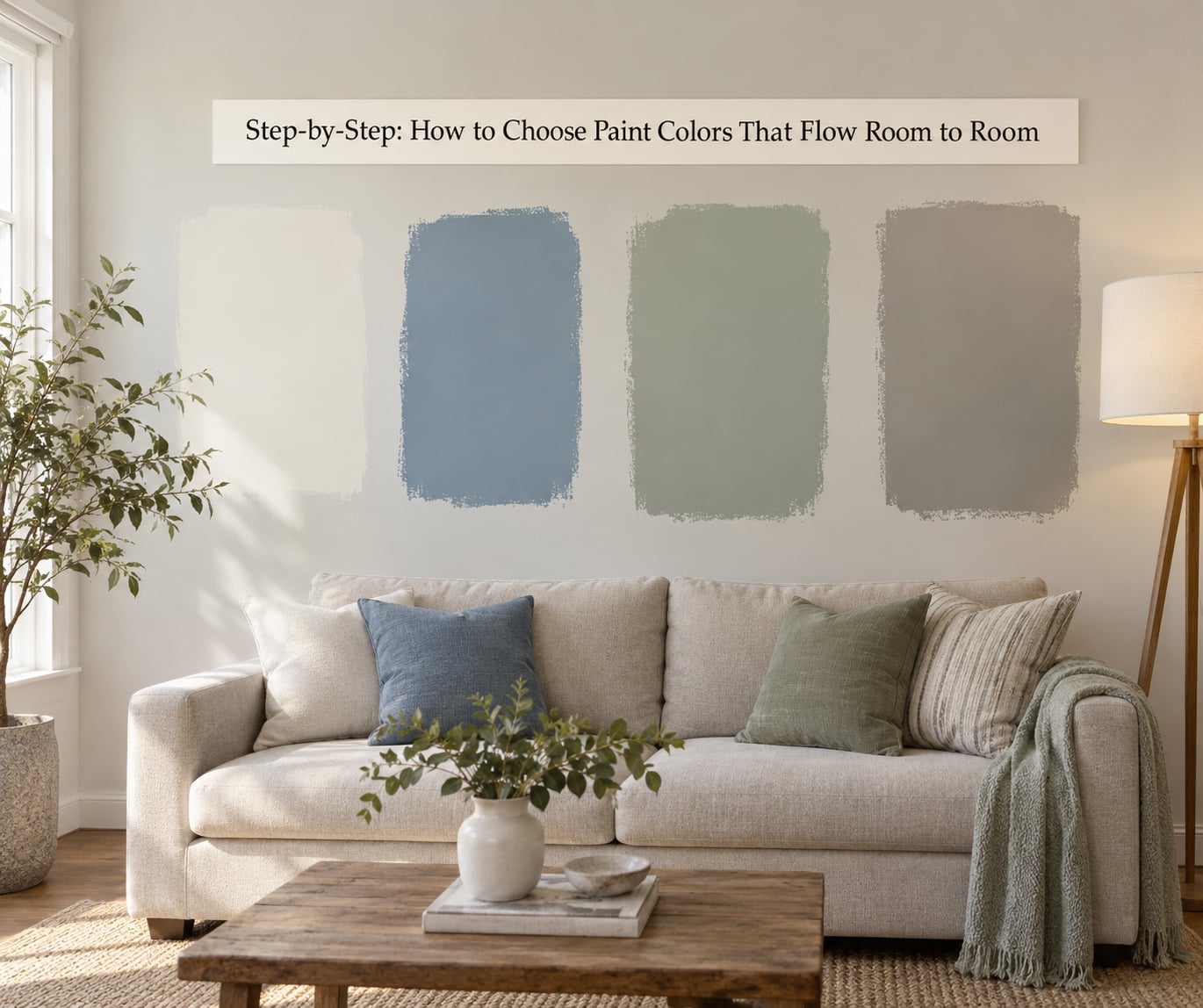
Step-by-Step: How to Choose Paint Colors That Flow Room to Room
Start with the rooms you see together
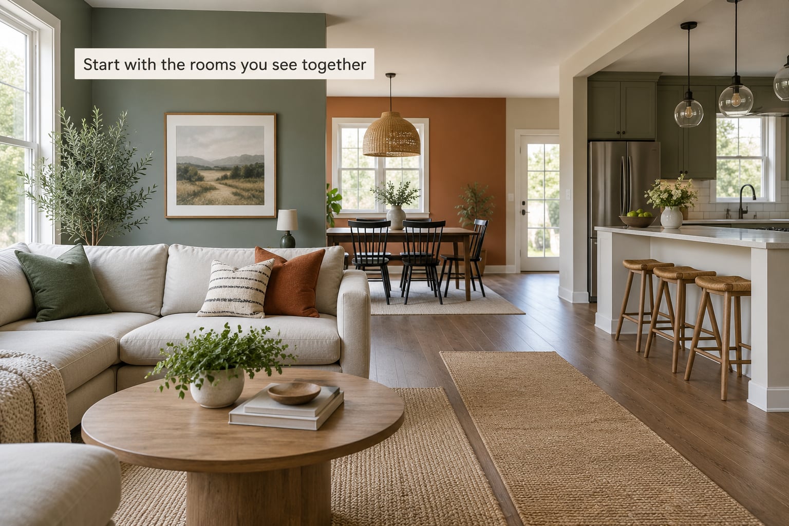
Stand in the room you use most and look through every doorway and opening you can see from there. That cluster of spaces decides your palette. Paint them from the palette first, and the rooms you rarely enter get the leftovers.
In an open plan, the living room, kitchen and dining area share one sightline, so those three set the tone together. Foyers, hallways and stairwells are connectors, and connectors work best as flow-through colors: one shade that quietly ties the rooms on either side together. A hallway painted a contrast color is the fastest way to make a house feel chopped up, and the consensus in decorating threads is that a darker shade of the same family works better.
For two rooms that should feel different but connected, let one repeat the other’s accent color as its wall color. The hallway is pale greige, the living room is a deeper version of the same hue, and the dusty blue that shows up in the living room cushions becomes the dining room’s walls. The eye reads the repetition and calls it a plan.
Read the light in each space
The same paint looks like a different color in a north-facing room than it does one facing west. Northern light runs cool and tends to push a warm beige toward gray. Afternoon sun can turn a soft gray-green into something flatter and more olive by four o’clock.
Notice how much light each room gets and how deep it is, because that changes which values will work. A small room needs a lighter value to feel larger, and a windowless basement has to start a step or two lighter than you would pick elsewhere, since there is no daylight to lift it. Note your bulb color temperature too: warm bulbs around 2700K push everything warmer, and cool bulbs near 4000K expose every green or pink undertone.
Find your shared undertone
Undertone is the faint green, pink, yellow or blue cast sitting under a color, and it is the reason two neutral walls can look like they came from different houses. You can spot it by holding two swatches side by side under daylight and asking which one looks slightly dirty. That one is carrying an undertone that fights the other.
Pick one temperature family and stay in it. Warm neutrals have yellow, red or brown undertones and suit wood floors, warm woods and most bulbs. Cool neutrals have blue or green undertones and suit white oak, gray tile and lots of daylight. Warm naturals have taken over a lot of the territory cool gray used to hold, so if you want neutral but not cold, a soft clay or mushroom tone is a safe pick next to hardwood.
Once you have your base neutral, you can derive more of the palette without adding new colors. Ask the store to knock a color down by half, or mix equal parts of your neutral with white. That single tint gives you a lighter version for a small room or ceiling and a slightly stronger version for a room that needs weight, and because they came from the same can, the flow is automatic. This is the step people skip, and it is the one that makes the rest of the palette fall into place without a single trip back to the store.
Test before you commit
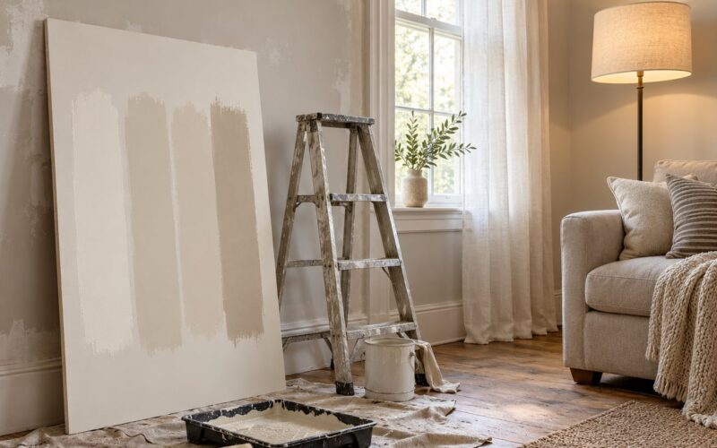
Paint patches at least two feet square, not the two-inch dabs you make in the store. Put them at eye height on a main wall, on a wall that gets evening light, and on one you only see in the morning. This is the diagnostic that people on decorating forums keep coming back to: tape a board of every paint color already in the house to a wall and let it sit.
Then live with the patches. Look at them first thing in the morning, at midday, and with the lamps on after dark, and stand back across the room. Do this over at least two days, with your own furniture and drapes in place, and compare each patch against the flooring and the kitchen cabinets rather than admiring it alone on the wall. The best way to choose paint colors that flow room to room is to test them against each other on the same wall, because a swatch held in the hand tells you almost nothing about how two colors will argue.
If a color looks different every time you check it, that is not indecision. That color changes with the light in your house, and no amount of extra time will fix it.
Common Mistakes
Choosing each room on its own. The fix: stop, and write down every color already in the house, including the builder-grade paint you inherited. Then choose the accent from that list rather than from a catalog.
Ignoring undertones. A warm beige beside a cool gray on a connecting wall is the classic clash, and neither color is wrong. The fix is to compare swatches against each other rather than against white paper, and keep the whole house in one temperature family.
Trusting a small swatch. A two-inch dab is too small for your eye to judge. The fix is a patch the size of a sheet of paper, taped up and revisited at three different times of day.
Forgetting the floors and cabinets. Warm oak floors push cool walls toward green. The fix is to put those samples on the board first and match the paint to them instead of fighting them.
Using too many competing accents. Every room introducing a different bold color reads as noise, especially in an open plan. The fix is one accent used in several rooms, and bolder colors reserved for enclosed spaces such as powder rooms or a closed den.
Repainting the house one room at a time, in random order. A half-finished house looks half-finished. If you must phase the work, start at the front door and work outward in sightline order, finish one connected group before starting the next, and keep the same trim and ceiling color throughout so the phases still read as one house.
One more worth knowing: if a room already clashes, you can usually rescue it with paint instead of replacing furniture. Knock the offending color down by half, or pull its undertone into the family your other rooms already share.
Frequently Asked Questions
Should the entire house be painted the same color?
No. Painting every room one color is safe but usually reads flat, especially if you like color. Keep the same undertone family and trim color throughout, repeat one neutral in the rooms you see together, then vary the rest with related tints and one repeated accent. You get a home that feels planned without looking like a hallway.
What is a good paint color palette for a whole house?
Most whole house color palettes work with about six tones: one main neutral for the busiest rooms, a secondary neutral for smaller spaces, one white or cream for trim and ceilings, one accent at roughly 10 percent coverage, and one or two supporting muted tones. One temperature family across all six is what makes them flow. Start from your flooring and cabinets rather than from a color you like.
What is the 3-color rule in interior design?
The three-color rule says a room reads as complete with no more than three distinct colors. Pick a neutral, a mid tone and an accent, then let the accent reappear in another room as that room’s wall color. It is a useful ceiling rather than a law, and it works best as a limit on strong color rather than on every shade of white and beige in the house.
What is the 60-30-10 rule for painting?
It splits a room into three shares of color: 60 percent is your dominant neutral, 30 percent is a supporting tone such as flooring, cabinetry and upholstery, and 10 percent is the accent. On walls the 10 percent is where people overreach, so a single accent color on one wall or one room is enough. Two accents at once usually tips the room into busy.
How long should I test paint swatches before painting?
At least 48 hours, and a weekend is better. Check the patches in the morning, at midday and with lamps on in the evening, then again the next day, with your own furniture and textiles in place. If a color still looks different at every check, it is reacting to your light and it will look unpredictable on the wall too.
Do paint colors have to match between rooms?
They do not need to match, they need to share an undertone and a temperature. Two colors never seen side by side can differ a lot and still look connected. Two colors that are always visible together, such as a hallway and the rooms it joins, should be closer in value and never opposite in temperature.
Conclusion
Start with your sightlines, not with a swatch. Stand in the room you use most, note everything you can see from there, and let those spaces set the palette. Pick one undertone family, choose one shared neutral for those rooms, and test three candidates on two-foot patches for two full days before you buy anything. That sequence takes a weekend and saves a repaint.
If you only remember one thing about how to choose paint colors that flow room to room, remember the repetition. One neutral repeated in the rooms you always see together, one undertone family across the house, one accent that shows up more than once. Everything else is detail.