The most common decorating mistakes to avoid in a living room are simple and repetitive: furniture pushed against every wall, a sofa that swallows the room, a rug that stops short of the seating, one lonely ceiling light, art hung at ceiling height, and matching sets that leave nothing to look at. None of them are expensive to fix.
What makes these errors so common is that each one feels right in the moment. The couch looked fine in the store. The lamp was on sale. The rug was the only one that fit in the cart. A room comes together in a series of reasonable decisions that add up to a space that reads cramped, flat, or strangely unfinished, and by then the money is already spent.
I break each mistake below into what it looks like in a real room and the quickest correction that fixes it, with the actual measurements so you are not guessing. Most corrections take an afternoon and nothing but what you already own. Where a room is small, a rental, or shared with kids and a dog, I say so, because the fix for a tight space is often not the fix for a generous one.
Table of Contents
- Decorating Mistakes to Avoid in a Living Room at a Glance
- 1. Choosing Furniture That Is Too Large for the Room
- 2. Pushing Every Piece Against the Wall
- 3. Arranging Furniture Just for a TV
- 4. Ignoring the Focal Point
- 5. Mixing Too Many Colors Without a Plan
- 6. Using Furniture and Decor in the Wrong Scale
- 7. Hanging Art at the Wrong Height
- 8. Skipping Layered Lighting
- 9. Overloading Surfaces with Accessories
- 10. Letting Textiles Fight the Color Scheme
- The decorating mistakes to avoid in a living room when you layer textiles
- 11. Making the Room Feel Closed In
- 12. Decorating for an Empty Room Instead of Everyday Life
- Frequently Asked Questions
- Should furniture go against the wall in a living room?
- How high should art hang above a couch?
- How do I know if my sofa is too big for my living room?
- What is the 3-5-7 rule in decorating?
- What makes a home look tacky in a living room?
- What are the most common living room decorating mistakes?
- Conclusion
Decorating Mistakes to Avoid in a Living Room at a Glance
Here is the whole list in one place. Read down the middle column and you will usually recognize your own room in three or four rows.
| Mistake | How it looks in a room | Quickest correction |
|---|---|---|
| Oversized furniture | Walking room exists but nothing fits around it | Tape the footprint on the floor before buying |
| Everything against the wall | A flat perimeter ring with a dead center | Float the sofa 8 to 12 inches off the wall |
| Layout built around the TV | Seats face a screen, not each other | Pull two chairs at an angle to the group |
| No focal point | Every wall competes with every other | Pick one feature and point everything at it |
| Too many colors | Accents everywhere, rest nowhere | Use 60 percent neutral, 30 percent support, 10 percent accent |
| Wrong scale | Tiny frames above a large sofa, huge vases in a small room | Go bigger on one piece, not five |
| Art at the wrong height | Frames near the ceiling, disconnected from the sofa | Hang 6 to 8 inches above the sofa back |
| One overhead light | Harsh, flat, slightly cold room after dark | Add two lamps and warm the bulbs to 2700K |
| Crowded surfaces | Coffee tables buried under small objects | Group in threes, leave the edges clear |
| Competing textiles | Four patterns shouting at once | Repeat two colors, bridge with a solid |
| Room feels closed in | Blocked windows, heavy pieces, no daylight path | Move the sofa off the window, lighten the drape |
| Designed for an empty room | Nothing works once people, cords and pets arrive | Plan storage and a landing spot before styling |
1. Choosing Furniture That Is Too Large for the Room
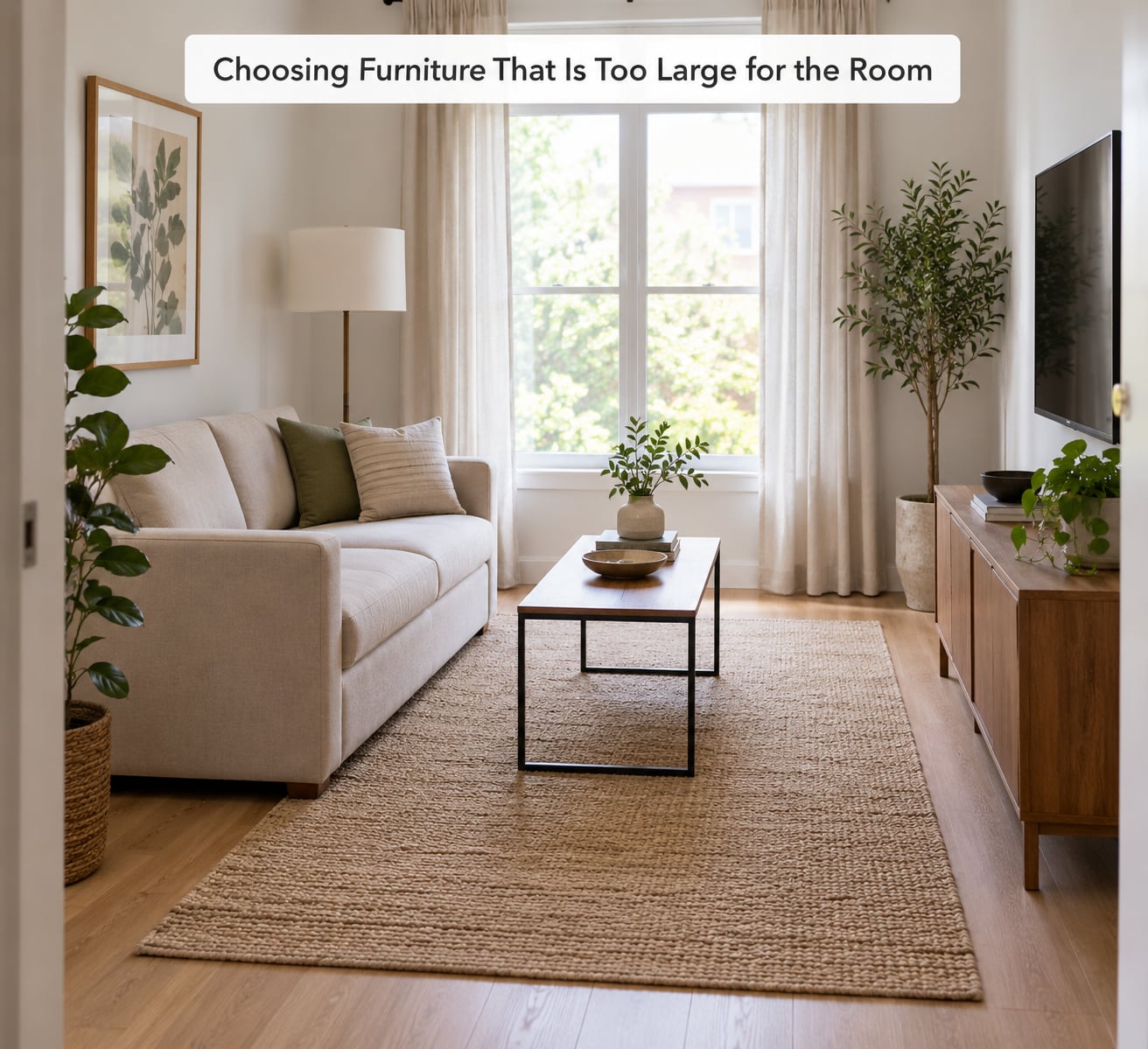
An oversized sofa is the classic example. You can measure it, tape its outline on the floor with painter’s tape, and see in thirty seconds that it eats the only path between the door and the kitchen. Rooms read as expensive when the furniture looks easy to move through, not when the pieces are impressive.
Tape before you buy. Draw the rectangle, then walk around it with a broom handle pretending to be a person carrying a drink. Leave at least 18 inches of clear circulation behind and beside every major piece, and 30 to 36 inches between the sofa and the coffee table. If the tape fails the walk test, the sofa fails the room.
A swap like this one often solves it: replace an oversized sectional with two compact chairs angled toward each other. Seating capacity stays about the same, the center of the room opens up, and the footprint drops by several square feet.
The reverse error shows up in small rentals, where three small pieces scattered around a wall look like a waiting area. One well-proportioned sofa beats a loveseat and two stools every time.
2. Pushing Every Piece Against the Wall
Line the perimeter of a room with furniture and the middle becomes a corridor nobody uses. This is the decorating mistake that most often makes a small living room look worse than it is, and it is also the one designers name first.
The fix is a conversation area rather than a wall ring. Float the main sofa 8 to 12 inches off the wall, place a chair across from it with a similar gap to another wall, and let the pieces face each other. If the ceiling is low, push one piece back against the wall and float the rest, which stops the room from reading as a single flat line.
Keep 18 inches of walking room around the group so people can reach a seat without stepping over the coffee table, and never let a door or a walkway get narrower than that. In an open-plan space, floating the living room furniture also marks the zone without a wall, which is cheaper than a room divider and looks better.
3. Arranging Furniture Just for a TV
Somewhere in the last decade every living room started facing a screen. It is a workable layout if watching is genuinely the room’s main job, but a room arranged for viewing usually leaves people angled at each other’s shoulders rather than at each other.
Turn two of the seats by about 30 degrees toward the center of the group. A sofa plus a loveseat set at right angles, or a sofa with two chairs pulled in from the far corners, keeps the screen visible for most seats while making conversation the main event. If your sofa is the only piece that can see the screen, that tells you the room is a media room, and it is fine to accept that and style it like one.
Check the rest of the room for one-sidedness too. If the only lamp is behind the sofa, or all the seating points the same direction, the layout is telling visitors where to look and nowhere else to go.
4. Ignoring the Focal Point
A focal point is whatever the room is built around: a fireplace, a television, a large piece of art, a view, or a shelving wall. Most rooms that feel unfocused are not missing furniture. They are missing a decision about what matters most, so every element competes and nothing anchors.
Pick the feature first, then aim the furniture at it. Let the rug lead toward it, hang the largest piece of art above the fireplace mantel or the sofa on the opposite side, and put the tallest lamp in the corner nearest to it. Visual weight should rise toward the focal point and fall away from it, which is a different approach from distributing heavy objects evenly around the four corners, a habit that flattens a room.
One caution on televisions. A screen that hangs above a working fireplace is two focal points fighting, and a large black rectangle on a pale wall pulls the eye harder than any painting will. Mounting it low, framing it with the furniture, or hiding it behind a curtain panel on a track fixes the competition without hiding the screen.
5. Mixing Too Many Colors Without a Plan
Five or six colors appearing in equal measure turns a room into a visual argument. Nothing feels wrong, and nothing settles. Thrifted pieces are the usual culprit, since each one arrives with its own history and nobody checks the palette.
The simplest structure is the 60-30-10 split. Sixty percent of the room is a neutral base, thirty percent is a supporting shade, ten percent is the accent you actually want people to notice. Work out which color is your dominant one by adding up what is already there rather than starting from scratch.
A thrift-store version of the same idea: a cream sofa, dusty blue curtains, and one rust-orange cushion as the only bright note. The blue repeats in the rug, the orange appears in two places at most, and the cream does all the quiet work of holding the room together. If two accessories in the room make you hesitate, one of them is competing with your accent and should go.
6. Using Furniture and Decor in the Wrong Scale
Scale problems are the ones people cannot name, which is why they bother them for months. A dainty frame floating above a deep sofa, a narrow coffee table stranded in front of a wide one, or a tall vase on a low console all produce the same feeling: something is off and nobody can say what.
Two habits fix most of it. Group in odd numbers, so three objects of different heights read as a composition while two read as a pair that was bought together by accident. And when something feels too small, go bigger on one piece instead of adding more pieces, since a single large artwork does more for a blank wall than four small frames do.
Textiles follow the same logic. Drapes that stop an inch above the floor make the ceiling look lower and the sofa look wider. Let the panels pool slightly or end within an inch of the floor, and check the ratio in the room rather than trusting a product photo.
In a genuinely small room, scale cuts both ways. Resist buying every oversized object at once, and pick one statement piece, a large mirror or a wide piece of art, then keep the supporting objects modest.
7. Hanging Art at the Wrong Height
Art hung high looks like an attempt to make a low-ceilinged room taller, and it always backfires. When the gap between the frame and the furniture below is large, the art stops belonging to the sofa and starts floating on its own, and the wall behind it reads as empty space.
Two measurements solve nearly every case. Hang art 6 to 8 inches above the back of the sofa, or align the center of the artwork with the top of nearby furniture so the eye connects them. When there is no furniture underneath, use standard eye level, roughly 57 to 60 inches from the floor to the center of the piece.
For more than one frame, group first and hang second. Lay the group out on the floor, trace the outline, move it upstairs, and transfer that outline to the wall with a level. Two or three mismatched frames hung in one grouping look intentional in a way that the same frames scattered across the wall never will.
8. Skipping Layered Lighting
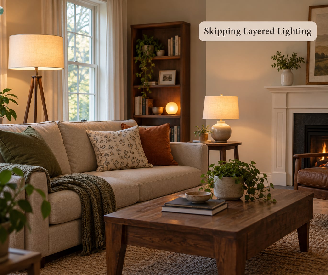
A single ceiling light makes a room look like a waiting area, and people say so constantly on decorating forums, usually in the same words: the overhead light is making the space feel cold. It flattens texture, throws shadows under furniture, and turns evening into an interrogation.
Three layers fix it without touching any wiring. Ambient light is the ceiling fixture or a flush mount, left mostly off after dark. Task light is the floor lamp beside the sofa or swing-arm wall sconces at reading height. Accent light is the small stuff, a table lamp on a console, a candle, a lit shelf, or an uplight aimed at a plant or a wall.
Switching bulbs does most of the work for almost nothing. Aim for 2700K warm white in living spaces, which softens the tone compared with the 4000K bulbs people install by default. Put lamps where they can be turned off individually, so a room has three dimming options instead of one switch, and the change is immediate in how a space reads on an evening.
If you rent, floor lamps and battery candles cover most of this without a single hole in a wall.
9. Overloading Surfaces with Accessories
Crowded coffee tables and end tables are the reason rooms look busy rather than layered. Every small object adds a little visual weight, and past a certain point the surface stops reading as a surface and becomes a pile.
The rule of three does most of the cleanup. Pick three related objects, vary their heights, vary their textures, and cluster them on one end of the table rather than spreading them evenly. Leave the rest of the surface empty, because empty space is what lets the grouping look deliberate.
The same approach works on mantels and shelves. Three objects on a mantel, spaced with gaps, read better than seven evenly distributed ones, and if your mantel is short, two books and a lamp is plenty. Books stacked flat and stood on end next to each other give you height without buying anything, and a plant with visible growth adds life in a way that a small fake one never does.
10. Letting Textiles Fight the Color Scheme
Pillows, throws, rugs and curtains all carry pattern, and when four of them are different the room stops feeling calm. This is one of the more subtle living room decorating mistakes, because each piece is defensible on its own.
The decorating mistakes to avoid in a living room when you layer textiles
Repeat colors rather than patterns. Pick the two colors that already dominate your room and use them in the throw, the cushions and the rug, then let the patterns vary. A solid piece between two patterned ones bridges them, so a plain linen cushion in your wall color can settle a busy window treatment next to a floral rug.
Coordinating a thrifted rug is the same exercise in reverse. Pull the two strongest colors out of the rug, repeat each one somewhere else in the room, and leave everything else out. A rug that shares a color with the curtains and one with the cushions looks like it was chosen for the room, even if it was a happy accident at a flea market.
Limit the load to three patterns in a typical room, and if the room is small or the seating is close, drop to two. Texture, not print, is what carries a layered look in a compact space.
11. Making the Room Feel Closed In
Rooms feel small when daylight and movement are interrupted. A sofa back to a window kills the brightest part of the space, heavy full-length drapes darken the wall, and bulky furniture parked in the middle of a narrow room narrows it further.
Protect the light first. Keep the window treatment open during the day, and if privacy allows, switch to shades during the day and drapes at night, which gives you the best of both. If a sofa has to sit near a window, keep it low-backed so the sill and frame stay visible, and place a tall plant beside it to draw the eye upward.
Second, stop pushing weight to the center of the room. Low, wide furniture spreads a space; tall and deep pieces compress it. A mirror placed to catch a window reflects daylight into the far corner and makes a dim room read as brighter without any painting involved.
Third, check the floor. If almost nothing is visible between the front legs of the furniture, the room looks heavier than it is, and lifting a few pieces slightly or switching to slim-legged versions opens the floor plane immediately.
12. Decorating for an Empty Room Instead of Everyday Life
Look at almost any showroom arrangement and notice there is nowhere to put a cup, a book, a remote or a bag. Real rooms are used, and a layout that only works in a photograph starts working against you within a week. This is the reason so many decorating mistakes to avoid in a living room are really planning mistakes.
Plan storage before styling. A lidded basket near the sofa for throws, an ottoman that opens for blankets, and a small tray on a side table for the things that migrate out of pockets all keep surfaces clear. Design a small landing place, one surface near the door or the main seat where keys and mail live, and the clutter stops spreading.
Think about the room in real ratios. Use the 80-20 approach: the room should comfortably support the way you spend most of your time, even if the other 20 percent is a hobby or a guest scenario. A formal sitting room arranged only for occasional entertaining is fine, but be honest about which one you have.
In houses with kids or pets, decide this early. Cords get routed along baseboards or covered, low breakables move up to shelves, and washable or stain-resistant textiles get the risky jobs instead of the delicate ones. In a rental, the same thinking applies to the walls: a few well-placed pieces and freestanding lamps travel with you, while paint and drilled holes do not.
Frequently Asked Questions
Should furniture go against the wall in a living room?
Not all of it. In most rooms, one or two pieces belong against a wall for storage and stability, while the main seating floats 8 to 12 inches out to form a conversation area. Everything pressed to the perimeter leaves a dead corridor in the middle. Keep at least 18 inches of clear circulation behind and beside seating so people can reach a seat without squeezing past.
How high should art hang above a couch?
Six to eight inches above the back of the sofa is the working rule, measured from the top of the sofa frame to the bottom of the frame or canvas. If there is no furniture underneath, hang the center of the piece at standard eye level, roughly 57 to 60 inches from the floor. Above a mantel, leave 6 to 10 inches so the two do not look stacked.
How do I know if my sofa is too big for my living room?
Tape its footprint on the floor before you commit, then walk around the outline carrying something in one hand. You want at least 18 inches of clear path behind and beside it, and 30 to 36 inches between the sofa and the coffee table. If the tape blocks a doorway, a walkway, or a window, the sofa is too large for the room as it is arranged.
What is the 3-5-7 rule in decorating?
It is a restraint guideline for styling surfaces: group accessories in threes, fives, or sevens rather than scattering them in pairs or ones. Odd numbers read as composed because the eye looks for a center element, and grouping keeps small objects from spreading into visual clutter. It is a suggestion rather than a law, and it works best alongside leaving open surface around each group.
What makes a home look tacky in a living room?
Usually a mix of taste-level habits rather than one big error: shiny gold metals used everywhere, three or four mirrors competing for attention, cheap artificial plants, and bulk-bought multi-piece art packs hung as if they were a collection. Long-term trends over-committed to also date a room fast. Warm brushed metals, one purposeful mirror, and fewer larger pieces fix the effect cheaply.
What are the most common living room decorating mistakes?
The recurring list runs from layout to finishing details: furniture pushed against every wall, a sofa that does not leave a walkable path, a rug too small for the seating group, one overhead light with no lamps, art hung near the ceiling, curtains stopping short of the floor, matching showroom sets, and surfaces crowded with unrelated objects. Each one is a quick fix once you can name it.
Conclusion
If you only have a weekend, work in this order. Measure the room and tape the layout first, since every other decision depends on what actually fits. Then fix the scale: the right-size sofa, a rug that reaches under the seating group, and art hung at the right height. Next choose your focal point and let the furniture point at it.
After that comes lighting, because two warm lamps change a room faster than any accessory. Finish with color and textiles once the bones are right, keeping surfaces to a few grouped objects. That sequence is what separates the decorating mistakes to avoid in a living room from a shopping list, and it works in a rental, a studio, or a house with a lot of traffic.