If you have ever pulled a second patterned cushion onto the sofa and immediately wanted to shove it back in the closet, the problem is rarely the patterns themselves. Nothing was anchoring them.
To mix patterns in a room so it reads layered instead of loud, pick one dominant pattern as the anchor, tie the rest together with two or three shared colors, and give the room a large, a medium and a small scale. Budget an afternoon and nothing more than a measuring tape.
Table of Contents
- What You Need
- How to Mix Patterns in a Room
- Start With One Dominant Pattern
- Build a Limited Color Palette
- Mix Large, Medium, and Small Scales
- Repeat One Motif or Color
- Balance Pattern With Solid Surfaces
- Use Texture to Connect Different Patterns
- Check the Room From Across the Space
- Swap by Season if You Want a Cheap Refresh
- Common Mistakes
- Frequently Asked Questions
- How many patterns are too many in one room?
- Can you mix geometric and floral patterns?
- How do I mix patterns in a small bedroom?
- How do you mix patterns with a patterned rug?
- How can I mix patterns on a budget or in a rental?
- What is the 3-5-7 rule in decorating?
- Conclusion
What You Need
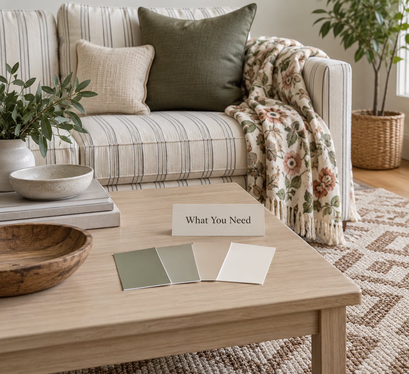
Before moving anything, take stock of what you already own. Most pattern-mixing problems turn out to be a distribution problem, not a shopping problem.
- Every patterned textile you have: cushions, throws, curtains, bedding, table runners, tea towels, rugs. Pull them all into one spot, even the ones you are unsure about.
- Paint names and swatch cards for the walls, plus a photo of each wall in daylight. Undertones shift as the light moves across the day.
- Wood and metal finishes: floor tone, table legs, lamp bases, window hardware, metal picture frames. Patterns collide with these too.
- A fixed large surface: your biggest rug, your sofa, or your bed. One of these is usually the pattern you cannot move.
- Fabric samples or offcuts, if you have any. Holding two prints side by side in your hand beats looking at photos on a screen.
Optional tools that make the job quicker:
- A measuring tape, for checking pattern scale. Lay a print flat and measure the repeat, then measure the piece it will sit on.
- A ruler or a grid sheet for sorting small patterns by size.
- Painter’s tape to mark where each pattern will go on the floor before anything gets lifted.
- A phone photo of the empty room taken from the doorway. That doorway shot becomes your before and after.
Set everything on one surface near the room, not scattered across the house. Moving pieces back and forth is where an afternoon disappears.
How to Mix Patterns in a Room
This is the repeatable process. Once you can do it in your head, you will stop second-guessing the pieces at the clearance rack.
Start With One Dominant Pattern
Choose the largest or strongest pattern in the room and let it be the hero fabric. Usually it is the rug, the sofa, or the curtains, because those are the biggest and hardest to replace.
Look at the room and ask which print carries the most visual weight, whether through size or contrast. That one leads. Everything else supports.
The failure mode here is treating all textiles as equals. Four medium patterns sitting at the same level of intensity will fight each other no matter how well the colors match.
Build a Limited Color Palette
Pull three colors from your hero fabric and let those be the whole room’s palette. One dominant, one supporting, one accent.
Then check every other pattern against those three. If a print brings in a fourth color that fights the others, it either steps down in size, moves out of the room, or gets replaced. That is the whole test.
The 60-30-10 way of thinking helps here: roughly 60 percent of the visual field in your dominant tones, 30 percent in supporting tones, 10 percent in the accent. Applied to pattern rather than paint, it stops you adding one more print just because it was on sale.
Mix Large, Medium, and Small Scales
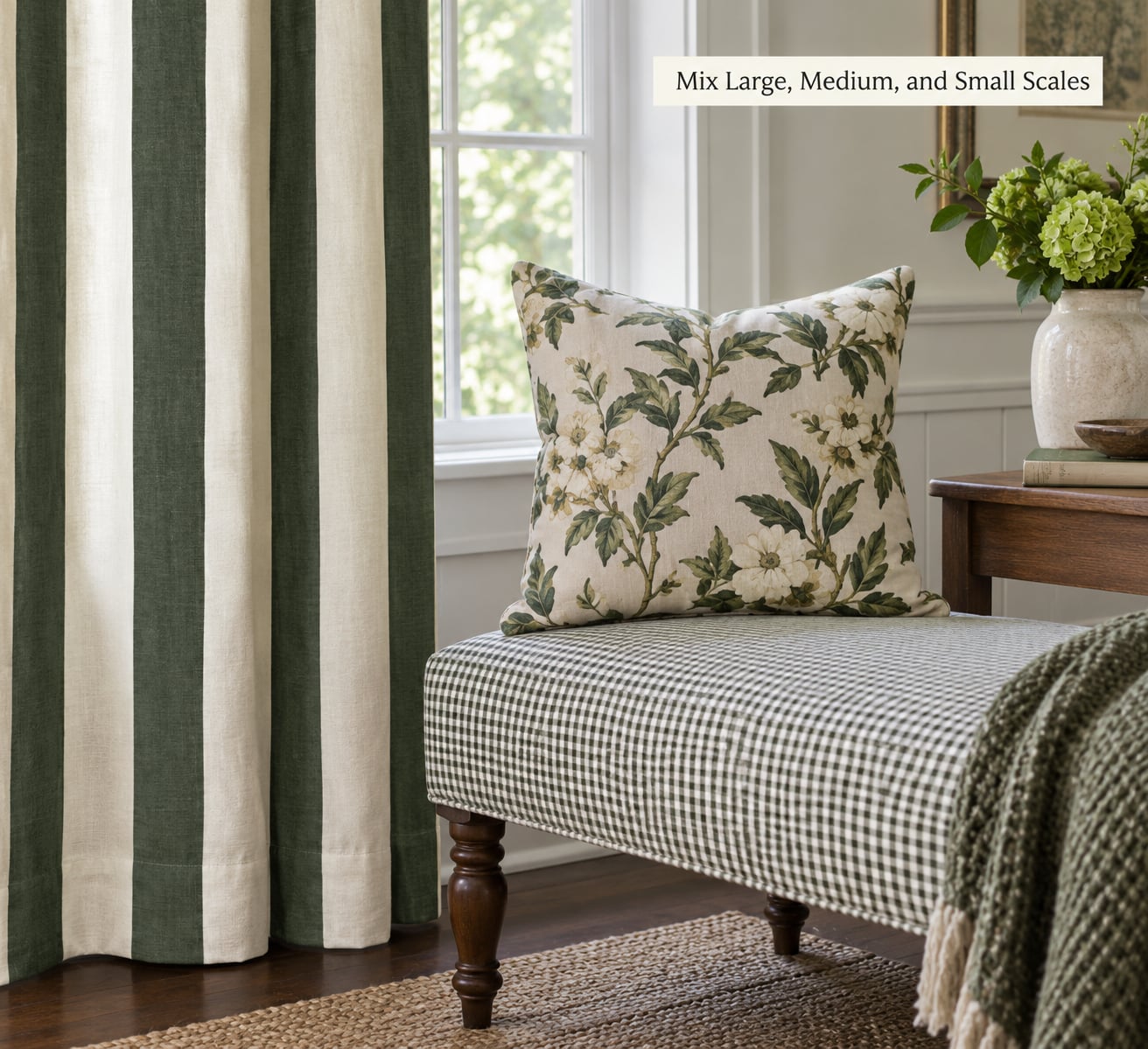
Pattern scale is the size of the motif, not the size of the object. A wide stripe on a small chair is still a large-scale pattern.
Sort your pieces into three buckets: large (motifs wider than about 4 inches, big florals, broad stripes), medium (2 to 4 inch motifs), and small (tiny ditsy prints, micro checks, pin dots). Aim for one from each bucket in the main sightline.
When scales sit next to each other, each pattern stays readable. When two prints share the same scale, they merge into visual noise, and that is the clashing feeling most people describe.
Repeat One Motif or Color
Repetition is what makes a mixed room feel deliberate rather than accidental. Pick one element and show it at least twice, in different parts of the room.
A burgundy that appears in the hero floral, in a small cushion and in the artwork ties three zones together. So does a recurring shape, a similar stripe rhythm, or the same border detail on a throw and a tea towel.
Repeat it in different sizes and you get depth without more purchases. This is the cheapest trick in the whole method.
Balance Pattern With Solid Surfaces
Solid surfaces are the pauses in the room. Plain walls, an unpainted baseboard, a solid upholstered chair, a bare wood table, a window seat in one flat color.
Keep solids between patterned pieces rather than grouping all the prints together. A busy area needs a quiet area next to it, and most living rooms have more than one spot where you land your eye.
The 30/70 rule works the same way: keep bold patterns near 30 percent of what you can see, and let neutral or subtle surfaces take the rest. Rooms that tip past that ratio start to feel busy by evening, when the lighting flattens and every print competes at once.
Use Texture to Connect Different Patterns
Texture is the bridge between prints that have nothing obvious in common. A nubby linen, a smooth cotton percale, a looped wool rug, a velvet cushion: they read as a family even when the motifs differ completely.
Lean on the same fiber in two or three places. Linen curtains with a linen-look seat cushion and a coarse wool throw will settle a floral-and-geometric pairing faster than any color trick.
Mixing textures also solves a specific problem: a small pattern next to a large one can look like wallpaper. A rough surface against a flat one resets the eye and gives each pattern its own territory.
Check the Room From Across the Space
Step back to the doorway and take the photo you took earlier. Judge the room from there, not from two feet away at the sofa.
Look for the area that draws the eye first, then ask whether that is where you want it. If one corner is doing all the talking, move the loudest print out of it or spread the same pattern to a second spot.
Then check the reverse: the spot that reads completely empty. Usually the fix there is one small repeat of a color you already have, not a new purchase.
Swap by Season if You Want a Cheap Refresh
Keep your dominant pattern and your palette in place all year, and change only the small and medium prints. Bedding, the throw, the runner and two cushions will shift the mood of a room completely for the cost of a few items.
This is also the cheapest way to test a combination before committing to it. If it works for a season with the cheap pieces, you know the large-scale arrangement is sound.
Common Mistakes
Too many patterns at one scale. Two florals of similar motif size blur into one another. Fix: keep one, swap the other for a scale you do not already have.
Every print in a different color family. Nothing connects, so the room reads as storage. Fix: pull three colors from the hero fabric and check every other print against them before it stays.
Bold patterns grouped together. Cluster them and they amplify. Fix: separate each bold print with a solid surface, a plain wall or an open stretch of floor.
Small patterns placed far apart. A tiny print on one side of the room and another motif across the space reads as two unrelated accidents. Fix: bring small prints close together, within one sightline.
Ignoring what you cannot change. The rug, the sofa and the wood floor set the palette whether you chose them or not. Fix: sample the fixed piece first, then shop around it.
Mixing eras without a link. A chintz sofa and a plain mid-century cabinet do not connect on their own. Fix: repeat one color from the chintz in a solid cushion and a frame, and let the two eras share it.
Buying before you photograph. Fix: shoot the room from the doorway, note the pattern in each zone, and only then decide what is missing.
One last tip: if a combination is bothering you and you cannot name why, take out the most recently added piece and look again. Roughly half the time, that one print was the whole problem.
Frequently Asked Questions
How many patterns are too many in one room?
Most rooms feel right with three to five distinct patterns in the main sightline, as long as at least two of them sit at different scales. Beyond five, you rarely need solids to do their job. Count what you can see from the doorway rather than what is in the room, because closed doors and tall furniture hide a surprising amount.
Can you mix geometric and floral patterns?
Yes, and that pairing is one of the easiest to pull off. Keep the two prints at clearly different scales, a small geometric with a large floral for instance, and let them share one or two colors. Texture does the rest: a plain linen or wool between them keeps the floral from competing with the sharp edges of the geometry.
How do I mix patterns in a small bedroom?
Use scale more than color, because a small room magnifies everything. Pick one pattern for the bedding, one small-scale pattern for curtains, and let walls, the headboard and the floor stay solid. Resist adding a third print near the bed, where the eye spends the most time. Fewer, better-spaced patterns read larger than many crowded ones.
How do you mix patterns with a patterned rug?
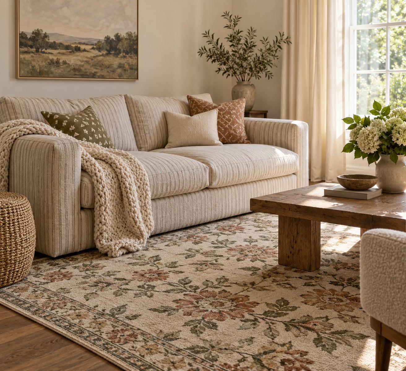
Treat the rug as your hero fabric and pull your palette from it, then keep other prints quieter and lighter than the rug. Skip any textile with a motif close in size to the rug pattern, since the two will compete across the floor. Curtains in a solid, and cushions in a small-scale print drawn from the rug colors, is a safe combination.
How can I mix patterns on a budget or in a rental?
Change only what you do not own. Curtains, cushions, throws, runners and a duvet cover will change a room completely without touching the walls or the furniture. If you are starting from a patterned sofa or a fixed rug, sample its colors and buy small pieces in those tones. Texture swaps, like a chunky knit for a smooth cotton throw, cost less and change the feel just as much.
What is the 3-5-7 rule in decorating?
The 3-5-7 rule is a loose guideline from interior styling that suggests grouping accessories in odd numbers, such as three vases, five books or seven pillows, because odd groupings feel more relaxed than symmetrical even ones. It applies to objects more than to prints. For patterns specifically, the more useful rule is the rule of three scales: one large, one medium, one small.
Conclusion
Mixing patterns in a room comes down to three decisions: one dominant pattern, a palette of two or three shared colors, and a controlled spread of large, medium and small scale. Hold solids and similar textures between the prints, repeat one color in a second and third spot, and judge the result from the doorway.
Start with the piece you cannot move, sample its colors, then add patterns around it. If the room already feels like too much, remove the most recent print before you buy anything new.