An accent wall is one wall painted in a contrasting shade while the rest of the room stays in a quiet base tone. To pick one, choose the wall your eye lands on first when you walk in, then choose a shade two or three steps darker than the walls beside it, or pull a hue straight from your rug, sofa or artwork.
The wall is the easy half. The shade is where weekend projects go sideways, because a sample chip and a painted wall are genuinely not the same thing. Test on the real surface, in the real light, for a couple of days, and the color you keep coming back to is the one worth buying.
Here is the whole process for how to pick an accent wall color without a designer, a second opinion or a repaint. Budget an afternoon for testing and a weekend for one wall of painting. You do not have to touch the other three walls at all.
Table of Contents
- What You Need
- Step-by-Step: How to Pick an Accent Wall Color
- 1. Identify the room and the wall’s job
- 2. Look at lighting and wall conditions before you pick an accent wall color
- 3. Build a color direction from the room
- 4. Narrow the options with neutrals or a bold accent
- 5. Test paint samples on the actual wall
- 6. Make the final choice by checking the whole room
- Match the paint finish to the wall
- When you can’t paint the whole wall
- Common Mistakes
- When to skip the accent wall entirely
- Frequently Asked Questions
- What are the best accent wall colors for a living room?
- How do you know which wall should be the accent wall?
- What type of paint finish is best for accent walls?
- Should I paint my walls matte or eggshell?
- Are accent walls out of style?
- Should the accent wall be darker or lighter than the other walls?
- Conclusion
What You Need
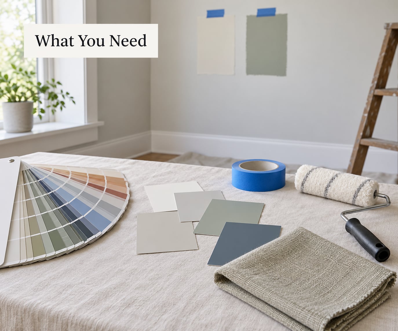
You can test a color properly with a small kit, and most of it is already in a closet:
- Two to four paint sample pots from your shortlist
- A fan deck, ideally a painted one, since paper color wheels go flat and lie to you
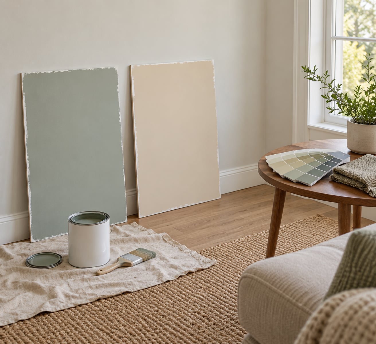
- Two or three 8-by-8-inch scrap boards of drywall or foam board, primed in the color already on the wall
- Painter’s tape, a 2-inch angled brush and a short nap roller
- A step stool or a work platform, plus a second pair of hands for anything over 10 feet
- A spackle knife and sandpaper if the wall has old nail holes or filler showing through
- Your phone, for photos at the same spot at the same hours
The boards are the part people skip, and they are the reason a sample disappoints you later. Paint brushed onto drywall that matches your existing wall color is the only honest preview of the finish you will end up with.
Before you pick anything up, write down what cannot change in the room: your flooring, white trim, appliances, window frames. Those set the boundaries. Then note where the light comes from and which direction the windows face, because that is the variable that will make two identical swatches behave like two different colors.
Step-by-Step: How to Pick an Accent Wall Color
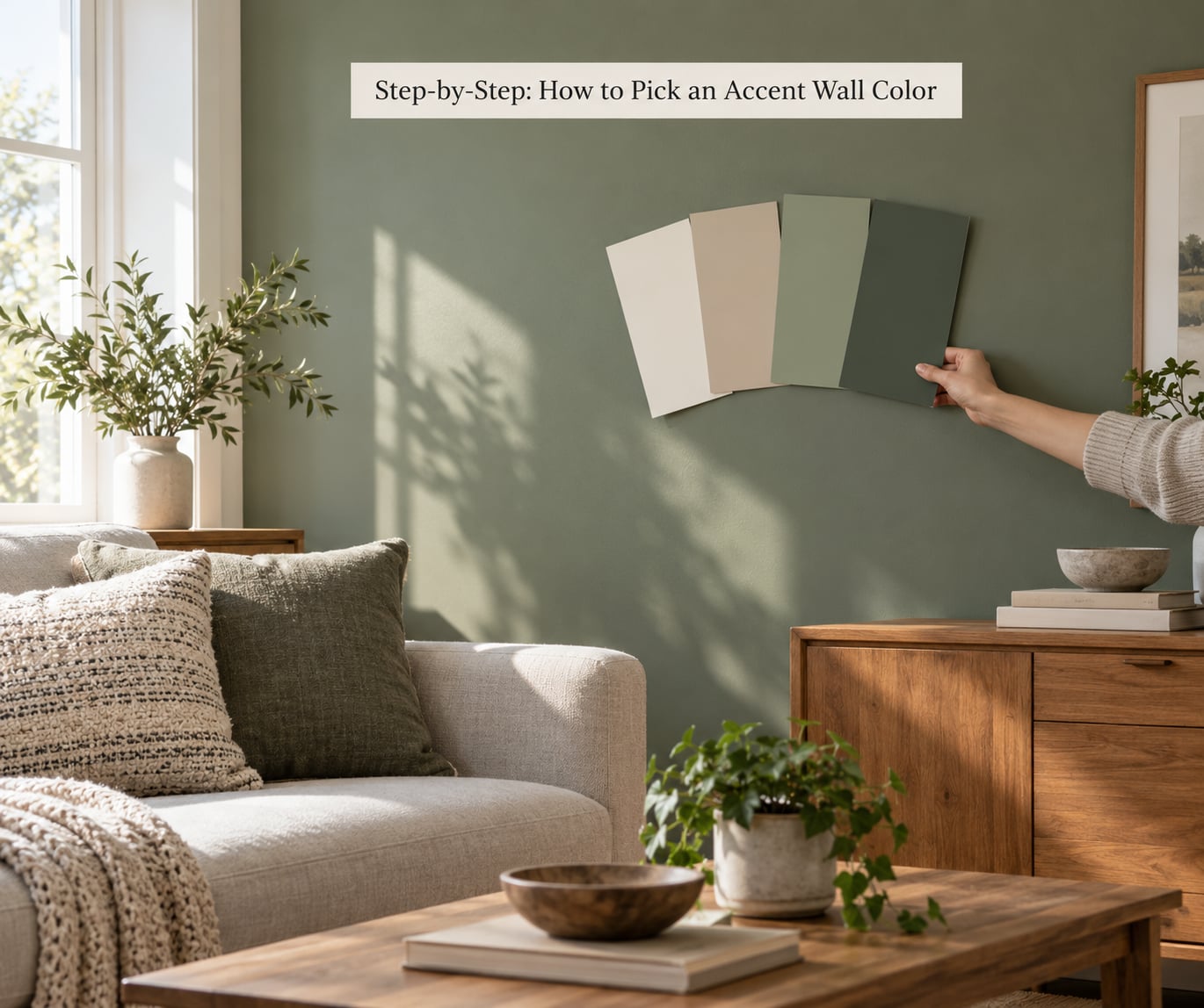
Work through these in order. Each step takes a decision away from the next one, which is how you avoid standing in a paint aisle with six pots and no plan.
1. Identify the room and the wall’s job
Before you think about color, decide what the wall is for. Is it creating a focal point, hiding an outdated treatment, drawing the eye to a fireplace, or warming up a room that gets cold light all day? The job dictates how bold you can go. A wall that has to hide a paneled texture needs saturation to disappear. A wall that already holds the room’s biggest piece of furniture can stay quiet.
Most rooms have a natural focal point already: the fireplace, the headboard, the sofa, the built-in shelving. Paint behind that, and your eye goes where you want it to. Skip walls cut by windows, doors or a stair opening, because the broken edges fight the color and you end up with two half walls instead of one statement.
| Room | Where the accent wall usually goes | Color direction |
|---|---|---|
| Living room | Behind the sofa or the fireplace | Deep blue-green, clay, or a neutral two steps darker than the base |
| Bedroom | The wall the headboard pushes against | Soft, low-saturation tones unless the room gets real daylight |
| Home office | The wall the desk faces, if it is windowless | Calm mid-tones, nothing that reflects glare onto a screen |
| Dining room | One wall, often behind the largest piece | Saturated or dark. Dining rooms take more color than living rooms |
| Bathroom | Opposite the mirror or behind the vanity | A washable finish and a mid-tone rather than something very pale |
| Small room | Whichever wall has the fewest openings | Light to mid value, warm. Skip the darkest end of the shelf |
| Open-plan space | The wall that defines the living zone | A shade readable from the kitchen so the space does not read as two rooms |
2. Look at lighting and wall conditions before you pick an accent wall color
The same paint looks different in a north-facing bedroom than it does over a west-facing one, and no amount of sample-buying fixes a bad light match. Note the direction your main windows face and treat the room as if it only has that light, because most of the year that is when you see it.
| Window direction | What the light does to color | What to choose |
|---|---|---|
| North-facing | Cool, even light with low contrast, which flattens warm tones | Warm neutrals, clay, terracotta. Cool grays look flat and tired |
| South-facing | Strong and warm for much of the day | Deeper, cooler colors hold up. Pale shades wash out and yellow |
| East-facing | Cool mornings, warm low evening light | Mid-value colors are safest. Always check the evening glow |
| West-facing | Warm and saturated late light | Cool accents balance it. Dark colors turn heavy after dark |
| Mostly artificial | The bulb decides more than the wall does | Judge the sample under your actual lamps, not under daylight |
Now check the wall itself. Old filler, patched nail holes and scuffs read as shadows under a dark color, so patch and sand first, then dust with a tack cloth so the sample bonds evenly. Textured walls take more paint and show every skipped spot. Glossy walls need sanding or a bonding primer, otherwise the new color peels in sheets a season later.
Also decide whether you are painting over the current color or cutting to bare drywall. Two coats of a lighter shade over a dark one can look blotchy forever; a primer in the same family as the new color fixes it.
3. Build a color direction from the room
Look for colors you already own and repeat one of them. Pull a hue from the rug, the sofa, the drapes, the wood tone, the artwork, even the paint on a bedroom door. Matching the undertone is what matters, not matching the exact shade. An accent wall that agrees with the room’s warmth looks deliberate; one that argues with it looks like a mistake someone else made.
Undertone is the hidden warm or cool bias inside a color. Warm colors carry yellow, red or orange. Cool colors carry blue or green. Grays, beiges and whites have undertones too, which is why two grays that look identical on a card can look like different rooms on two walls.
Fixed items set the limit. In decorating forums, people working with gray floors and gray tile keep landing on navy or slate blue because those colors hold their own against cool flooring without fighting it, and they still work with white trim and warm wood. If your floor is cool and busy, a warm clay or terracotta wall will pull the room together faster than another cool neutral will.
The 60-30-10 rule is a useful sanity check: about 60 percent of what you see in the room is your base neutral, 30 percent is secondary tones and furniture, and 10 percent is the pop. The accent wall usually counts as part of that 10 percent, which is another way of saying it should not fight everything else in the room.
4. Narrow the options with neutrals or a bold accent
There are two honest approaches. The restrained one uses a soft, tonal or neutral shade maybe two steps away from your walls, and it suits small rooms, north light, busy rugs and open plans where the color needs to travel. The expressive one uses a saturated, dark or high-contrast shade, and it earns its place when the wall has a clear job and the room is not competing with you already.
Warm neutrals and soft browns have largely taken over from the cool grays that ran through the last decade, and clay, mushroom and warm greige show up again and again in 2026 color lists. That is worth knowing, but not worth overfitting to. The color that survives your own lighting test is a better buy than the color that is having a moment.
| Color family | Pairs well with | Rooms it suits | Watch out for |
|---|---|---|---|
| Warm neutral: sand, clay, mushroom | Oak and walnut, linen, black metal | Living rooms, bedrooms, rentals | Going flat under cool bulbs |
| Deep blue: navy to slate | Warm wood, brass, cream upholstery | Living rooms, offices, dining rooms | Turning into a black hole next to a dark fireplace surround |
| Earthy green: sage to forest | Cream, terracotta, rattan, wicker | Bedrooms, bathrooms, entryways | Gray-green shades can look institutional |
| Terracotta and rust | Cream, oak, deep blue | Kitchens, dining rooms, entryways | Strong red undertones turn orange beside warm wood |
| Clay pink | Warm gray, walnut, brass | Bedrooms and small rooms | Chalky pinks disappear in north light |
| Charcoal | Light wood, white trim, glass and metal | Offices and TV walls | Needs a second light source after dark |
5. Test paint samples on the actual wall
Buy sample pots, not just cards. Cards are printed and flat; a pot is the actual formula in the actual sheen, and it will show you patches, lap marks and coverage problems before the gallon does.
Paint each shortlisted shade onto a primed scrap board in two thin coats, let them dry fully, then tape the boards to the accent wall at two heights and step back. Move them to an adjoining wall too. A color that looks right on one wall of a room can clash against a different light and a different neighbor.
Check three times: mid-morning, late afternoon and after dark with your lamps on. Paint dries lighter and less saturated than the wet sample, and a dark color shifts again as it cures, so give each board at least a day or two before you decide. Take a photo from the same spot at each check so you can compare honestly rather than from memory.
Then walk in from the front door and see what you notice first. That is your wall, whatever the tape says.
6. Make the final choice by checking the whole room
Put the furniture back before you commit. An accent color judged against bare walls looks stronger than it will with a sofa, a bed and lamps in front of it. Bring the sample board over to the floor and check the wall color against the wood, the rug and the white trim, not just against the wall.
Hang or plan the art too. If a painting is going above the sofa or the bed, decide whether the wall is echoing the art or staying quiet behind it. Two competing focal points is the most common reason an accent wall feels busy, and it usually is not the color’s fault.
Last check, and it is the one that saves money: pick the shade that looks intentional rather than the one that looks exciting. You will live with it every day.
Match the paint finish to the wall
Eggshell is the sensible default on most walls. It holds color, hides roller marks better than flat, and cleans up. Matte looks softer and more modern and it is the better choice on textured walls, plaster or limewash finishes where flat and eggshell can look patchy. Flat is fine on ceilings, and the contrast actually helps a flat ceiling make the accent wall read as a separate plane.
Save satin and semi-gloss for trim, doors and cabinets, and keep them as a separate purchase so you can match sheen if you repaint later. One semi-gloss wall next to an eggshell wall will read as a mistake because sheen changes how light hits a color.
Two practical notes. In a kitchen or bathroom, buy the washable formula. Behind a wall-mounted TV, a high sheen can bounce glare into the screen in the evening, so eggshell or matte is the calmer choice.
When you can’t paint the whole wall
Tall ceilings are the most common reason people give up. You do not need scaffolding. Cut in the edges with a brush from a stable platform, then roll the field with an extension roller from the floor. Work in sections you can finish in one sitting, because a wet edge halfway around the room will lap and show.
Rentals are the other one. Read your lease first, and if painting is not allowed, lean two or three primed boards against the wall instead. On move-out you will still have nail holes and a scuffed corner, so patch and touch up with the leftover pot while you still have it.
If you can reach the wall but not the ceiling, tape a clean line at the top and paint down to it. A straight taped edge reads as intentional trim; a hand-cut uneven one never does.
Common Mistakes
Almost every regret I have seen traced back to one of these:
- Choosing from a chip or a phone screen. Fix: test on primed boards at least 8 inches square, in the real sheen.
- Testing at one time of day. Fix: check mid-morning, late afternoon and at night with lamps on, before buying a gallon.
- Copying a color you liked in someone else’s room. Fix: pull the hue from something you own, and match the undertone rather than the shade.
- Ignoring what cannot change. Fix: check the color against flooring, tile, trim and appliances first, since those decide your boundaries.
- Picking a shade that competes with every accessory. Fix: let the wall be the loudest thing, or the second loudest behind one clear focal point. Not both.
- Deciding before the furniture goes back. Fix: re-check the sample with the room fully dressed and the lamps on.
- Skipping patches on filler and nail holes. Fix: spackle, sand and dust first. Dark paint turns every old hole into a visible crater.
- Buying one sheen and mixing brands. Fix: buy the whole accent wall in a single formula, including the primer.
When to skip the accent wall entirely
Sometimes the honest answer is that the wall will not help. Skip it in a very small room already full of pattern, where another strong color has nowhere to go. Skip it in a rental you cannot paint, and in a room with ceilings you cannot safely reach. Skip it when something in the room is already the focal point, such as a tiled fireplace surround, a large media unit or a mural. Skip it in an open-plan space where the wall is a pass-through to another room and the color would be visible from every seat.
In those rooms, a different move does the same job. Lean two large primed boards against the wall, hang a textile or a set of framed pieces on it, or paint the trim a shade deeper than the walls so the room gains a focal point without a fifth color.
Frequently Asked Questions
What are the best accent wall colors for a living room?
The most reliable living room accents are deep navy, slate blue, muted sage, terracotta and a warm greige two steps darker than your walls. Navy and slate blue are the safest bold choices, because they sit well against warm wood flooring and white trim while staying calm next to cool gray floors. Sage and clay suit rooms with neutral furniture. Test whichever two you like on primed boards in your own light before you commit.
How do you know which wall should be the accent wall?
Pick the natural focal point of the room: the wall behind the fireplace, the sofa, the headboard or the built-in shelving. A good test is to walk in the front door and notice which wall your eye lands on first, because that is what visitors do too. Avoid walls broken up by windows, doors or stair openings, since the interruptions leave you with awkward half walls instead of one clean statement.
What type of paint finish is best for accent walls?
Eggshell is the best all-round finish for an accent wall. It holds color well, hides roller marks better than flat and wipes clean, which matters in a living room or hallway. Matte looks softer and suits textured walls, plaster or limewash. Keep satin and semi-gloss for trim, doors and cabinets, and buy a washable formula for kitchens and bathrooms.
Should I paint my walls matte or eggshell?
Choose eggshell for most rooms, especially any wall you touch daily or where scuffs show. Pick matte when the wall has texture or a limewash or plaster finish, since flatter sheens can look uneven there. Use flat on ceilings, and use a washable eggshell or satin in bathrooms and kitchens. If your whole room already has one finish, match it so the accent wall does not read as a repair.
Are accent walls out of style?
No. What changed is the palette, not the idea. Designers now lean toward color-drenching, where two or three related shades wrap a room, and toward warmer neutrals and browns in place of cool gray. A single deeper wall still works well when it is chosen deliberately, tested in real light and paired with furniture and art that support it.
Should the accent wall be darker or lighter than the other walls?
Usually darker or more saturated, by two or three steps, since contrast is what makes the wall read as separate. Lighter accent walls work too, but they suit small rooms, north-facing light and spaces with tall windows. Going very dark is a mistake in a dim room or next to a black fireplace surround, where the wall turns into a hole. Sample the darkest option at night before you choose it.
Conclusion
Start with the two things you cannot change: the light in the room and the colors you already own. Decide which wall is doing the work, pick a shade two or three steps away from your walls or one that repeats a hue you own, then paint two or three sample pots onto primed boards and leave them up for a couple of days. Check them in morning light, afternoon light and under your lamps, and bring the furniture back before you decide. That afternoon of patience costs far less than repainting a wall you regret.