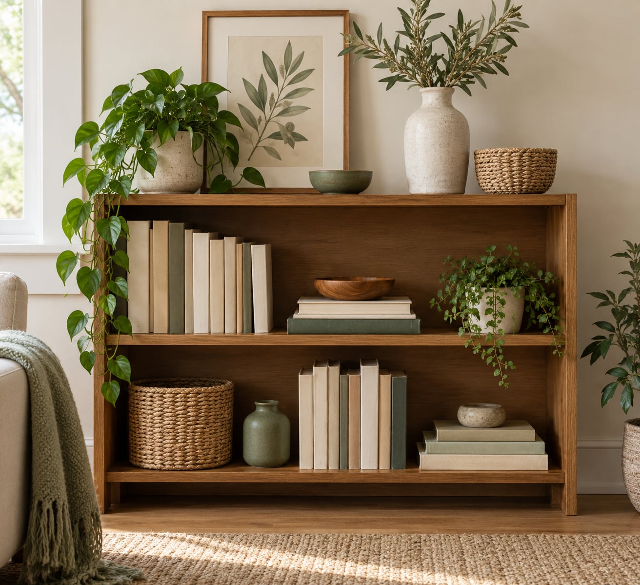
The trick to knowing how to decorate a bookshelf that looks styled is that the tallest object goes down first, the groups come in threes, the empty space is deliberate, and everything shares one color story. Strip a shelf down, put the books back in simple blocks, then add one focal object per shelf and a couple of supporting pieces. The whole unit takes about an hour for a standard bookcase, and none of it requires perfect symmetry.
The reason a shelf reads as styled rather than stuffed is visual weight. When a single shelf is overloaded, the eye has nowhere to rest and the whole unit flattens out. Empty gaps and a limited number of larger objects give the eye somewhere to land, which is why taking things off a shelf usually improves it faster than adding things to it.
There is no single correct bookshelf arrangement, and the styled-for-photo version is not always the one you want to live with. The approach below is a sequence you can repeat, with the parts you can skip marked as optional.
Table of Contents
- What You Need
- Step-by-Step: How to Decorate a Bookshelf That Looks Styled
- Clear and Measure the Bookshelf
- Choose a Color and Style Direction
- Group Books and Objects Instead of Filling Every Inch
- Add One Focal Point per Shelf
- Layer Height, Texture, and Shape
- Finish with Greenery and Final Adjustments
- How to Decorate a Bookshelf That Looks Styled When You Own More Books Than Decor
- Style the Whole Bookcase, Not One Shelf at a Time
- Common Mistakes
- Frequently Asked Questions
- How do I style a bookshelf without making it look messy?
- What colors should I use when styling a bookshelf?
- How do I mix books and decorative objects on a shelf?
- How should I style a small or narrow bookshelf?
- How do I make a bookshelf look balanced without filling every shelf?
- Can I style a closed bookshelf or cabinet?
What You Need
You need very little. The objects are mostly already in your home, and the tool you actually use is your hands plus a tape measure.
- Your books, sorted into rough groups. Pull them all off the shelves and stack them on the floor or a bed by category, or by spine color if you plan to color block. Sorting is the step most people skip, and it is the one that makes the rest go fast.
- Objects in three sizes. One tall piece per shelf, two or three medium pieces, and a handful of small ones. Height variety is what stops a shelf looking like a row of identical spines.
- Containers. A woven basket, a lidded box, or a ceramic vessel for the small clutter that otherwise collects on shelves.
- Something flat and framed. A print, a photo, or a piece of cardboard with something you like on it. Leaning it against the back panel uses shelf depth that books alone waste.
- Greenery, optional. One small plant with a low-light tolerance is enough. Trailing varieties soften a hard corner better than an upright one.
- A tape measure and a pencil. Note the shelf width, the depth, and the gap to whatever sits above. A shelf 30 inches wide behaves very differently from a 12 inch cubby.
- Bookends, optional. Thrifted ones work well, and a heavy ceramic animal or a stack of hardbacks holds a leaning row perfectly well.
Step-by-Step: How to Decorate a Bookshelf That Looks Styled
Clear and Measure the Bookshelf
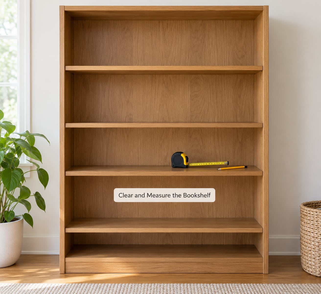
Take everything off. Dust the shelf, the back panel, and the sides while it is bare, because this is the only moment you can reach the corners.
Measure three things: the width of each shelf, its depth, and the clear height above it. These numbers decide what is possible. A shelf 8 inches deep holds a framed print behind a row of books. A shelf 4 inches deep does not, and trying it looks cramped.
Then decide per shelf what job it is doing. A shelf you pull a book from daily wants to be easy to browse. A shelf above eye level is display only and can hold bigger, emptier groupings. Step one worked if you can name each shelf’s job in a few words.
Choose a Color and Style Direction
Pick two or three colors before you place a single object, then let every item stay inside that range. Two neutrals plus one accent is a reliable starting point: cream, warm wood, and a single deep green, for example.
Decide on a style word too, because it filters your choices. Modern leans on clean lines and few objects. Collected means many small things with a story, arranged tightly. Minimal means books only, with one object per shelf. Eclectic is the most forgiving, and it needs the tightest color control.
If your books already carry a lot of color, keep the decor quiet. If your books are plain, let the objects carry the color. Trying to do both is why shelves look busy.
Group Books and Objects Instead of Filling Every Inch
This is where most styled shelves succeed or fail. Work in simple blocks: about a third of the width to a group of upright books, another third to a horizontal stack of three or four hardbacks, and the final third to a taller grouping with a bookend. Vary the block widths slightly from shelf to shelf.
A workable ratio is one or two decorative objects for every three to five books. Another way to say it: roughly 60 to 70 percent books, 30 to 40 percent everything else. When you exceed it, the shelf starts to look like a display case with books in it.
Leave real gaps. An empty hand’s width between two groups reads as breathing room at normal viewing distance. Books pushed flat to the back panel waste the depth, so pull the front row forward a couple of inches and let the second row show behind it.
Add One Focal Point per Shelf
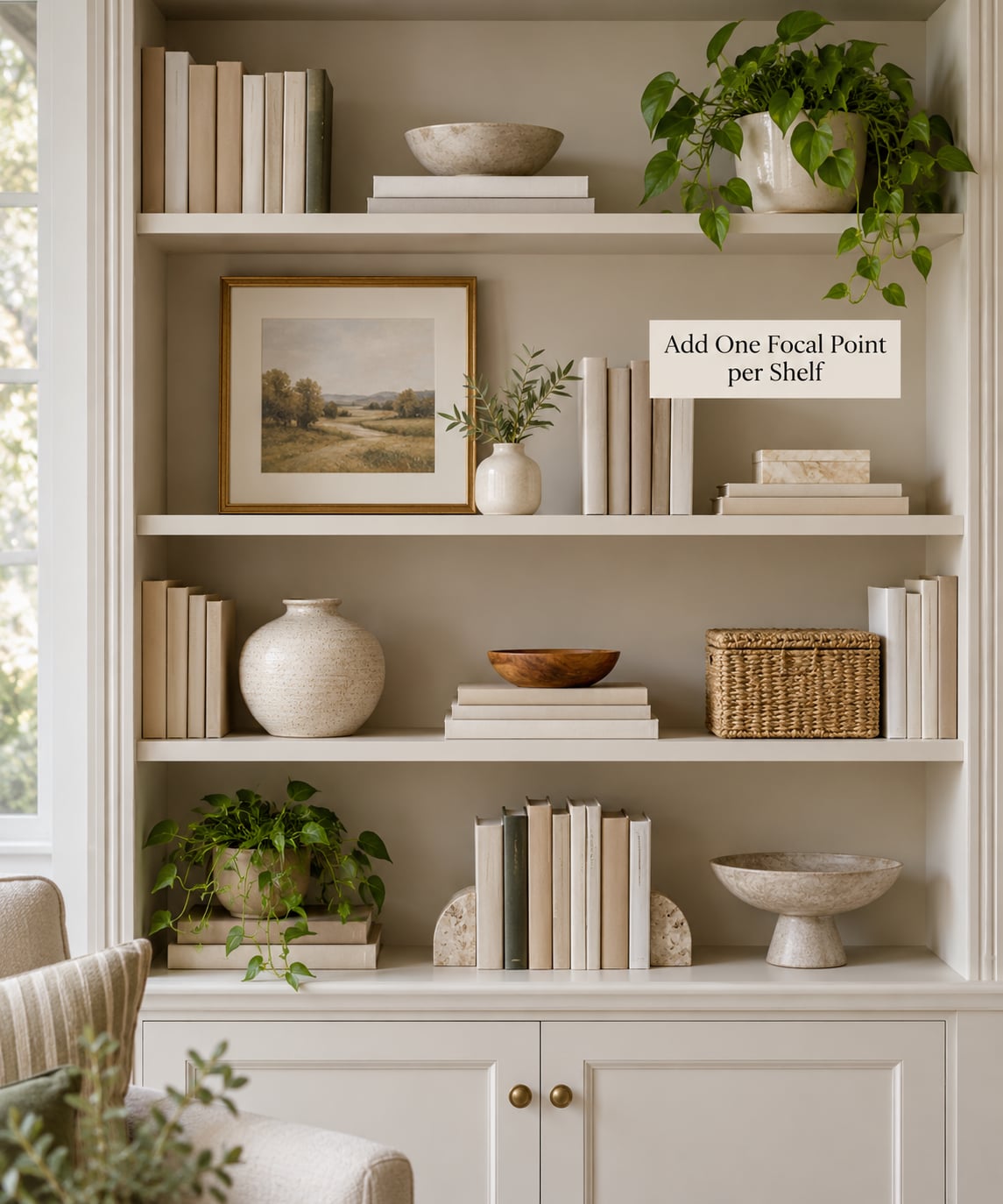
Each shelf gets one object that is clearly larger or more distinctive than the rest: a tall vase, a leaning framed print, a small lamp, a stacked pair of books with something on top. The eye needs one place to land per shelf, and that object is the place.
Set it at the end of a book group rather than floating in the middle of empty space, and keep its base at or just below the top of the books beside it. Three placements work well: the tallest piece on the top shelf near the center, a second grouping on a middle shelf, and a third lower and off to one side. That loose triangle gives the whole unit a rhythm.
Two objects can share a shelf if they clearly belong together, and a pair of matching vases or a set of stacked boxes reads as one group. Two unrelated objects of equal size just compete.
Layer Height, Texture, and Shape
Vary height in steps rather than at random. A good shelf has something around 4 inches, something around 8 inches, and one taller piece, so the eye moves across the shelf instead of scanning a flat line.
Mix surface textures too. Matte ceramics beside glossy spines, a woven basket against smooth wood, rough clay against paper. Texture separates objects that are similar in size and color, which is how you keep a tight palette from looking flat.
Shapes matter as well: one round form offsets a run of rectangles, and a single angular object keeps soft ceramics from turning into a sweet pile. Use the full depth of the shelf, leaning a print or a small platter behind the front row so the shelf has a back layer as well as a front one.
Finish with Greenery and Final Adjustments
Add greenery last and lightly. A trailing plant on one shelf breaks the hard vertical line that a row of books creates, and a second low plant on the opposite side of the unit keeps the composition from leaning. Set plants back a couple of inches so their leaves sit behind the book line rather than in front of it.
One small lamp adds more to a shelf than any single decorative object, because it changes how the shelf looks at night. Use a rechargeable or battery version so there is no cord to hide and no hole to drill for anyone who restyles often.
Then step back two paces and run the self-test: is there empty space on every shelf, one clear focal point per shelf, one or two colors repeated across the whole unit, and no shelf carrying noticeably more visual weight than its neighbor? If a shelf fails, remove something before you add something.
How to Decorate a Bookshelf That Looks Styled When You Own More Books Than Decor
This is the common version of the problem, and it has an easy answer. When books outnumber objects, let the books be the styling. Group them by spine color across one shelf, alternate vertical rows with horizontal stacks, or leave a few covers facing outward on a single shelf as a display row.
Turn a leaning row into a composition by resting it against a stack of hardbacks, and use a thrifted object as a bookend. On shelves with no decor at all, vary the heights of the blocks and leave one visible gap per shelf. That alone reads as designed.
If a shelf is above a radiator, in a dim hallway, or in an alcove where nothing tall fits, work flat: horizontal stacks, framed art leaning at the back, and shallow objects. A low shelf is not a failed shelf, it is a different canvas.
Style the Whole Bookcase, Not One Shelf at a Time
Once the individual shelves are done, look at the entire unit. Read it as one composition with visual weight rather than as six separate problems. A tall object low on the unit pulls the eye down, and a heavy object on a high shelf pulls it up, so spread the heaviest pieces across different heights instead of stacking all of them at eye level.
Repeat your two or three palette colors on alternating shelves so the eye connects shelves that are not adjacent. Symmetry is optional; even visual weight is not. An asymmetric shelf that balances out reads as relaxed, while a perfectly mirrored shelf often reads as staged.
Finish by looking at the unit the way a visitor would: from the doorway, not from inches away. Anything that jumps out at that distance is either the focal point you wanted or something that needs to go back in a box.
Common Mistakes
Almost every shelf that looks cluttered has one of these problems, and each has a quick fix.
- Filling every inch. The fix is to remove a group from the middle of a shelf rather than from the end, which leaves a deliberate gap in the center where the eye expects air.
- Too many small objects. The fix is to put the small things in a basket or a lidded box and treat the container as one object.
- One tall object and nothing else. A lone tall piece on a flat shelf looks accidental. Pair it with a low horizontal stack so the two shapes describe a range.
- Uniform book heights. Combine upright rows, leaning rows, and flat stacks on the same shelf. Vary the block widths so the shelf has at least three distinct sections.
- Every shelf decorated the same way. Alternate: a books-and-one-object shelf, then a display shelf with a larger grouping. Alternating makes a full unit look planned.
- Books pushed to the back. Pull the front row forward two inches and let the second row read behind it, which adds depth to a flat shelf.
- Mismatched colors everywhere. Pick two colors and let a third appear once or twice. Repetition does more for a shelf than variety does.
- Ignoring the limits of the shelf. Deep shelving, short shelves, dark wood, and low ceilings each need a different scale of object. Measure first, then choose.
Two final tips that pay off fast. If the shelf is used daily, style the working shelves last and keep them the simplest, so reachability beats decoration. And rotate rather than redecorate: swap two or three objects with the season and leave the structure alone, which keeps a shelf you already like from going stale.
Frequently Asked Questions
How do I style a bookshelf without making it look messy?
Leave visible empty space on every shelf, group objects in threes rather than scattering them, and limit decor to one or two pieces for every three to five books. Vary heights so the eye has a high point and a low point on each shelf. If a shelf still reads as cluttered, take one group off the center and leave the gap there.
What colors should I use when styling a bookshelf?
Choose two or three colors and repeat them across every shelf of the unit. Neutral tones with one accent are the safest choice because they let the books stay the loudest element. If your book spines are already colorful, keep the decor neutral so the palette does not compete. Warm wood, cream, and one deeper shade such as forest green or terracotta work in most rooms.
How do I mix books and decorative objects on a shelf?
Keep the books in simple blocks and put the objects at the transitions between them, not scattered through the middle. A common pattern is one third upright books, one third flat stack, and one third taller grouping with a bookend. Pull the front row of books forward slightly so the shelf has depth, and let a framed print lean behind it.
How should I style a small or narrow bookshelf?
Scale everything down. Skip tall vases and table lamps, since they will crowd a narrow shelf, and use horizontal stacks of hardbacks, small framed prints, and shallow ceramics instead. Leave more empty space proportionally than you would on a wide shelf, because a narrow space fills visually faster. One or two focal objects per shelf is plenty.
How do I make a bookshelf look balanced without filling every shelf?
Balance visual weight instead of volume. Put a tall object on one shelf and a low, wide grouping on another, then spread the heaviest pieces across different heights so the unit does not all sit at eye level. Repeat two or three colors on alternating shelves to connect them. Completely empty shelves are fine if they read as intentional, especially at the top or bottom of a unit.
Can I style a closed bookshelf or cabinet?
Yes, but the visible surface changes what works. Keep the top surface to a vignette of two or three objects, such as a stacked pair of books with a small bowl and a trailing plant, and leave clear space around them. Avoid a row of small items along the front edge, which hides the objects behind it. If the doors are glazed, style one shelf strongly and keep the others calmer.
Start with the shelf you look at most and clear it completely. Sort the books, put the tallest object down first, work in groups of three, and stop when you see a gap you are tempted to fill. The rest of the unit follows the same order, and most of it takes an hour. That is how to decorate a bookshelf that looks styled without buying a single new object.