Sorting books by color comes down to four moves: group them by the color of their spines, choose a pattern, stand each group up tallest book to shortest, and push every spine flush to the front edge of the shelf. On a single bookcase that is 30 to 45 minutes of actual work. I will also be honest about the part most articles skip, which is that color sorting makes books harder to find unless you add one small step at the end.
The method works on any shelf. Built-ins, open shelving in a kitchen, a freestanding bookcase in a hall, a low display shelf in a living room. What changes is how much leeway you have, and a small apartment shelf needs a much simpler pattern than a wall of shelving.
If you have never done it, start with one shelf rather than the whole bookcase. Twenty minutes on a single row teaches you more than an afternoon of shuffling paperbacks around.
Table of Contents
- What You Need
- Step-by-Step: How to Arrange Books on a Bookshelf by Color
- 1. Sort Your Books Into Color Groups
- 2. Choose a Color Pattern for the Entire Bookshelf
- 3. Test the Arrangement Before Placing Every Book
- 4. Arrange the Books from Largest to Smallest
- 5. Add Bookends and Balance the Shelf
- 6. Finish with a Practical, Livable Display
- Common Mistakes
- Frequently Asked Questions
- Should every bookshelf in the room use the same color pattern?
- How do I make color-arranged books look less perfect or artificial?
- Where should I put books with faded, damaged, or mismatched spines?
- What is the best way to keep color-arranged books from falling over?
- Should I arrange the colors as a rainbow or as a two-color gradient?
- How do I keep a colorful bookshelf from becoming dusty?
- Conclusion
What You Need
None of this is required, and the more honest answer is that a plain rainbow shelf needs nothing but the books and your hands.
- The books. Pull the whole shelf out first, including anything at the back and under the last row of paperbacks.
- A pair of bookends. Two are enough for a single shelf. Heavy ones hold a gradient in place once you start nudging things.
- A pencil and small slips of paper or masking tape. For labeling a group without committing. A paper tag under a stack of yellow books is faster than writing on spines.
- A soft cloth or a small brush. Optional, for wiping spines as you go. Dust on dark covers kills a gradient faster than a mismatched color.
A ladder is worth grabbing for anything above shoulder height, and a second pair of hands makes the tall shelves much less annoying.
Step-by-Step: How to Arrange Books on a Bookshelf by Color
1. Sort Your Books Into Color Groups
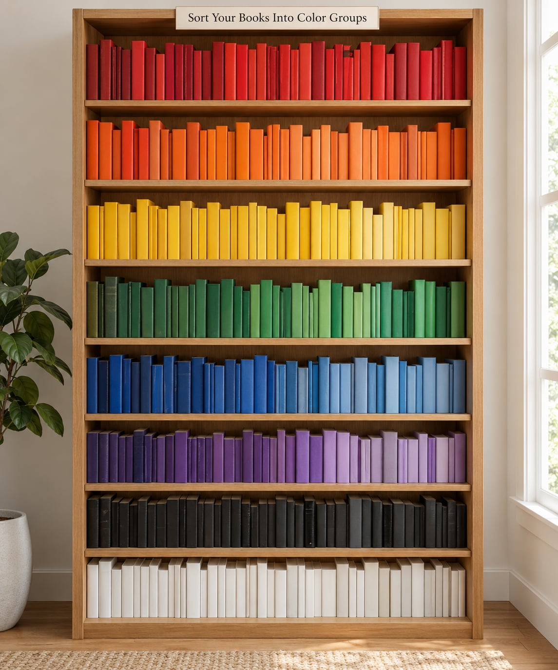
Read the spine, not the cover. Most covers photograph beautifully and tell you nothing about what the shelf will look like, because you only see the spine once the book is standing up.
Judge each book by whichever color covers the largest part of its spine. A cream book with a thin navy band is a cream book. This rule alone fixes most of the arguments people have with this method.
Then handle the awkward cases:
- Neutrals. Black, white, cream, grey and brown are their own group, not leftovers. A run of white spines in the middle of a rainbow reads as a deliberate pause.
- Repeated colors. If you own nine yellow books, they are one group, not nine tiny ones.
- Multicolored spines. Gradient and illustrated spines go wherever their strongest color falls, or into a shared mixed pile if you cannot decide.
- Books you would not call any color. Do not bin them. Group them by series instead, so a five-book set stays a single unit.
If your collection is mostly black, grey or navy, stop forcing a rainbow. Sort by tone instead, lightest to darkest, or sort by cover illustration which gives you far more variety than the spines do.
2. Choose a Color Pattern for the Entire Bookshelf
Decide the pattern before you place a single book, because a color shelf that changes logic halfway along reads as a mistake rather than a style.
These five patterns cover almost every shelf I have seen work:
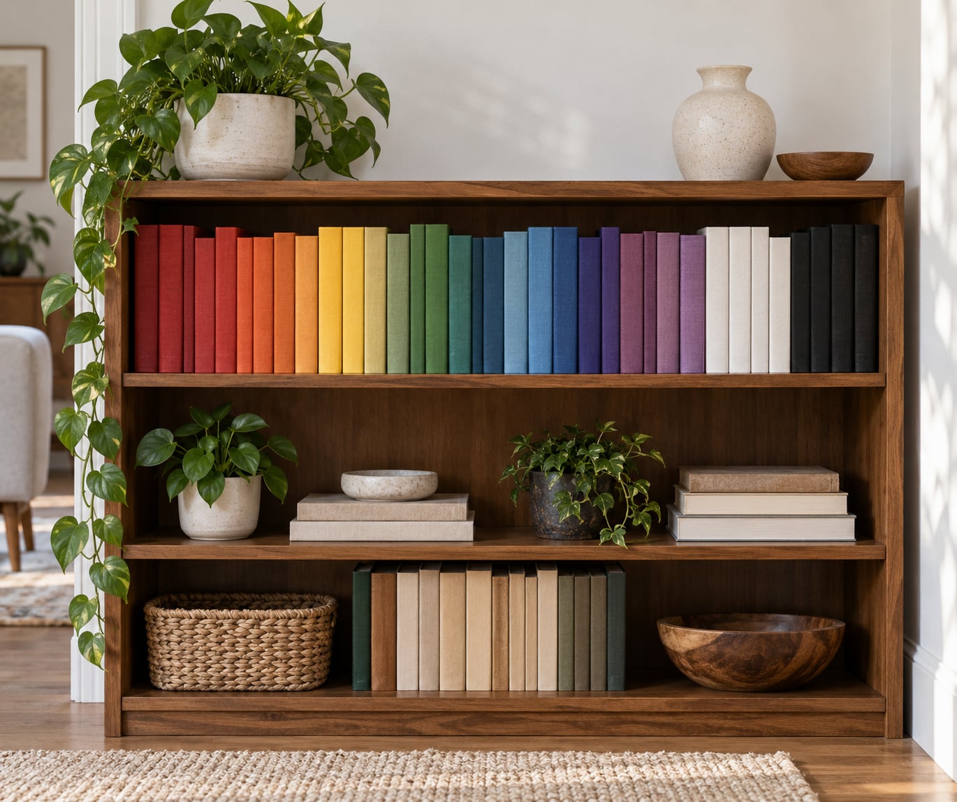
- Full rainbow. Red and orange, then yellow, green, blue, violet, with neutrals at one end or at both ends. This is the one people picture, and it only works on a shelf with real color range.
- Two-color gradient. One hue to its opposite, say teal into rust. Much easier to keep looking right, and it suits small shelves where a seven-color rainbow looks busy.
- Light to dark. Every color sorted by value, palest to deepest. This is the most forgiving option because it stays readable even when the hues are muddled.
- Alternating color blocks. Two colors in bands, for example ten deep blue, ten cream, ten deep blue. Bold, and it hides gaps well.
- Rainbow per shelf. Each shelf runs its own spectrum rather than the whole bookcase running one long spectrum. Best when your shelves are separated by a divider or a change of wall.
Whichever you pick, the rule is that the same logic repeats on every shelf. One rainbow on top and color blocks underneath is the combination that makes people ask what happened to half the bookcase.
3. Test the Arrangement Before Placing Every Book
Do not slide 200 books in one at a time and judge it at the end. Build one short run, around a foot of shelf, and step back.
Two things only show up at that scale. First, whether your chosen hue order actually reads as a gradient from where people sit, and second, whether the colors you assumed you owned are really there. Plenty of shelves turn out to be four colors deep once the paperbacks are out of the way.
Label your piles as you make them. A strip of masking tape with a pencil word on it, tucked under the stack, keeps you from re-sorting the same group twice. Once the run looks right, work along the shelf in the same order and keep the same rhythm.
4. Arrange the Books from Largest to Smallest
Inside each color group, order by height, tallest book down to shortest. This is the step that turns a pile of colors into a clean band, because the tops of the spines fall into a smooth line instead of a jagged one.
Sliding height in descending order also improves stability. A short paperback leaning between two tall hardcovers is what starts the collapse, and it is usually on the first pass, not months later.
One warning. Height is a sorting tool, not a demolition plan. Large art books and thick hardbacks are often what is propping up a run of lighter paperbacks, so move them only as a group and check that nothing above them shifts. Books you have stacked flat to fill a gap are doing the same job quietly.
If you also want size in the mix, the usual approach is to sort the shelf into three height bands first, then color within each band. It is more work and it gives a tidier result on a shelf where height varies a lot.
5. Add Bookends and Balance the Shelf
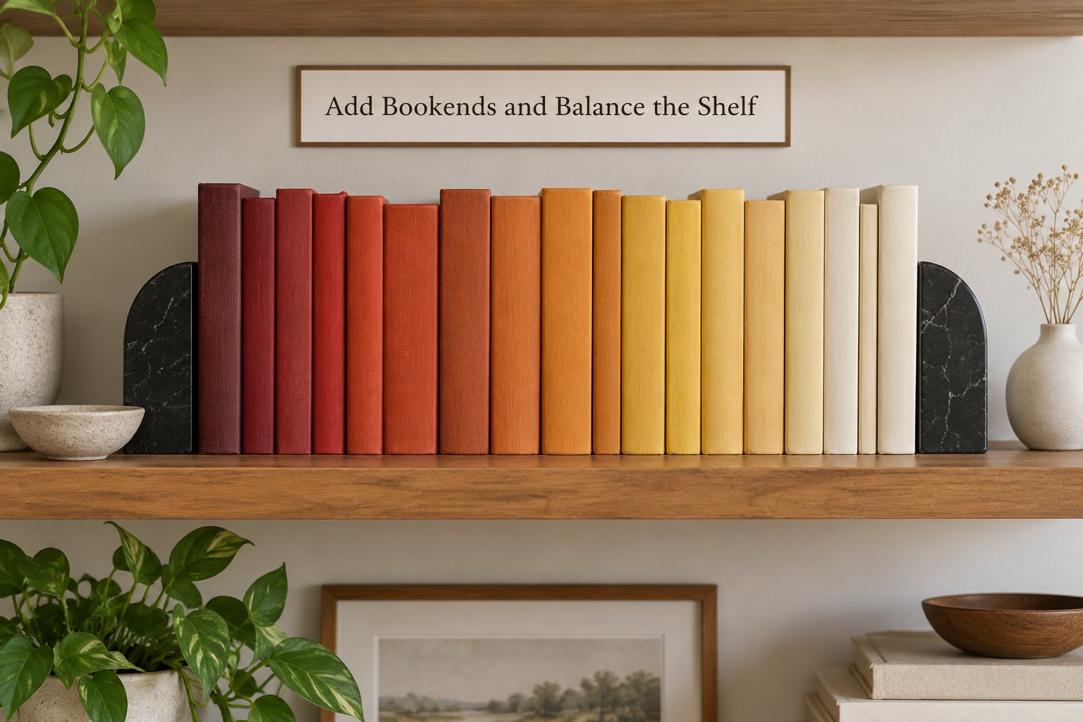
Slide a bookend against each end of the run and push the whole group toward it until the spines sit flush with the shelf edge. Most of what people read as messy is books sitting a centimeter or two deeper than their neighbor, so the last ten minutes is nudging, not arranging.
Fill gaps with books turned so the spine faces in, or with a second short run. Do not fill a gradient with a wide object in the middle of it, because anything you put at the midpoint pulls the eye away from the color.
Then think about weight rather than color. A shelf that is all dark spines on one side and pale ones on the other looks unbalanced even when the gradient is technically right, so alternate dark and light groups when you have a light-to-dark pattern to build on.
Finally, keep the books you reach for at hand. A color shelf where the book you want lives in the back row on a high shelf will lose the argument within a week, and the arrangement will drift back to nothing.
6. Finish with a Practical, Livable Display
Leave breathing room. One small plant, one framed photo, or a low storage box at one end of the shelf is enough. Three objects turn a color gradient into a crowded arrangement, and the books stop being the feature.
Stacking two or three books flat at the far end works well and costs nothing, provided you choose those books for height and color together. A flat stack of matching spines reads as a tidy block rather than a gap.
If the shelf is visible from a window or a walkway, leave one third of it open. Room to breathe is what separates a color shelf that looks considered from one that looks like a sorting project that never finished.
Common Mistakes
It looks too mechanical. A perfect saturated rainbow on every shelf can read as a trend that has passed. Vary the saturation, keep one shelf in neutrals, and break the run with a plant or a stack laid flat. Two-tone gradients and light-to-dark arrangements stay current longer than a full spectrum.
Heights are all over the place. The gradient will not read until the spine tops line up. Sort tallest to shortest inside each color group, and if a few stubborn paperbacks break the line, turn them to show the back cover or move them to a different group.
One color dominates and the rest disappear. This is normal. Most collections are lopsided, and forcing equal blocks produces narrow slivers of color. Instead of evening things out, build the pattern around what you actually own, with the rarest colors given the widest spacing so they read.
Everything is packed tight. Crammed spines with no air between them hide the gradient. Leave a finger width at the top of the run so the light catches the colors.
Dust collects in the gaps. Color shelves collect dust fast because of all the small spaces between spines and because nobody wants to move a neat run. A quick wipe with a dry cloth every few months keeps it honest, and a shelf light makes the whole thing worth looking at.
You ignore the lighting. An unlit shelf in a dark corner flattens every hue into grey. An LED strip under the shelf above or a small picture light is the cheapest upgrade to a color arrangement, because it makes the top edges of the spines glow.
You split up a series. The most common complaint from people who try this and hate it. Treat a series as one unit: keep all the volumes together in the group matching the dominant spine, and stand a bookend against the set so the boundary is obvious.
Frequently Asked Questions
Should every bookshelf in the room use the same color pattern?
Usually yes, or at least the same underlying logic. One rainbow on the top shelf and color blocks below reads as two different rooms sharing a wall. The exception is when shelves are separated by a change of wall color, a divider, or a room change, because then each section can run its own spectrum. What you want to avoid is switching patterns halfway along the same row of shelving.
How do I make color-arranged books look less perfect or artificial?
Give the arrangement one honest flaw. Leave part of a shelf empty, mix a neutral run through the middle of a rainbow, or turn a few books so the pages show. Adding one plant, one frame, or a flat stack of books at one end also breaks the strictness. Perfectly equal blocks of saturated color on every shelf is what makes the look read as a project rather than a room.
Where should I put books with faded, damaged, or mismatched spines?
Group them by series where you can, since a matching set of faded spines still looks deliberate. Otherwise put them at the ends of the shelf or at the top, where a few imperfect spines do not interrupt the middle of a gradient. Dark and faded spines work well together as a neutral band, which is often where the black and grey books end up anyway.
What is the best way to keep color-arranged books from falling over?
A bookend at each end of the run, the heaviest kind you can find, plus spines pushed flush to the front edge. Inside each group, sort by height from tallest to shortest so nothing is leaning on a much thinner neighbour. Keep short paperbacks off the bottom row, where the weight above them does most of the damage, and check the run after any large addition.
Should I arrange the colors as a rainbow or as a two-color gradient?
A rainbow needs a wide range of real colors on the shelf and a long enough run for each hue to register. If your collection is mostly neutral, a two-color gradient or a light-to-dark progression will look far better, because those patterns work with only two or three hues. Rainbow per shelf works well when a single shelf is wide enough to hold seven visible color bands.
How do I keep a colorful bookshelf from becoming dusty?
Dust settles in the gaps between spines, so a run of tightly packed books collects more than an open one. Wipe the shelf and the spine tops with a soft dry cloth every few months, and do it in sections so you are not dismantling the whole arrangement. A shelf light draws attention to the spines, which helps you spot fading and grime early, before it dulls the color.
One more thing worth deciding before you start, because it is the reason some people love this system and others abandon it in a month. If your visual memory is strong, many readers find they genuinely remember a book by the color and size of its spine rather than its title, and the shelf works exactly as designed. For everyone else, keep the color blocks but alphabetize the titles inside each block. You keep the look on the shelf and the index in your head, and the arrangement survives contact with daily life.
Conclusion
Start small. Pull the books from one short section, sort them by dominant spine color into groups, and try a single light-to-dark gradient on that run. Judge it from where you normally stand, keep the tallest books at the back of each group, and push every spine flush to the shelf edge.
If the run looks right, extend the same pattern along the shelf. If it does not, you have learned more in twenty minutes than in a week of reading about it, and the books are still in piles on your floor. Adjust the pattern to the width of the shelf you actually have, and remember to leave the books you reach for most at the front.