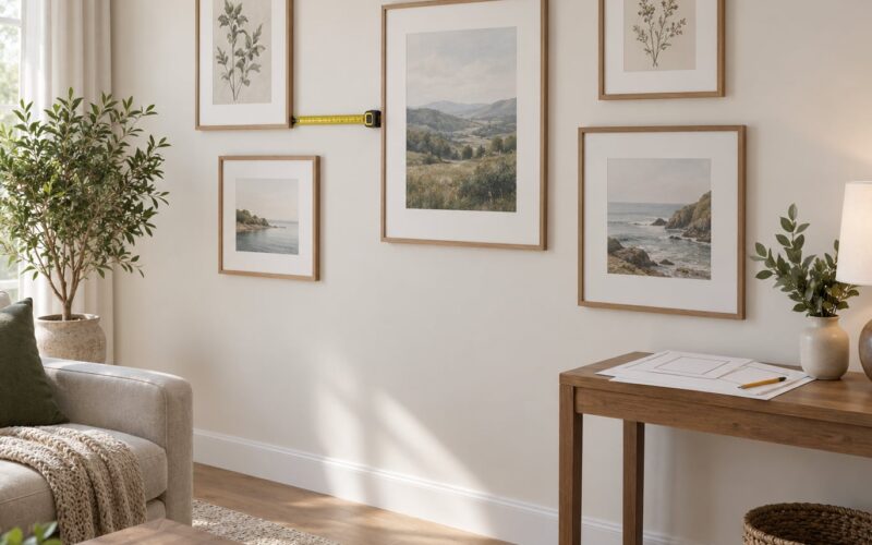
A gallery wall layout plan is a to-scale drawing of your wall showing exactly where every frame goes before you touch a hammer. You measure the usable wall, mark the center, pick your largest piece as the anchor, sketch the frames at scale on paper, space them 2 to 3 inches apart, tape paper templates to the wall to test the look, then hang from the center outward. On a nine to twelve piece wall, budget an hour.
The reason to plan is boring but decisive: spacing is the one thing you cannot eyeball. A wall can look deliberate or accidental depending on a single inch of gap, and the only reliable fix is moving frames, which means a second set of holes.
Table of Contents
- What You Need to Make a Gallery Wall Layout Plan
- Step-by-Step: How to Plan a Gallery Wall
- 1. Measure the Wall and Mark the Center
- 2. Choose a Gallery Wall Layout Style
- 3. Map the Frames on Paper to Build the Layout Plan
- 4. Arrange and Balance the Frames
- 5. Transfer the Layout to the Wall
- 6. Hang the Frames and Make Final Adjustments
- Common Gallery Wall Mistakes and Quick Fixes
- Frequently Asked Questions
- How far apart should picture frames be on a gallery wall?
- What is the easiest way to plan a gallery wall?
- How do I make a gallery wall work in a rental?
- How do I mix different frame sizes without making the wall look messy?
- Should I draw a gallery wall layout on the wall first?
- How do I choose a gallery wall layout for a narrow or awkward wall?
- Conclusion: Start With Paper, Not Nails
What You Need to Make a Gallery Wall Layout Plan
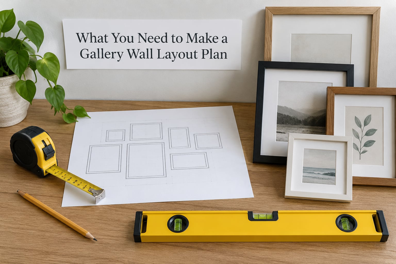
You need very little, and most of it is already in a junk drawer. The plan itself is made of paper and pencil.
- Graph paper or a large sheet of kraft paper for the scaled drawing. Butcher paper from a craft store works well because the cutout templates come out of the same sheet.
- A measuring tape, plus a pencil and a soft eraser.
- A level, 12 inch or 24 inch. A cheap torpedo level is fine.
- Painter’s tape for marking positions and holding paper templates.
- Scissors or a craft knife for cutting templates at frame size.
- Removable putty to steady the bottom corners of light frames after they are up.
- Your frames and hardware. Check what each one uses: a wire on D-rings, a single sawtooth, or a keyhole hanger.
- Optional: a phone photo app, a free online gallery wall layout generator, or a ruler for marking the paper.
Counting what you already own comes before counting what you buy. Home decorators on Reddit repeat the same advice: a collection gathered over years rarely fits one wall until you measure the frames, not just the wall.
Step-by-Step: How to Plan a Gallery Wall
1. Measure the Wall and Mark the Center
Measure the usable wall area, then leave 6 to 8 inches of breathing room on the left and right. That margin is what keeps the arrangement from looking crammed.
Write down the height of the furniture underneath. A sofa back usually sits around 30 to 34 inches, and the bottom row of frames should land 6 to 8 inches above it. Note every obstacle: light switches, outlets, window trim, a door that swings, the ceiling line on a stairwell.
Tap a light pencil mark at the horizontal center of the space you have marked off. Over a sofa, the layout should span roughly two thirds of the sofa width, so a 72 inch sofa gets a layout about 48 inches wide. Center it on the sofa, not on the wall, which is usually how an arrangement ends up looking off to one side.
2. Choose a Gallery Wall Layout Style
Pick the style that matches your frames and the room. A grid suits same-size frames, a linear run suits a hallway, and a salon mix hides mismatched sizes best.
- Grid. Best for matching or near-matching frames, formal rooms, dining and office walls. Total span can be any size, usually close to square. Spacing: 2 inches, perfectly even. Difficulty: easy.
- Linear. Best for hallways, landings, and above a long console. Total span is wide and short. Spacing: 3 inches in a straight line. Difficulty: easy.
- Salon mix. Best for collections of different sizes, family photos, and found art. Total span runs square to slightly wide. Spacing: 2 to 3 inches with varied edges. Difficulty: medium.
- Stair-step. Best for staircases and sloped ceilings. Total span follows the incline. Spacing: 2 to 3 inches along a diagonal. Difficulty: medium.
Two more rules make almost any arrangement work. Keep the gaps consistent within a style, and let one oversized piece sit slightly off-center as the anchor if the collection leans that way.
3. Map the Frames on Paper to Build the Layout Plan
Draw your wall area to scale, with one square on graph paper equal to one foot. Then draw each frame as a rectangle at that same scale and write its dimensions inside it.
Measure frames on the outside, not at the glass or the mat. A 16 by 20 inch frame measures 16 by 20 inches, and that is what eats into your wall, not the visible picture.
Decide your gap before you place anything. Two to three inches is the usual range: 2 inches looks tight and formal, 3 inches gives a mixed collection room to breathe. Write the gap at the top of the paper and hold to it.
Now test arrangements by moving the rectangles around on the floor of the paper. Most people try two or three, photograph the one they like, and that photo becomes the reference while they hang.
4. Arrange and Balance the Frames
Place your largest piece near the center and build outward from it. That single habit is the most commonly recommended rule in decorating communities, and it is why the arrangement reads as intentional rather than scattered.
Distribute the heavy items evenly. If one side has three large frames and the other has two small ones, the wall will tip visually even though both sides are the same width.
Align edges where it helps. In a salon mix, aligning the outer top and bottom edges keeps the block from fraying while the interior stays loose. Stagger orientation, mixing landscape and portrait, so the wall has rhythm.
Give the group one unifying element: a shared mat width, a repeated frame finish, or a tight color palette. If your frames come from different years and finishes, matching mats are the fastest fix.
5. Transfer the Layout to the Wall
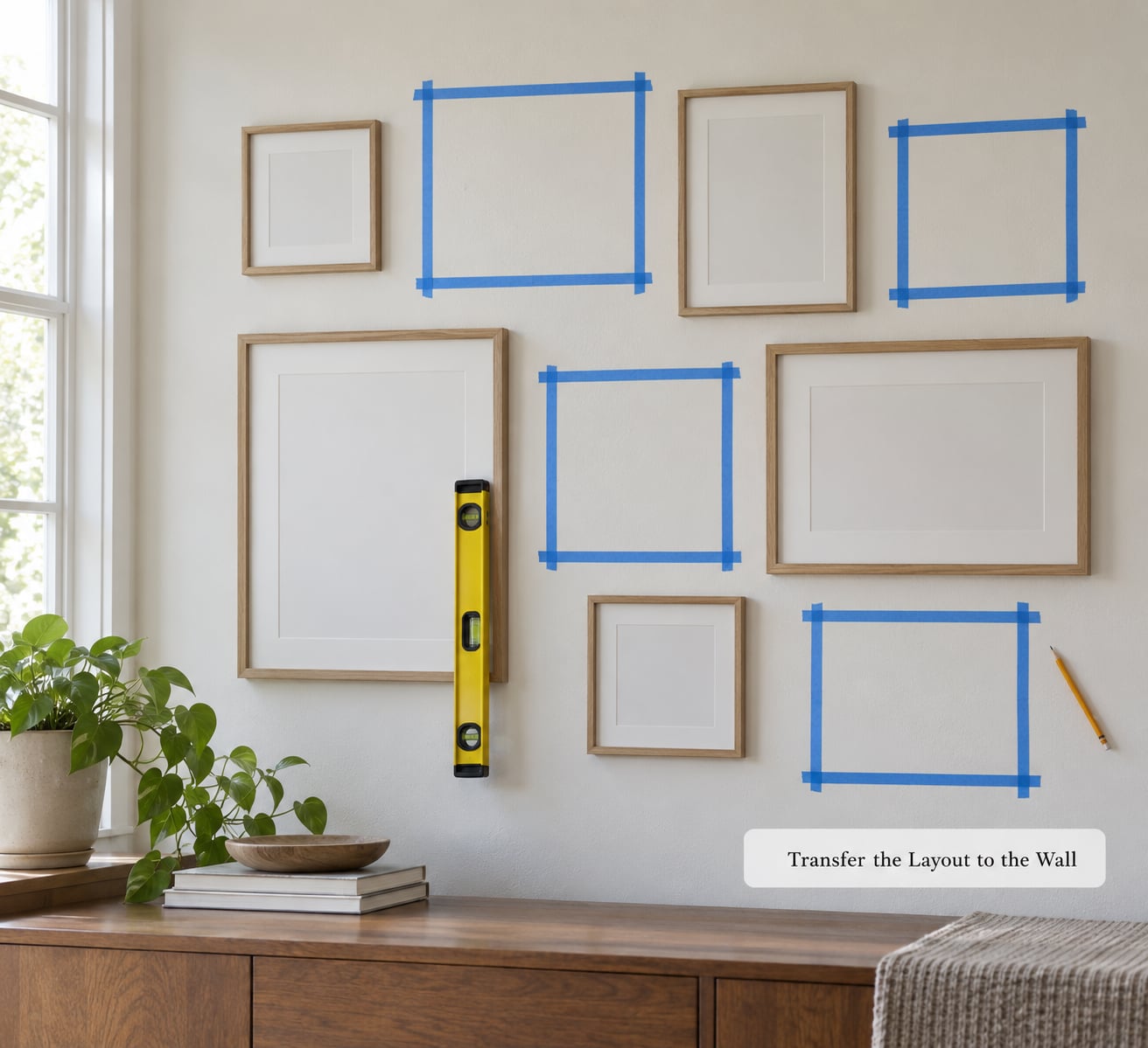
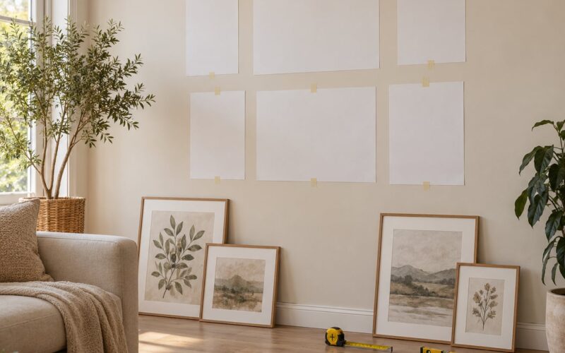
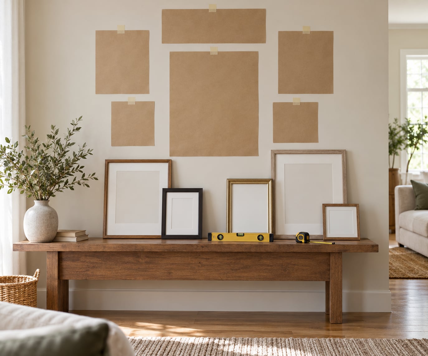
Cut kraft paper rectangles at the exact frame sizes from your plan and tape them to the wall in your chosen arrangement. This is the step people skip, and it is the one that saves them.
Tape a straight level line across the wall first, at the height of your bottom row, so you have a baseline to check every template against. Hang the templates, step back, and photograph the wall. Adjust while paper is cheap to move.
Then mark the hanger position. Here is the detail that causes most crooked gallery walls: the nail goes where the hardware sits, not where the frame center is. For a wire hanger, measure the drop from the top of the frame down to the wire, then add that drop to your mark. For D-rings, the nail lines up with the rings. For a sawtooth, it lines up with the tooth.
Make light pencil marks, never permanent marker. Renter anxiety about a single nail hole is real, and pencil marks come off with an eraser.
6. Hang the Frames and Make Final Adjustments
Hang in order, starting with the center piece and working outward in both directions. Hanging the anchor first means every other frame positions against something already true.
Check each frame with the level before you move on, and nudge rather than re-hang when it is off by a fraction. After three or four frames, step back six feet and look again, because the eye reads the whole block, not the near edge.
Put a small piece of removable putty under the bottom corners of anything that rocks. Tilted frames are the most common reason a finished wall looks slightly wrong to people who cannot say why.
Common Gallery Wall Mistakes and Quick Fixes
These six account for most disappointing gallery walls, and every one of them has a fix you can apply without starting over.
- Measuring only one section of the wall. Measure the full width at two heights and check that the wall is actually square. Fix: mark the center again from both ends and average the two numbers.
- Choosing a layout before inventorying frame sizes. You end up with three frames and an empty corner. Fix: write every frame dimension on a list before you pick a style.
- Ignoring the furniture below. A bottom row that drifts a few degrees from the sofa back looks wrong instantly. Fix: use the furniture top as your baseline in the level line.
- Using inconsistent gaps. Fix: mark the gap on your paper plan and measure two or three gaps on the wall to stay honest.
- Hanging without a level, or measuring to the frame center instead of the hardware. Fix: level the baseline first, then measure the wire drop before marking the nail.
- Overfilling the wall. People regret a plan that reaches the margins. Fix: shrink the layout by a foot on each side and let the wall breathe; an underfilled wall is easier to add to later than a crowded one is to thin out.
If you rent or want a reversible wall, the plan works the same, only the hardware changes. Removable adhesive strips rated for the weight of each frame, nail-free hanging hooks, or a gallery leaning against the wall on a long shelf all let you keep the layout and skip the holes. Weight ratings matter, so add up the frames on each strip rather than trusting the number on the box.
Frequently Asked Questions
How far apart should picture frames be on a gallery wall?
Two to three inches is the standard gap. Two inches suits a formal grid and matching frames, while three inches works better for a mixed collection where different sizes need to breathe. Pick one gap before you place anything and hold to it, because even spacing matters more than the exact number.
What is the easiest way to plan a gallery wall?
Draw the wall to scale on graph paper, where one square equals one foot, then draw every frame as a rectangle at that same scale. Cut kraft paper versions of those rectangles, tape them to the wall, and step back. It costs almost nothing and lets you move the layout by inches instead of holes.
How do I make a gallery wall work in a rental?
Keep the layout plan and change the hardware. Use removable adhesive strips rated above the weight of the frame they carry, or nail-free hooks rated for the load, and never exceed the stated limit. A leaning gallery on a long shelf is a fully reversible option that still follows the same spacing rules.
How do I mix different frame sizes without making the wall look messy?
Mix sizes deliberately rather than randomly. Put the largest piece near the center, distribute the remaining visual weight evenly, and align the outer top and bottom edges so the block holds together. One shared element, usually the same mat width or a repeated finish, keeps an eclectic wall from reading as cluttered.
Should I draw a gallery wall layout on the wall first?
Yes, and paper is better than marker. Tape cut paper templates at true frame size to the wall using a level line as your baseline, step back, and photograph the result. Adjust the arrangement while moving paper costs nothing, then transfer the final positions with light pencil marks that erase cleanly.
How do I choose a gallery wall layout for a narrow or awkward wall?
Use a linear run or a stair-step arrangement instead of a block. On a narrow wall, spread frames horizontally in one row with 3 inch gaps, keeping the total span inside the wall minus 6 to 8 inch margins on each side. For an incline or alcove, follow the slope rather than fighting it with a square grid.
Conclusion: Start With Paper, Not Nails
Measure the wall first, then list every frame you own. That single afternoon of planning is what turns a gallery wall layout plan into a wall that looks balanced, with one set of holes and no rearranging on your hands and knees later.